Hi all,
@ruidajo and me have been working in a new modification (we call the “mods”, as others do for games ;-)), based in a patched version of Krystal combined with Projectify and some other plugins.
So far we like our KrystalMod. But we would like to change some extra things:
- We would like to have a fixed navigation bar, similar to the one in TiddlyStudy or Notebook or, even better the Multicolums Layout, while keeping the current feature of a top bar with “Open”, “Recent”, “Tools”, etc, deploying a tiddler at the left.
- We would like to have a bigger edition area, similar to what @telmiger has done with Bricks, so we can have a broader preview of the edit. In its current form, Krystal, while good for reading and keeping tiddlers in context, is not wide enough for a good preview. Alternatively, now that we can have two tiddlers sharing the screen, having the same, side by side in editing and preview mode could be an option. I remember seeing something like this in this forum, but I don’t know if it would be applicable for our current mod.
How can we achieve the two items mentioned above?
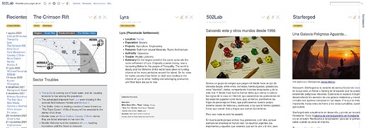
As a side note, we start to explore this themes, while updating a little microwiki for Table Top Role Playing. Here is a screenshot:
And a couple of tweets about this. The software that feeds the games oracles is TiddlyWikiPharo and we will share back the data narratives (in Spanish so far about the process).
