Tabs is a handy macro in Tiddlywiki, but customizing it is a little tricky! This tread discuss some of features for styling tabs!
Docs:
Example iii - Alberto Tabs
Alberto Molina Pérez in his Magic tabs uses a very smart solution to create tabs showing number of tiddlers tagged with current tiddler (e.g current tab). The below solution creates an Alberto like tabs
Anatomy
To see how the tabs style works lets
- go to https://tiddlywiki.com/
- create a new tiddler “mytabs”
- add the below content
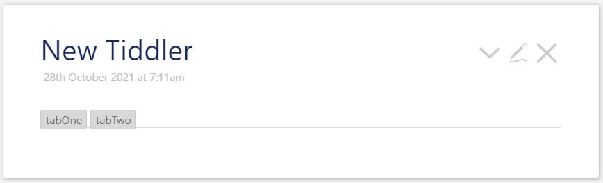
<<tabs tabsList:"tabOne tabTwo" >>
- New click show preview pan select
Raw HTMLfrom drop downChoose preview type - You should see
<div class="tc-tab-set ">

<div class="tc-tab-buttons ">
    <button class=""> tabOne </button>
    <button class=""> tabTwo </button>
</div>

<div class="tc-tab-divider "></div>

<div class="tc-tab-content ">
    <div class=" tc-reveal" hidden="true"></div>
    <div class=" tc-reveal" hidden="true"></div>
</div>

</div>
With below result
If you look at the classes you should have the below class
.tc-tab-set{}
.tc-tab-buttons{}
.tc-tab-buttons button{}
.tc-tab-buttons button.tc-tab-selected{}
.tc-tab-divider{}
.tc-tab-content{}
Example i:
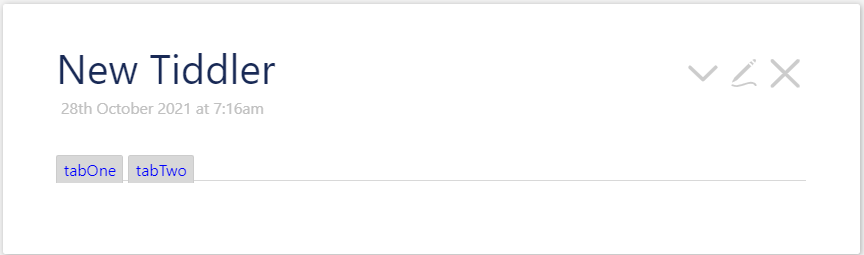
Lets change the color of tabs button to blue
- create a stylesheet tiddler
- create a tiddler named for example “mytabs.css”
- tag it with
$:/tags/Stylesheet - add below style
.tc-tab-buttons button{color:blue}
and you get
Example ii
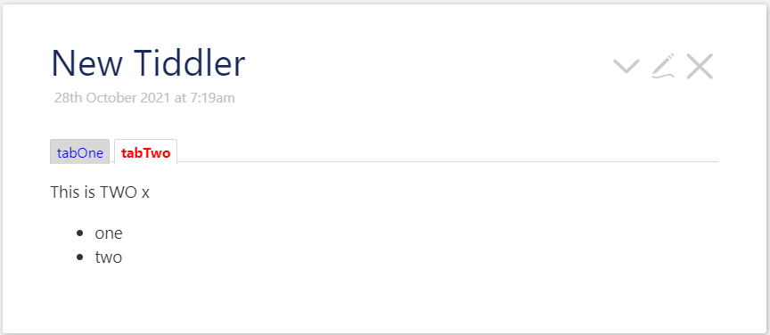
Set the color of selected (active tab) to red and its font weight to bold. It is good to create two tiddlers in above example <<tabs tabsList:"tabOne tabTwo" >> e.g. tabOne and tabTwo tiddlers with some contents!
- open the tiddler named for “mytabs.css” from example i
- add the below style
.tc-tab-buttons button{color:blue}
.tc-tab-buttons button.tc-tab-selected{
  color:red;
  font-weight:bold;
}
and you get
Example iii: Alberto tabs
This example implements tabs like tabs in his Magic tabs from Alberto Molina Pérez
- go to https://tiddlywiki.com/
- create a new tiddler “alberto-tabs”
- add the below content
\define BTcaption()
<$transclude tiddler={{$(currentTab)$!!icon}} mode=inline/><$count filter="[tag<currentTab>]"/>
\end

<div class=s03><<tabs tabsList:"[tag[alberto]]" explicitState:sample03>></div>

<style>
.s03 .tc-tab-set{}
.s03 .tc-tab-buttons{}
.s03 .tc-tab-buttons button{}
.s03 .tc-tab-buttons button.tc-tab-selected{
     background:lavender;
}
.s03 .tc-tab-divider{}
.s03 .tc-tab-content{
 background:lavender;
 margin-top:0px;
 border-bottom-left-radius:  5px;
 border-bottom-right-radius: 5px;
}
.s03 .tc-tab-content div{
 color:blue;
 padding:5px;
}
</style>
-
Next creates two tiddlers (you create more) with
-
tiddler 1:
- icon: some icon like:
$:/core/images/twitter - tag: alberto
- icon: some icon like:
-
tiddler 2:
- icon: some icon like:
$:/core/images/options-button - tag: alberto
- icon: some icon like:
-
-
Creates some tiddler tagged with above two tiddlers
You should get:
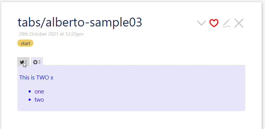
- The first tab has one child
- The second tab has three children
To give a try download sample03-alberto-magic-like-tabs.json (2.0 KB)
and use in https://tiddlywiki.com/
Usecase: Use these kind of tabs for links/backlinks/keywords, etc…
Contribution
This is a wiki post. Please add more examples below!
