TiddlyWiki Page Layout - Alternatives

I was wondering whether anyone has managed to use TiddlyWiki with a new/ alternative Page Layout. If you have created a new layout, I would be interested in seeing an example layout tiddler that I could use to create my own structure, starting with the basic/ standard page elements.

The suggestion to clone the default page template didn’t work for me in the past, it corrupted the tiddler. Whether that was a problem with TW I am not sure.

I would appreciate links to any examples that you know of, or any help you could offer.

Scot
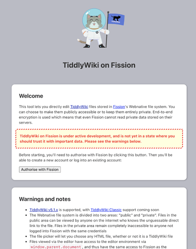
TiddlyWiki on Fission uses a custom page layout:

https://tiddlywiki.fission.app/

There’s a link at the bottom of the page to switch to the standard layout (or you can use ctrl-shift-L)

1 Like

Hi Scot.
For some views which require the whole screen, I superimpose an alternative page-template I called pagestage.
Here Grid — is a sort of flexgrid-style landing-page. But I also use it for Kanban-like pages to sort objects. (You get to see the ingredients going to the normal view via the top-right corner)
@jeremyruston I still would love to have a draggable version of the cecily - view which is a very usefull and impressive alternative layout.

Best wishes Jan

1 Like

Hi @jeremyruston
thanks for replying.
Although I have looked at TiddlyWiki on Fission a number of times, it did not dawn on me to look at the page template that it is based on, right in front of me all the time.

I guess there’s none so blind as those that cannot see :grinning:
I’ll have a closer look next time.
Thanks again.

1 Like

Hi @JanJo
thanks for suggesting Grid. It reminds me of Tiddlywiki 960 which I saw a while back, which I thought had a lot of promise for future layouts. At the time though, I was on the start of the TiddlyWiki learning curve. It may still be around somewhere.
I was thinking along the lines of using Flexbox and creating a page layout similar to a Word Document with the title, headers and sections. I had a php version a while back but I couldn’t get TiddlyWiki to fit.

I’ll have another look at Grid and see if it will fit the bill.

I think TiddlyWiki 960 was a TWclassic layout using jQuery and was designed for 960 pixel wide PC screens “many” years ago. …

I think today we could go for 1200 or 1400 for PC like displays. On mobile screens it’s much more complicated, we need a responsive design here. …

I think Projectify would be a good starting point already. Projectify — Manage projects in TiddlyWiki.

Hi @pmario
I have used Projectify and like the layout.
Regarding TiddlyWiki 960, I think your right it was probably TW Classic.
What I liked was that you could place different things outside the storyriver and make up a grid like layout for various topics or functions like menus etc.

My task at the moment is just to create a tabulated layout using flexbox to replace <table> tags and to have a document structure containing fields such as

Document Number
Document Issue
Issue Date
Document Title (not tiddler title)
Document Text
Logo
Group/ Department
Document Type ( not tiddler type)
Page Number (not essential but possible feature)

Transcluding the fields into each section of the page layout.

The result would look like a DTP document to the viewer.
The TW sidebar menus would not be visible; these could be accessed from a Dashboard tiddler.

1 Like