Comment: Now we are Cooking By Gas !!
The miniBrowser is a solution to many issues.
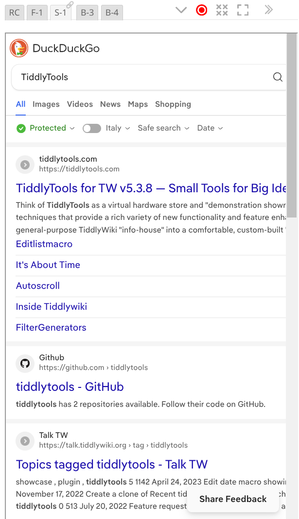
I’ll give one example … Searching the internet from the TW Sidebar …
The tool has …
- Easy Bookmarking
- Bookmark Filters
- Bookmark Folder Assignment to individual miniBrowsers — allowing independent hierarchies of Bookmarks
- Ability to Auto-Open external Tabs/Windows for non-iframe-ables
- Record of each miniBrowser’s last site
- Configurable Zoom ranges in each miniBrowser
I can’t thank @EricShulman enough!
TT