Related to What is Jeremy’s business model? - #74 by JuanPalomo , I just find https://www.intertwingledinnovations.com/
And I also find everything looks yellow when I move my eyes away from the monitor.
The blue color itself is good, color.adobe.com have many example that use simillar color, but perhape the area is too big? Or my monitor is too big?
Or too bright! It sounds like the purity of the color has overwhelmed many of the color-sensing cones in your retina, leading to a negative afterimage. Any chance you were viewing at night?
(The effect is not so strong for me, perhaps because I’m in a well-lit room, and the colorful screen is just one part of my visual field.)
I think the blue itself is not so bad, but the primary red and yellow of the banner pushes it into eyestrain territory for me. I do think breaking up the highly saturated color with some off-white or paler neutrals would make the overall effect a little more harmonious.
1 Like
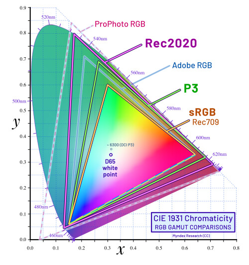
The trick on https://intertwingledinnovations.com is that some of the colours are specified using the display-P3 colour space (also known as “wide colour” or HDR). This is a relatively new standard for expressing a wider range of colours than the familiar sRGB colour space. This diagram from Wikipedia shows the subset of the range of all possible colours that are supported in different colour spaces. You can see how P3 covers colours that are out of reach of sRGB:
Not all devices/displays support P3, but it is getting more common, particularly on phones and tablets. Even for those that do, colour pickers in applications tend to be restricted to sRGB colours.
The upshot of all of this is that there is a set of secret colours that are very striking when you come across them. I find that pretty awesome. P3 is typically used in small doses, for example brightening up sunsets in photos, but it amused me to experiment with using it in a more unexpected way. My hope was that visitors would be struck by the vibrancy, and be intrigued.
However, I take the point about inducing eye strain, and if that is a widespread problem I would be happy to change it.
3 Likes
Interesting story and nice music, haven’t heard of it, thanks.
Yes, the color looks softer on P3, I find it is not configued under Windows monitor setting, need to use physical buttons on monitor to enable P3 in color temperature menu.
When using P3 the color temperature is colder, everything is blue, so color on the website does looks softer.
Need to configue Windows to also enable P3 together with monitor to make it work…