is an example, how practical it would be to have a template to print other TiddlyWiki content like this. I would like the possibility to make little - analogue - cheatsheets in this form.
Hi @john.edw_gmail.com ,thank you, this is a great step towards the solution … althougth it does not work perfectly yet.
Looks like there is a missing secret ingeredient. Does nobody have an ancient copy? Waybackmachine does not seem to have understood the tiddlywiki logic.
A thing that I missed during my research was a css way to overflow content from one div to another. This would facilitate the layout, but I guess this needs js.
This is fantastic. I will be playing with this, as I was going to build a trifold brochure this week as a political handout for the local election. A book like this would be so much more interesting! I will try to create one that does all 16 subpages from both sides of the sheet, using a cut/fold as described here: https://www.youtube.com/watch?v=ozCQe0dRr44. I’ll report back if I have any progress.
I think this might be best done without thinking of overflow, ensuring that each tiddler fits on a mini-page, and using overflow: hidden if necessary.
Sadly, CSS doesn’t have the capability to flow content between one box and another.
A possible workaround might be to use tid2png to render a single tiddler as a tall thin PNG, and then render cropped and transformed copies of the PNG across the page using CSS.
I think this also would involve quite a lot of code, or can we know the height of the png by advance. The approach I stumbled upon in the web is similar, but without the step to render as a png
…but I still wonder, why there is no standart web-design apporach to this.
Here is another workaround by rearranging the pages of a pdf for printing a booklet.
…but again, this means lots of aditional steps - because you have to export a pdf with correct paages first.
There is now a range of html/CSS features for “responsive” or multi-device screen layouts and lots of options via media queries you would think we could prepare the content for print as well. eg
Or is print now neglected?
[Post Script] I did build a PDF print layout solution and found value using page break avoid, and page break after, successfully, tables are good at this, however it is very fragile and footers, harder than headings.
I’d like to see that.
What is neglected in css is the ability rearrage pages so that they correspond to the retro-verso-nextpage necessities of a booklet (see the image at the top of the thread). Therefore it would be usefull to detremine a div into which the overflow goes. This is of course a print use-case, but the feature could be usefull for web as well.
It is hard to separate what I did from the wiki I built for a commercial client, but I am happy to share what I learned.
The key is arranging the content to be printed in a hierarchical form and decide which parts will not be allowed to break across pages, or they will move to the next page. Then also indicate where you want a specific end to the page, like before a page heading.
- If the content is all part of a table it is easy to repeat headings across pages, with only rows prevented from being split across pages.
- However there may be opportunities with the other items I listed, but I am not sure how to use (yet)
TW > {Publish_Script_Plugin} > Pandoc > LaTeX > PDF
Where are you there?
Some progress: I will try to post more this evening if I can, but I did manage to get something to work well mostly with CSS, with no attempt to overflow between the <div>s.
The HTML looks like this:
<div class="print-brochure">
  <div class="brochure-page page-1" >Content 1 here</div>
  <div class="brochure-page page-2" >Content 2 here</div>
  <!-- ... more here ... ->
  <div class="brochure-page page-16" >Content 16 here</div>
</div>
where the <div> contents are transcluded tiddlers.
.brochure-page {width: 2.75in; height: 4.25in; overflow: hidden; padding:.125in; font-size: 8pt; line-height: 1; position: relative;}
.brochure-page h1, .brochure-page h2  {text-align: center; font-weight: bold;}
.brochure-page p.overview {text-align: center; font-size: 125%;}
.brochure-page .logo {text-align: center;}
.brochure-page .logo img {width: 75%; margin: 0 auto;}
.brochure-page h3 {margin-top: -.1in; line-height: 1; font-size: 175%;}
.brochure-page .role {font-size: .75em; font-style: italic;}
.brochure-page div.avatar {margin-left: 0;}
.brochure-page .avatar img {width: 1.25in;}
.brochure-page ul {padding-left: 2em;}
.brochure-page .skip-in-brochure {display: none;}
.brochure-page .footer {text-align: center; margin-top: 2em;}

.print-brochure {height: 21.5in; width: 8.5in; position: relative; padding: 0;}
.print-brochure .brochure-page {margin: 0; position: absolute; top: 0%; left: 0%; }
.print-brochure .brochure-page.page-2 {transform: matrix(0, 1, -1, 0, 75, -100)}
.print-brochure .brochure-page.page-9 {transform: matrix(0, -1, 1, 0, 600, -100);}
.print-brochure .brochure-page.page-3 {transform: matrix(0, 1, -1, 0, 75, 225);}
.print-brochure .brochure-page.page-8 {transform: matrix(0, -1, 1, 0, 600, 225);}
.print-brochure .brochure-page.page-4 {transform: matrix(0, 1, -1, 0, 75, 550);}
.print-brochure .brochure-page.page-7 {transform: matrix(0, -1, 1, 0, 600, 550);}
.print-brochure .brochure-page.page-5 {transform: matrix(0, 1, -1, 0, 75, 875);}
.print-brochure .brochure-page.page-6 {transform: matrix(0, -1, 1, 0, 600, 875);}
.print-brochure .brochure-page.page-10 {transform: matrix(0, 1, -1, 0, 75, 1135);}
.print-brochure .brochure-page.page-1 {transform: matrix(0, -1, 1, 0, 600, 1125);}
.print-brochure .brochure-page.page-11 {transform: matrix(0, 1, -1, 0, 75, 1450);}
.print-brochure .brochure-page.page-14 {transform: matrix(0, -1, 1, 0, 600, 1450);}
.print-brochure .brochure-page.page-12 {transform: matrix(0, 1, -1, 0, 75, 1800);}
.print-brochure .brochure-page.page-13 {transform: matrix(0, -1, 1, 0, 600, 1800);}
.print-brochure .brochure-page.page-16 {transform: matrix(0, 1, -1, 0, 75, 2125);}
.print-brochure .brochure-page.page-15 {transform: matrix(0, 1, -1, 0, 600, 2125);}

.brochure-only {display: none;}
.print-brochure span.brochure-only {display: inline;}
.print-brochure div.brochure-only {display: block;}

@media print {
  div.tc-titlebar, div.tc-subtitle {display: none;}
}
Those matrix transforms do two things. First, they rotate my content either +90° or -90°, then they slide the resulting rectangle around in my output. If I play with this beyond my current practical needs for a brochure for this weekend, I would probably generate the repetitive part of the CSS as well from a simpler data structure. The odd ordering in the CSS is to show where the small pages (whose page numbers are ordered in a fairly logical reading order for the funky brochure) is about how they layout on the sheet. That is, the first two pages listed are 2 and 9, which are the top-left, and top-right of the front page, and they continue on until we hit 16 and 15 which are at the bottom of the back page.
I haven’t yet tried to make this into a function/macro with a passed filter listing the tiddlers, but that’s an obvious next step.
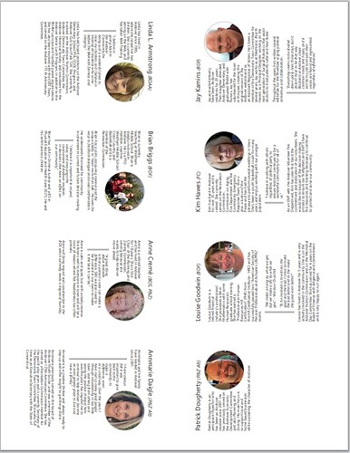
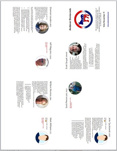
The output looks like this:
Front
Back
These are printed duplex, flipping on the long edge.
The borders in these images are just an artifact of my screenshot; there are no folding/cutting guides, but you can simply fold and cut this as described in the video above to make a very cute little booklet. The paper size is U.S. Letter, 8.5"x11", so this will not translate exactly to A4. We would need to tweak both the <div> dimensions and the offsets in the matrix transforms for a different paper size.
It’s real progress. Now if I can only get the three holdouts to send me their bios!
Are the contents of your divs images then?
No, they’re transcluded tiddlers with mixed content, with some wrapping information that I will eventually fold into the tiddlers. The CSS rotation applies to the entire <div>s.
If I pursue this (50-50 chance right now) I would like to make it so that I had a function with a filter parameter that used something like this:
<div class="print-brochure">
  <$list filter="$filter$ +[limit[16]]" counter="page">
    <div class={{{ [<counter>add[1]addprefix[brochure-page page-]] }}} >
      <$transclude mode="block"/>
    </div>
  </$list>
</div>
This way the tiddlers don’t have to know anything about the brochure; they merely have to be small enough to comfortably fit inside the fixed dimensions they are given.
I’m using the same content I use on a web page, with two special classes: one used to hide some content from the brochure view, and the other to show it only there. I’m not thrilled with this, as it clutters up the tiddler, but I don’t want separate copies of the same material. Here’s an example:
As a member of the BOE for the past eight years, Shannon has volunteered
significant time to:

* negotiating the contracts for<span class="skip-in-brochure"> each of the
  employees of AES, working with the individuals and unions;</span>
  <span class="brochure-only">AES employees</span>;
* ...
so that on the web view, our candidate (who, as you might be able to tell from her prose is a lawyer), it reads
As a member of the BOE for the past eight years, Shannon has volunteered significant time to:
- negotiating the contracts for each of the employees of AES, working with the individuals and unions;
- …
But on the brochure it reads
As a member of the BOE for the past eight years, Shannon has volunteered significant time to:
- negotiating the contracts for AES employees;
- …
It’s not a wonderful solution to this issue, and I’d love to hear alternatives. But it works for now.
Overall, though, I think this will be a useful approach to creating various kinds of booklets… so long as you don’t want content to automatically flow between the pages.
Adding this in case it adds to the development. zine machine! uses grid-template-areas for the layout.
example: https://zine-machine.glitch.me/
source: Glitch :・゚✧
It seems like you’re doing well. Even when you use a word processor, you usually have to determine content breaks manually.
Is the main difference between the two texts that the web version is longer? And it’s the awkward insertion of span tags that is the concern?
@pmario has a customised markup plugin that lets you define your own markup symbols (e.g. %%). I’m wondering if something like that could be used to apply the differences.
Right. I’m not worried about that for my own case, where each page is naturally its own tiddler, but some of the discussion above was about flowing text between the mini-pages.
Also, while you do have to determine them manually in a word processor, it’s much easier to simply type CTRL-Enter or backspace over it than to manually move content between two different tiddlers, often even in minor edits.
Yes and yes. Many of my mini-pages are the same between the two versions. But the longer ones have to be trimmed, and I don’t want to trim the web ones unnecessarily. I can’t think of a better way to maintain two closely related, but clearly different, texts. I was hoping someone else might have a better approach.
I was considering trying something like this, on my own, partly to better learn a part of TW that I don’t know anything about. But I was stopped by two thing: First, at the moment, it’s just a distraction from trying to get my brochure ready to print. Second, I’m not bothered too much by the markup mechanism. I’ve done HTML for more than 25 years. Throwing in a few extra <span>s isn’t worrisome. It’s the overall mechanism of the two intermingled versions I object to.
But thank you for the pointer. I may try it out, because while I don’t mind writing the text in this manner, reading it is less pleasant.
That might help. I’ll have to check. The 90° rotations are my biggest banes. I think theoretically, this should be simpler than the matrices, using transform-origin, but I haven’t worked that out. This does show me something I really should have thought about: I could do the simpler 180° rotations if I printed in landscape mode! D’oh! Time pressure can really mess with me.
All of us I expect.
Exporting as html and importing to word or another wordprocessor for final print preperation is a desperate approach I have used in the past.

