Table overflow issue after upgrading to TW 5.2.4

@pmario I think this issue is related to this PR

I have a GSD5 table Dashboard which used to overflow in mobile as shown in this link.
But after upgrading to TW 5.2.4, the entire contents of the table is getting cramped into the limited screen space of the mobile phone - demo. The old behavior was better for this dashboard layout so that I can scroll and see the column contents. Is there any CSS workarounds to get back the table overflow ?

I think that’s not the one … I’ll have a closer look.

IMO the dashboard tiddler should define a table min-width as a special case.
Normally we don’t want tables to “leak” out of tiddler frames.

In this case the table doesn’t leak out of the tiddler frame. It stays within the tiddler frame itself and I can scroll to view the hidden part of the table.

The dashboard has some hardcoded width styles directly applied to the TABLE element.

IMO you could use instead of <table style="width:100%;" class="styled-table">
use: <table style="min-width:800px;" class="styled-table"> … or something similar

This setting is there 2 times

There also is a class definition “styled-table” which imo is missing in the 5.2.4 wiki ??

1 Like

This one seem to solve the problem. Thank you @pmario for the help.

I just sticked with something which was looking fine and was working.

I had to use two tables due to some other CSS issues which I couldn’t solve.

Cool! … Yea tables are a bit problematic, because browsers seem to handle them slightly different. …

With v5.2.4 we did introduce some new Table Utility Classes, which should work with tables a bit more convenient.

2 Likes

Will take a look at those docs. Thank you

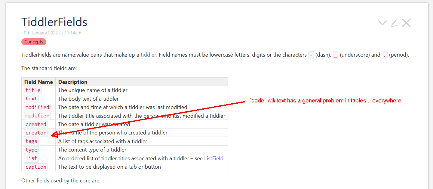
Although not directly related to the new Table Utility Classes, there was a change to the default CSS in $:/themes/tiddlywiki/vanilla/base that affected ALL tables, everywhere.

Specifically, this CSS in v5.2.4:

table th, table td { padding: 4px 6px 4px 6px; ... }

compared to v5.2.3:

table th, table td { padding: 0 7px 0 7px; ... }

This change had a significant negative impact on EVERY instance where I’d used a table without also explicitly specifying the padding for th and td elements. When I upgraded to v5.2.4, all the cells in those tables suddenly got “fatter” due to the increase in default padding.

To address this, I had three options. I could either

  1. Find every table in my content and explicitly add style="padding:0 7px" to every <td> element
  2. OR, in a Stylesheet tiddler, define a new classname; e.g. .skinnyTable th, .skinnyTable td { padding:0 7px; } and then find every table in my content and explicitly add class="skinnyTable" to every <table> element
  3. In a Stylesheet tiddler, revert to the previous default padding by defining
    table th, table td { padding: 0 7px; }

Because of the widespread use of tables in some of my content, I opted to use the 3rd approach, added to my general-purpose https://tiddlytools.com/#TiddlyTools%2FStylesheet%2FAdjustments stylesheet tiddler.

Having done so, I haven’t seen any negative impact on TWCore content that uses tables (e.g., various $:/ControlPanel tiddlers).

A similar “global” CSS impact also occurred with the addition of the following in $:/themes/tiddlywiki/vanilla/base

/* Input elements accessibility -- overwrite the reset */
:focus-visible {
	outline: 2px solid <<colour primary>>;
	outline-offset: -2px;    /* same as in reset.css [type='search'] but for more elements */
}

This addition resulted in a subtle but noticeable change in the appearance of ALL form elements throughout my content, which had previously used a platform-specific default style for showing the “focus ring” around the active form element.

To address this, I opted to add :focus-visible { outline-offset:-1px; border-radius:0.25em; } to TiddlyTools/Stylesheet/Adjustments as well as adjusting the primary (“primary foreground”) color definition in one of my custom palettes (TiddlyTools/Palettes/Dark).

Although I completely understand the benefits of “improving” the TWCore CSS definitions, it seems that the goal of strong “backward compatibility” is sometimes overlooked in regard to changes in the CSS definitions. I’m not opposed to making these changes, but I do think that their impact on existing TW content needs to be more carefully considered and then strenuously advertised PRIOR to releasing a TWCore upgrade.

Your thoughts?

-e

3 Likes

Thanks @EricShulman this is a serious regression. I’ve made a ticket on GitHub:

I’m sorry that I caused problems.

The offending PR was pushed for review on Aug. 18th and sat there for 3 months. I did add a link to the PR with a working demo, but nobody seems to open it.

At that time we didn’t have the automatic build system that we have now.

With the new system, which is active since several weeks, every pull-request automatically builds a “preview”, no matter if merged or not.

eg: Fix html macro exception missing parameter value by pmario · Pull Request #7122 · Jermolene/TiddlyWiki5 · GitHub … scroll down till you see the “vercel bot” message

The new table paddings also affects Shiraz Tables.

Here is an example of Node Explorer

TW 5.2.3

TW 5.2.4

I prefer 5.2.3 here (smaller padding)

Did you ever try to click the chevrons on a mobile screen?

So it’s more important to let the default documentation at tiddlywiki.com look like this.

For conditional mobile adjustments, you can do the following:

First, install $:/plugins/tiddlywiki/browser-sniff from the Official TiddlyWiki Plugin Library. Then, create a tiddler (e.g., “MobileStylesheet”), tagged with $:/tags/Stylesheet, containing:

<$let mobile={{{ [enlist[android ios windowsphone]addprefix[$:/info/browser/is/]get[text]match[yes]] ~[[no]] }}}>
<$list filter="[<mobile>match[yes]]">
table th, table td { padding: 4px 6px 4px 6px; }
</$list>
1 Like

Hi @pmario I like your suggestion on the forum to make the table cell padding be a theme tweak, but perhaps there’s scope to go further and introduce a new theme tweak checkbox for Vanilla that enables larger touch targets for mobile devices?

1 Like

According to Stackoverflow mobile devices can be detected with a CSS media query. Didn’t test it yet … More research needed.

@media only screen and (hover: none) and (pointer: coarse){

/* Regular CSS rules here*/

}