Sometimes for showing progress ( like task done, words learned, project steps finished …) in TiddlyWiki you need a simple macro and don’t want to go for heavy sophisticated JS.
Attached is a solution based on Oliviale great solution:
Hi, There are 2 problems I can see with this solution.
It adds a 33kByte compressed (unreadable for humans) CSS for something that can be done with about 25 lines of CSS
The pie-chart can’t be printed
I did play around some time ago with pie-charts, because I did find a nice gist at github, that I thought would be nice for TW. The whole thing will need a bit of polishing.
Eg: At the moment it only shows percent values. It doesn’t do any maths eg: 23 steps should fill the cycle to 100% …
Just now I commented you about the version surely was done by @pmario . The svg are rasterized better than conic-gradient.
Somebody can add mor options with more lines, but he/she use less lines than the older solution that use a custom css for 100 values (unminified CSS is 600 - 1000 lines depends on version)
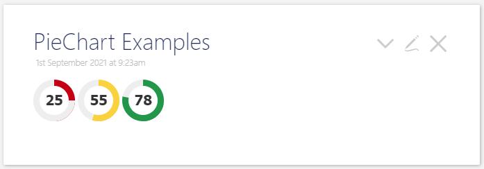
Pedantic note, this looks like a donut chart to me, not a pie chart, since it has the middle cut out. I know the author calls it a pie chart, and I’m not sure there’s any Chart Authority to declare what the “official” names are, but I think this is a pretty widely accepted distinction.
Donut charts are easier to read than pie charts IMO, especially if there are a bunch of slices to compare, so sweet – just surprised me to see the picture after the subject line!