As an enhancement proposal, I’d like the default “Hide Sidebar” top-right button ($:/core/ui/TopBar/menu) to look like the example below when SidebarSlider plugin is active:
Thanks! I don’t know if I can make this an official plugin, there are other plugins that create sidebar sliders that might be better suited, Idk.
Great that it works so well in your single-file wiki.
I found some flaws, especially when we start playing with unrealistic values for the minimal story width (like minimal story width greater than current story width) and I’ll try to find solutions for that
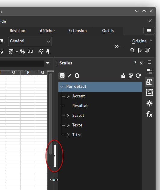
Exactly. In LibreOffice, the slider works just like yours, and this indicator is a button which hides the panel when clicked. Overall the button works like current TW’s hide sidebar button, just located over the slider and with a different style.
Agreed. I’ve never been happy with the current hide/show sidebar button. It’s distracting, and often interferes with other features in mobile. This would be much nicer!
I think tt should be a button-sized column at full window height, along the right edge.
Inkscape uses the same mechanism, with a minor difference that in LibreOffice if you try and drag the sidebar too small, it simply wont let you, whilst in Inkscape it will pass a threshold and snap closed, the same as if it had been clicked on, and likewise can be dragged open and it’ll snap to minimum width. Anywhere along the vertical bar can be dragged to resize, but only the center button acts a button to do anything when clicked on. (I can try and work out how to gif the behaviour if needed)
as I understand it, the need to have a dynamic slider doesn’t exist on mobile devices, since the sidebar is now on top, with width dictated by the device, and height dictated by the content, so it’s simply an open/close toggle?
In which case, I think a horizontal bar full-width, to seperate content from the sidebar top content, with a tappable button in the middle, that collapses the top content and has just the bar along the top, with central button to expand again.
…I’m not sure this is great as it moves the control from the top of the top-content, to the bottom of it. Otoh, when the content is hidden, the current ‘show’ icon basically overlaps the topmost close ‘x’, so moving the tappable ‘show’ away from that would be a win IMHO.
I do like LibreOffice look and feel for this feature, and also its behavior.
In the gif I posted above LibreOffice displays a thin and high button in the vertical middle of the slider, with a right-facing triangle symbol when the sidebar is open, and an inverted left-facing triangle when it’s hidden. In hidden state, the slider and its button are still active, they just lay on the right edge of the window.
Although I seldom use TW on mobile, I agree with @nemo here: on narrow screens, TW’s UI already switches to an up/down layout where sidebar is above story. The slider, if any, could then work the same as horizontal layout, just vertically.
On firefox with the sidebar collapsed, the right vertical scroll bar keeps me from being able to click the new expand button. shift-alt-s required to get the sidebar back.
I haven’t dug too deeply into the implementation – that’s a lot of tiddlers touched! – but there is something disconcerting about this using a property not in the $:/temp namespace, and hence having the “save” button immediately turn red on any move of the slider. But I don’t know that there’s any comfortable alternative. Sometimes using it would involve a temporary viewing convenience, and sometimes I would want it to be a permanent fix; not a situation easy to cater to.
Question: If I wanted to use this only in author mode, could I add the plugin, adjust my divider, and remove the plugin, leaving everything working as it was except for the new widths of the two sides?
Looks good (Windows + Chrome). But I don’t see how to move the sidebar to the left. There are no instructions or visible cues for that. It just lists that as a current feature.