Semantic linebreaks and TW discussion

@pmario brought up some good points when discussion some formatting issues that were revealed when using the TW-Section plugin.

Rather than clutter @Mohammad 's github issue page, @pmario talk.tiddlywiki.org may be a better venue to continue our discussion.

Writing with semantic linebreaks

@Eric_Simpson wrote:
When writing my tiddlers, I like to use Semantic-linebreaks in my tiddlers:

@pmario wrote:
That’s an interesting view. Especially the quote from “1974, Brian W. Kernighan” that line breaks should be placed after commas. … This may have been valid for 1974 text editors but immediately breaks down in times where documents are viewed on “responsive” devices.

I think the Kernighan quote is focused on the editing portion for text-documents, not their viewing. For example, part of Kernigan’s quote is:

[…] First, when you do the purely mechanical operations of typing, type so subsequent editing will be easy. […]
– Kernighan, 1974

I find this especially true when revising and performing change control for any type of latex, markdown, or asciidoc style document. Without following at least the one-sentence-per-line approach, performing ‘diffs’ and ‘reviews’ with github-like tools is very difficult.

Useful background thoughts:

Extending writing linebreaks to reading with linebreaks

One thing I noticed using semantic linebreaks in my writing,
is the linebreaks also helped my understanding while reading.

I found concepts were easier to understand
reading my unrendered wikitext
compared to its rendered TW form.

In my rendered TW, I already kept the tiddler’s text from becoming too wide.
This roughly follows ideas on readability as described by Donald Knuth and many others.
As Knuth mentioned in his “Digital Typography”,
there are ties between readability, line length, and the human visual system.

As an aside, a book I think is also beautifully typeset is Introduction · Crafting Interpreters

I can’t link to a direct Knuth quote, but the basic idea is echoed at:

Too wide:

  • […] reader’s eyes will have a hard time focusing
  • […] reader’s focus gradually wears off over duration of the line

Too narrow:

  • […] reader’s eye will travel back too often, breaking the reader’s rhythm

Readability: The Optimal Line Length – Articles – Baymard Institute

On the too narrow side,
if the sentence breaks at the end of the idea,
it does not break my reading rhythm.

With semantic linebreaks,
there are no visual scan breaks to interfere with my reading comprehension.

With traditionally wrapped paragraphs,
visual scan breaks can interfere with seeing the whole sentence at once.

I think the ability to “see” an unwrapped idea
may be why I comprehend semantically broken text better than wrapped.

As an extreme analogy relating to understanding equations,
I’m thinking about the following:

a = 1 + 2
b = a     + 1

In the above,
my visual system sees the same top-down and left-to-right order
required to understand the text’s meaning.

                    a = 1 
+ 2;
b = a + 1

In the above,
Even a simple idea like “a = 1 + 2”
is more difficult to comprehend when visually split.

For me,
the semantic line breaks hold even when reading natural language.

Foo is equal to one plus two.
Bar is equal to Foo plus one.

I’ll try to write out my mental comprehension as I read the above:

  • “Foo is one plus two → ok, three”
  • “Bar is Foo plus one”
  • “Ok, go back to Foo, this is three, Bar is four”
          Foo is equal to one 
plus two. Bar is equal to Foo
plus one.

In the above,
I’ll also try to write out my mental flow:

  • “Foo is one”
  • “plus two”
  • “Bar is equal to Foo”
  • “plus one”
  • “Ok, go back to Foo”
  • "Foo is one "

It is messier for my mind to visually and mentally unwrap the ideas.

For me,
I think reading with semantic linebreaks is why I comprehend better.

Difficulties with small displays

This obviously gets difficult when reading on a 2inch (5cm) device.
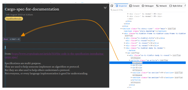
As @pmario mentioned in the github link,

eg: On My mobile. There are 4 runts, that are caused by hard line breaks. […] The “wasted space” is marked with the red rectangle.

Personally,
I find deep reading impossible on a 2inch device.
I’m not sure what the right approach is for that class of display.

My preference is to keep the semantic break though.
Even if one idea is wrapped and causes a wasted end of line,
it still breaks before the next idea is started.

An interesting part about my preference for this unusual style of writing,
is that it is unusual!
It therefore breaks with our mind’s expected reading structure.
Our brain may not find broken paragraphs initially easy to comprehend,
not because it is difficult,
but because it is not familiar

I like Rich Hickey’s comments about easy vs familiar

Anyway, this was a rather large digression from our initial TW-Section plugin and using hardlinebreaks in TW.

-Eric

I find in discussions about linebreaks there are so many alternatives in tiddlywiki we can get lost. Most new users find this hard when there is no real paragraph break without an empty line \n\n there is also quite a difference between how you organise text when writting vs when it is pasted from elsewhere. @pmario and I have explored a range of methods, solutions and work arounds. Mario has a space space new line to trigger a visual paragraph, and a multitude of possibilities in “custom markup”

I have a dot paragraph, where lines started with a custom dot, paragraph break on a single new line, its the wiki text you can use when not using wiki text and the next line can use wiki text like *#!;: without a blank line between the dot paragraph and other wiki text. Multiple empty dot paragraphs are collapsed into one visual paragraph break at render. I have also modified the autolist plugin to work with dot paragraphs.

On the subject of text width zooming in and out can help but you can set maximum width for rendering and I have done so, but it can result in lots of right side wasted space. Using other page layouts such as newspaper columns, or Assides or text blocks can help. Eg a margin you can also annotate.

I also created a new wiki text symbol for a hard line break which becomes a <br> and resembles :leftwards_arrow_with_hook: in edit. Is this a semantic line break?

re: small displays

i use an iphone 13 mini so it’s super small!

i find removing as much side padding etc. to be helpful; then for me the number of words per line is ok

here it is in a simulator

i find your hardlinebreaks idea super helpful; i have a lot of triple quotes…

recently i was thinking of using html details for collapsing headers but was a bit stymied by the “normal tw” double linebreaks being “ignored” within the <details>: i have to use triple quotes AND double linebreaks?!? but really i totally get the issue with machine parsing being difficult from a programming pov!

Tiddlywiki parsing needs to determine if the content is to be parsed in inline or block mode. Place a blank line after the last html eg <hr> or <details> and it should become block mode. Alternatively look for the $details plugin/widget which has more features than the html one.

tbf <details> on its own is working fine

but having a <summary> line after the opening <details> scuppers it. maybe it’s just my css though

ordinarily the summary would be like a clickable “header”, so it’s really handy

it’s fine, i’m used to using triple quotes :slight_smile:

mohammad’s section editor is the bees knees for this kind of thing.

slightly off topic but i use a default-close version of it for long-form.

when the headings are all closed they form a inline table of contents which is super handy on a small screen when accessing and editing long tiddlers. select a header, then click the sub-edit button to edit just that section. no scrolling required – almost can’t live without it!

tying it back in to the OP, these closed sections make comprehension easier by giving an immediate overview, as well as splitting the text into manageable chunks.

i think with semantic linebreaks it would be even better, especially when editing (since whitespace can be minimised when viewing via css, editing is more of an issue), there would be no need for extra line breaks which take up too much space on a small screen and force scrolling.

i am a little wary of extra characters such as the space space newline (which i used to use), for poetry and lyrics it wasn’t practical in the end (triple quotes won out, only need to use six extra characters!)

am very interested to see where this goes, and solutions; is it because writers and programmers have different default needs? maybe writers could be better served in the documentation or could be steered towards a mode that defaults to single line breaks? (the problem being that wikitext parsing would be broken e.g. text/plain) – which is precisely what triple quotes is(!)

but like @Eric_Simpson says, triple quotes are visually noisy; also they take two extra lines at the top and bottom of the content which are precisely the most salient spots! (imagine a long table of spreadsheet cells, and each cell having triple quotes (twice) in it, top and bottom – that’s what i see every day! but nevertheless it is more efficient than the alternatives – so far…)

most people might say, “well you only see that when editing”, but to a writer that is precisely the most crucial time, no? which is a longwinded way of saying i think i see some of what @h0p3 means when preferring a text editor!

back in the day there was a way to use an external text editor on any text field (in firefox? “it’s all text” is now defunct)… hmm ghosttext seems to work great. anyway off topic!

My use of semantic linebreaks does not relate to <br> specifically.

I use semantic linebreaks to add additional structure to my writing.

Rather than breaking sentences at arbitrary page width boundaries,
ideas are broken at meaningful boundaries.

For me, semantic-linebreaks are meaningful-linebreaks.

If interested, my thoughts on this topic are captured in my semantic linebreaks tiddler.

1 Like

I find the visually noise aspect something that interferes with my writing and reading.
This is why I’m happier with the CSS solution.

This may be even further topic,
but an example it reminds me of is “the where’s waldo principle of verilog coding”.

This expresses my sentiments as well.

I am 99% happy with the CSS hard linebreaks solution.
If I can get it rendering “correctly” with @Mohammad 's TW-Section it will be 101% :slight_smile:

Don’t forget that a css solution can also help.

All your tiddlers, or just those with a certain tag, can bypass the usual wrapping behavior – rendering in view mode with all the line breaks you see in edit mode.

.tc-tiddler-body {
  word-break: normal; 
  word-wrap: break-word;
  white-space: pre-wrap;
}

You should be able to detect browser screen width to override this css for small screens, too.

1 Like

Good tips with regards to detecting browser width to override for small screens.

I apologize this thread is a bit confusing, because I started the discussion started over in a github issue:

For hopeful clarity, I will copy/paste some of the context here so people don’t have to click over to github.

original github comments below


Once again, I’m not too familiar with web technologies, but the extra rendered space seems similar to:

The extra <p> tags and whitespace-only nodes seem coupled.

For example, in the screenshot of the DOM below:

The highlighted whitespace-only DOM element is two newlines.
Since my line-spacing is currently 21px, that is what causes the 42px of extra vertical space.
Same goes for the other whitespace-only elements in the DOM on the right.

Once again though, if I remove the following CSS:

[data-tags*="hardlinebreaks"] div.tc-tiddler-body p {
  word-break: normal; 
  word-wrap: break-word;
  white-space: pre-wrap;
}

Those whitespace-only nodes do not get inserted into the DOM.
My simplified guess is something like the following is happening:

<p>
    <div>some content</div>  <!-- NEWLINE here in paragraph text is "white-space: pre" formatting honored, and inserted into DOM    
    <div>other content</div>  
</p>