That’s exactly, what an edition is. It is a public wiki that contains content. Users should be able to export or drag&drop from there what they need.
Editions do not necessarily mean, that you need to use it as a whole. It means they do have some initial functionality, so they work as a stand-alone wiki. – But as always users can use what they need and skip the rest.
…hmmm, so all public wikis are editions then? What do we then call TWs intended to be used as “starting points” for some more special use cases and that are set up with plugins/design to cater for those special use cases?
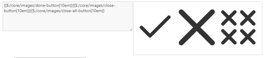
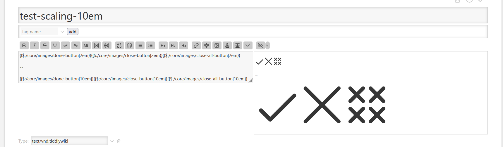
I agree with @stobot that close-button is indeed thicker than the rest of the icons in your plugin. Interesting how did that happen, knowing that the whole process is automated and the source Lucide icons are of course all equally thick.
One more issue. The svg elements in the plugin have the following attributes, which the core icons don’t have: fill="currentColor" stroke="none" stroke-width="0".
Because of the fill attribute the icons cannot be colored as the core ones, e.g. tiddler icon is not colored according to the color field. For example see ControlPanel, in the default theme the cog icon should be light gray, same as “$:/”.
fill is an oversight and should be fixed with the next push to the repo.
stroke="none" and stroke-width="0" are intentional, since they should be replaced by new parameters in the future. So we are able to make the icons thicker and thinner.
My main interest in the Lucide icons is the ability to change the icon weight dynamically, and I think it is worth exploring ways to make it work within TiddlyWiki.
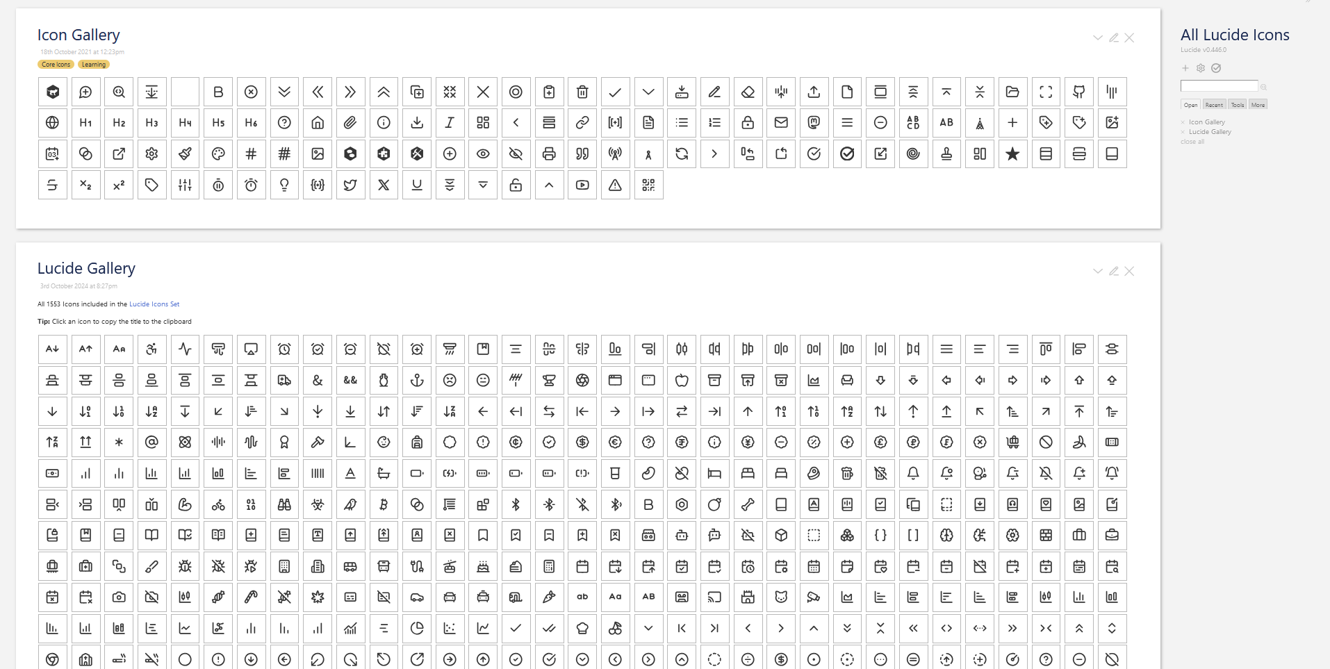
The other point about the Lucide icons is that they are coherent and consistent and so work harmoniously together. The trouble with large collections like https://www.svgrepo.com/ is that the icons are not consistent, it’s a ragbag of different styles and weights.
Yes. I’m still in the process to assign some classes and tags, to be able to reliably identify the icon and its origin.
All the icons have the core tc-image-button and tc-image-<TW-image-name>.
So $:/core/images/add-comment has class="tc-image-button tc-image-add-comment" for compatibility reasons
Since the icon directly comes from the lucide package it also has: class="lucide lucide-message-circle-plus" So we know the lucide name is message-circle-plus. This allows us to identify all the important information and also use the classes to style the elements individually in a backwards compatible way.
The tag is: $:/tags/Image because it is a core icon
All of this is still subject to change. But there will be a lot of flexibility.
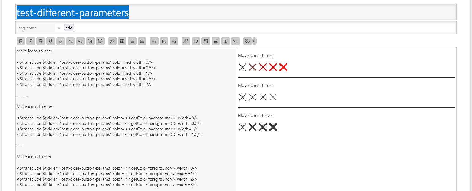
As you can see at: Lucide Icons — Lucide v0.446.0 there is an experiment, where I did try to create different “heavier” and “lighter” icons. Making them heavier should be very reliable, because we can use palette colours which are the same for ´fill and stroke´
To make icons thinner, we need to use fill-foreground and stroke-background colour, which probably can cause edge cases. That’s a disadvantage of our “outline based” icons.
I don’t know what trick do you have in your sleeve, but the mechanisms we have seen so far, particularly making the icons thinner, seem to be a nice trick for a plugin, but feel a bit too “hacky” for a potential core mechanism.
It was discussed of using the Lucide icons in the core in the future (after testing phase as a plugin). Is this thick/thin mechanism also considered as potentially making it into the core in the future?
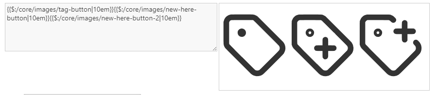
On lucide.dev the “hole” always appears as a solid circle, same as for the tag-button in your plugin. But the new-here-button and the alternative new-here-button-2 have “holes” that show up as a empty circle with a thin (thinner than the rest of the icon) border.
Btw, I think the alternative version with the off-set plus is much better. The plus inside the tag looks confusingly like “x” written on a label, it feels like it’s for “removing” something.
Yes. I designed the current TW5 icons myself because I wanted them to be consistent and coherent, with a simple visual language (eg + meaning “new”, or “x” meaning close) that allows elements to be combined to convey more complex concepts. I quite enjoy that sort of work; it is a satisfying combination of intense problem solving and relaxing pixel pushing.
But I have to recognise my limitations, and when I look at the Lucide icons I see a hundred little details that make them much more professional and harmonious.
I also think the enthickening feature is important both for accessibility and giving users the level of customisation expected of modern systems.
I appreciate the challenges in making enthickening work in a way that is fully backwards compatible. However, it is the accumulation of these sorts of possibilities for improvement that is likely to eventually drive us to create future versions of TW that trade backwards compatibility for modernity. I am referring principally to TWX, but we should also keep alive the possibility of a less ambitious compatibility break in the form of a TiddlyWiki 6.
That’s right, that’s why I mentioned it. Some more experiments are needed. I am not sure if it can be done in a backwards-compatible way.
The easiest way would be to create several different icon sets with different outline widths. This approach is guaranteed to have no side effects, except it would not be configurable.
Changing our default icons to stroke-based icons will require adjustments to our core UI code in roughly 600 places. However, this will be incompatible with all existing third-party UI code and CSS, which is a no-go.
I think it would be nice to have if we can do it reliably. If there is no core configuration, the “hack” will still be available on a per-icon basis for users. So, if needed, they can use it if we prepare the icon code to be able to do it
That’s right I did think the same way, that’s why I did add new-here-button-2 as an “easter egg”, so we are able to test it.
I did change the core button to new-here-button-2 and found out, that the plus “+” sign is a bit too small, but in general will look better. – So I think we should use the second version as the default.
Very nice work. I’m supporting @vilc about the + sign on the labal icon and also the + on the calendar icon is not the same size as on the different icons with it. I think it is important to be consistent in the way those ‘diacritics’ signs are inserted in icons. It has to be consistent across the all set.
I’m impatient to be able to use the set with color and thickness.
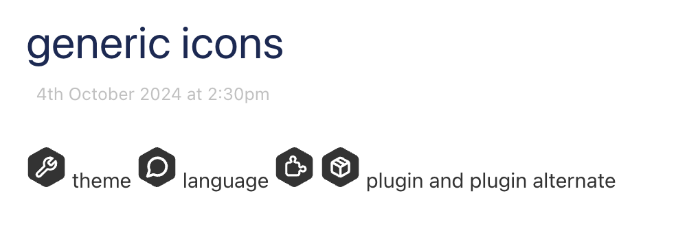
It would be also interesting to add the 3 generic TW icons ($:/core/images/plugin-generic-language, $:/core/images/plugin-generic-plugin and $:/core/images/plugin-generic-theme) in a new design.