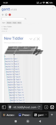
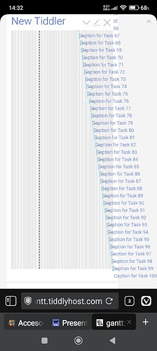
@vuk - about your chart with 100 tasks:
OK, so the result does display as expected but here are a few notes - plus a pragmatic solution:
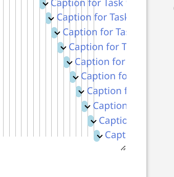
Everything in the gantt chart is relative to the tiddler width. There is no innate width to the segments, so if one wants a wider chart, there could be a css class to the wrapping div and then the user would manually have to set a desired chart width (e.g 200%)… but I’m not sure how to present that with a decent UI. If it were to be done I’d not want this width setting to be visible in the main UI so it’d have to be some controlpanel setting or in the plugins readme tid. But including it there, even if trying to be fancy with some RangeWidget slider, I think it would be particularly fiddly on a small screen so the solution would work against itself. If you have any good idea for a UI, I’d love to hear it.
A more pragmatic workaround: Use multiple tags! The reason I created this plugin to begin with was because I’m just about to start studying for (another) university degree and the courses are logistically messy, so I need an overview. While all courses are tagged “course”, I can get them chunked by also tagging them with the year, so there are only a few courses seen at a time.
…i.e maybe the full 100 task project doesn’t have to be seen on the mobile screen? There could, indeed, be such a chart but there can also be tiddlers with charts showing sub-sets that are mobile friendly.

 )
)


