I just don’t (can’t) get a diamond shape representing dirty. The semantics are completely wrong. A warning triangle is the best offering (via @Yaisog).
2 Likes
@Mohammad I liked your suggestion and was just showing what that might look like. Since this action is sometimes a “save” and sometimes a “download” and really is in indicator that “the user needs to do something”, I thought a “nota bene” type indicator like an asterisk makes sense.
To follow up, here is a drop-in shadow tiddler for https://tiddlywiki.com/prerelease that implements it using the new save-button-dynamic icon method (at least how I understood it).
/Mike
1 Like
Hi @btheado that is intentional. I tried having the rhombus offset by the same amount as the elbow of the tick but I felt that the resulting asymmetry was more distracting than the slight mismatch.
A counterpoint is that TiddlyWiki is in some key respects genuinely, radically different from many other systems that people are familiar with. Users need to understand those differences, and we can help them by signposting the things that are different.
We already use a very similar icon to mean “download”: 
“Download” is a different concept than “save wiki” because the former always involves downloading a file to the local computer, while “save wiki” can involve a wide range of different actions.
The primary reason is that some users don’t like animation, so we can’t rely on it for semantic purposes.
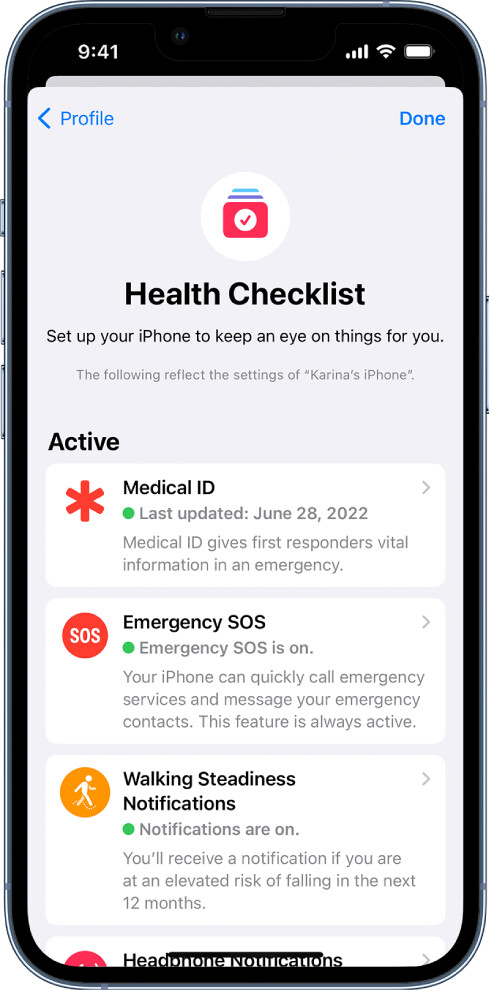
Thanks @mwiktowy it’s good to have a mockup of the asterisk option. However, I think the challenge is that (a) it doesn’t relate well to the tick used in the plain icon and (b) it resembles the “star of life” symbol that is sometimes used to indicate emergency medical services. Here’s an example from the iPhone:
Thanks @Charlie_Veniot this is a long, confusing thread but we have already covered:
- why I think we should avoid changing the save wiki icon
- why in any case the floppy disk icon wouldn’t be an appropriate replacement
- why I believe that icons with overlays are troublesome
I’m certainly open to discussion on those points, but would need to understand the counterarguments.
I don’t think it is possible to represent new concepts with icons that are self explanatory, and so that isn’t a goal for this exercise.
saved dirty

https://basicanywheremachine.neocities.org/BAM_IDE
Working with a colour-blind buddy, we’ve found the blinking save button the best.
Give it a try by going into the BASIC Anywhere Machine IDE (click on the link above), and just type a couple of random characters into the program you’re viewing.
If it is the kind of thing that annoys folk, then it would be easy to add some customisation settings to adjust the speed of blinking and colours involved.
No fuss, no muss, good enough.
Red and black are hard to distinguish for color blind folk.
So the button on the right will pretty much just look like a black circle. That might not work out well as a visual cue. Give it a try with a colour-blind person who can’t see red.
Thanks for pointing that out @jeremyruston … I hadn’t made that connection with the medical symbol.
That was just the default orientation of the asterisk of the font that I was using. You could apply a transformation of 30deg to make it just as understandable and reduce confusion.
Alternatively you can make it animated to really get people’s attention : ]
See stylesheet attached.
/Mike
(Edit: added 30deg clocked asterisk option)
$ _custom_stylesheet_save-button-dynamic(rotating).json (546 Bytes)
$ _core_images_save-button-dynamic(asterisk-rotated-by-30deg).json (2.4 KB)
There is only 1 problem, at least for me. Blinking in a 1 second interval is super distracting.
I strongly doubt that is the case for the majority. Regardless; it is simply(!) a matter of how light the inner red is. So we’d just make it light enough.
@Jeremy - whatever the final solution is, please ensure it does not makes things worse for the broad majority of people. Off-topic for the prerelease but: Maybe we should instead just consider an accessibility theme or a plugin. It could feature an easly accessible “Accessibility button” with some popup for special needs settings (font-size, contrast, icon-set, …)
Personally, I much prefer the save button not be touched. Looking at this thread of discussion, I think it is a mistake to change it.
Do, however, consider a small and easy interface (and/or: documentation) for folk to change it as they please.
1 Like
All those constructive discussion about one icon ! I think I will never complain about UI design. It’s a tough job !
But I will anyway give my last proposal. After that, I let Jeremy decide whatever he wants. Until now his decisions were always wise about TW.
An arrow showing were to click in the same orientation as the tick mark…not to be confused with the download icon.
Although I like that …
A colour-blind person (who cannot distinguish red and black) will not have enough of a visual cue. The differences between the two images (imagine them the same colour) are much too subtle.
The goal is to have something that can work for all abilities by making it easy to change via a simple interface.
Mine was just an example of what needed to be done to get things working nicely for two people with very different disabilities.
I wasn’t dictating a button for everybody. The idea is to have a button that can be easily customised to accommodate all abilities.
1 Like
Now there’s an idea… easily changed via a setting in Control Panel?
Hallelujah.
Somebody who gets what I’m trying to say despite me having a devil of a time with coherent wording.
Much appreciated !
If only I had a budget for an interpreter of what’s in my sponge …
The problem though, for such a fundamental part of the UI, it invites differences across systems. For the fundamentals, TiddlyWikis should look broadly similar out of the box.
Let’s see what others have to say.
For sure.
As long as a thing is recognisable when seen.
That’s why I’m not fond of changing the shape (or the name, or the function) of a thing.
But well-appointed animation to draw attention to a thing that ought to be done (like something’s changed, and you ought to press save), whether or not colour is involved, is a good way to go along with simple settings in the control panel.
I don’t see this as being any more problematic (or worth any less/more consideration) than other control panel settings like font-family, font-size, animation duration, etc.
If we are going to have willy-nilly image “shapes” for buttons, then we’ll get into cross-TW-instance-usage challenges.
Colour and animation variations in buttons (or anywhere) shouldn’t cause any hiccups, as long as they can be adjusted easily.
1 Like
I agree with this. It’s tricky to find a compromised solution that works for everyone. Any change of the default “dirty-state” icon would require everyone (colourblind or not) to adapt and get used to it. It affects everyone. One solution could be to offer an official “accessibility plugin” that includes this icon change, among other things, which can be installed by users based on their individual needs.
3 Likes
Oh no! This is very confusing! It is like an incongruous icon on the page control!
I think the first recording icon was better! I raised the issue that, the recording icon may be misleading as users may think TW is continuously saving when it is displayed on the page control.
2 Likes
@jeremyruston What do you think about replacing the done element with a small fish element?

It is well understood that there is tiddler being modified.
Icon 1 code
<svg width="22pt" height="22pt" class="tc-image-save-button-dynamic tc-image-button" viewBox="0 0 128 128">
<g class="tc-image-save-button-dynamic-clean">
<path fill-rule="evenodd" d="M120.783 34.33c4.641 8.862 7.266 18.948 7.266 29.646 0 35.347-28.653 64-64 64-35.346 0-64-28.653-64-64 0-35.346 28.654-64 64-64 18.808 0 35.72 8.113 47.43 21.03l2.68-2.68c3.13-3.13 8.197-3.132 11.321-.008 3.118 3.118 3.121 8.193-.007 11.32l-4.69 4.691zm-12.058 12.058a47.876 47.876 0 013.324 17.588c0 26.51-21.49 48-48 48s-48-21.49-48-48 21.49-48 48-48c14.39 0 27.3 6.332 36.098 16.362L58.941 73.544 41.976 56.578c-3.127-3.127-8.201-3.123-11.32-.005-3.123 3.124-3.119 8.194.006 11.319l22.617 22.617a7.992 7.992 0 005.659 2.347c2.05 0 4.101-.783 5.667-2.349l44.12-44.12z"/>
</g>
<g class="tc-image-save-button-dynamic-dirty">
  <path
     d="m 112,65 c -74.666667,42 -37.333333,20.999999 0,0 z m -48,64 c 35.346,0 64,-28.654 64,-64 C 128,29.654 99.346,1 64,1 28.654,1 0,29.654 0,65 c 0,35.346 28.654,64 64,64 z m 0,-16 C 90.51,113 112,91.51 112,65 112,38.49 90.51,17 64,17 37.49,17 16,38.49 16,65 c 0,26.51 21.49,48 48,48 z"
     id="path2"
     inkscape:connector-curvature="0"
     style="fill-rule:evenodd"
     sodipodi:nodetypes="ccssssssssss" />
  <path
     id="path814"
     p-id="2673"
     d="m 58.728752,85.569982 c 12.129069,0 22.721273,-7.383676 28.61662,-13.700982 l 11.77317,8.904354 c 1.635278,1.237581 4.076718,-0.08088 3.658808,-1.976345 L 99.517582,64.000005 102.7787,49.201646 c 0.41792,-1.895458 -2.02354,-3.212578 -3.65881,-1.976351 l -11.773165,8.90436 C 81.45138,49.813697 70.857821,42.43002 58.728752,42.43002 c -18.531312,0 -33.554804,17.255987 -33.554804,21.569985 0,4.313992 15.023492,21.569977 33.554804,21.569977 z M 46.942103,60.764507 c 1.786267,0 3.235498,1.449231 3.235498,3.235498 0,1.787607 -1.449231,3.235496 -3.235498,3.235496 -1.787607,0 -3.235497,-1.447889 -3.235497,-3.235496 0,-1.786267 1.449238,-3.235498 3.235497,-3.235498 z"
     inkscape:connector-curvature="0"
     style="stroke-width:0.06740619" />
</g>
</svg>
Icon 2 code
<svg width="22pt" height="22pt" class="tc-image-save-button-dynamic tc-image-button" viewBox="0 0 128 128">
<g class="tc-image-save-button-dynamic-clean">
<path fill-rule="evenodd" d="M120.783 34.33c4.641 8.862 7.266 18.948 7.266 29.646 0 35.347-28.653 64-64 64-35.346 0-64-28.653-64-64 0-35.346 28.654-64 64-64 18.808 0 35.72 8.113 47.43 21.03l2.68-2.68c3.13-3.13 8.197-3.132 11.321-.008 3.118 3.118 3.121 8.193-.007 11.32l-4.69 4.691zm-12.058 12.058a47.876 47.876 0 013.324 17.588c0 26.51-21.49 48-48 48s-48-21.49-48-48 21.49-48 48-48c14.39 0 27.3 6.332 36.098 16.362L58.941 73.544 41.976 56.578c-3.127-3.127-8.201-3.123-11.32-.005-3.123 3.124-3.119 8.194.006 11.319l22.617 22.617a7.992 7.992 0 005.659 2.347c2.05 0 4.101-.783 5.667-2.349l44.12-44.12z"/>
</g>
<g class="tc-image-save-button-dynamic-dirty">
  <path
     d="m 112,65 c -74.666667,42 -37.333333,20.999999 0,0 z m -48,64 c 35.346,0 64,-28.654 64,-64 C 128,29.654 99.346,1 64,1 28.654,1 0,29.654 0,65 c 0,35.346 28.654,64 64,64 z m 0,-16 C 90.51,113 112,91.51 112,65 112,38.49 90.51,17 64,17 37.49,17 16,38.49 16,65 c 0,26.51 21.49,48 48,48 z"
     id="path2"
     inkscape:connector-curvature="0"
     style="fill-rule:evenodd"
     sodipodi:nodetypes="ccssssssssss" />
  <path
     id="path814"
     p-id="2673"
     d="m 69.271246,42.430018 c -12.129069,0 -22.721273,7.383676 -28.61662,13.700982 l -11.77317,-8.904354 c -1.635273,-1.237581 -4.07672,0.08088 -3.658804,1.976345 l 3.259764,14.797004 -3.261112,14.798359 c -0.417922,1.895458 2.023531,3.212578 3.658804,1.976351 l 11.773165,-8.90436 c 5.895345,6.315958 16.488904,13.699635 28.617973,13.699635 18.531312,0 33.554804,-17.255987 33.554804,-21.569985 0,-4.313992 -15.023492,-21.569977 -33.554804,-21.569977 z m 11.786649,24.805475 c -1.786267,0 -3.235498,-1.449231 -3.235498,-3.235498 0,-1.787607 1.449231,-3.235496 3.235498,-3.235496 1.787607,0 3.235497,1.447889 3.235497,3.235496 0,1.786267 -1.449238,3.235498 -3.235497,3.235498 z"
     inkscape:connector-curvature="0"
     style="stroke-width:0.06740619" />
</g>
</svg>
1 Like