
That’s a bug: [BUG] New here with default tag "aa aa" does not work as intended · Issue #7354 · Jermolene/TiddlyWiki5 · GitHub
1 Like
Thank you for your clarification. I follow #7232 on GitHub!
Thanks for these important enhancements.
- I would recommend to include the browserstorage plugin into the empty version because this is where it is needed the most. Best you’d create prominent button t activate it.
- Also the new Diff-Match-Patch Primitives sounds great. Is there a way to apply/accept patches one by one that I did not get yet?
The “makepatches” operator produces a list of patches to describe the changes between two strings. Here’s an example of a list of two patches:
@@ -1,13 +1,14 @@
The
-human
+animal
min
@@ -542,21 +542,19 @@
e.%0A%0AMan
-canno
+mus
t hope f
I’m not sure how useful it is to split the list of patches into individual patches, but it could be done with the splitregexp operator.
1 Like
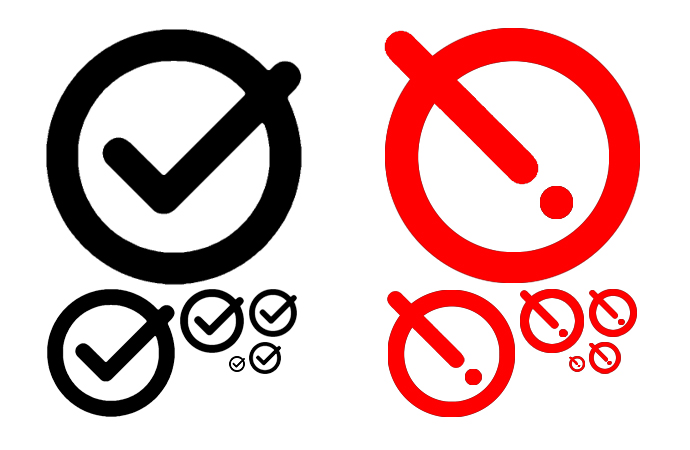
I would like the default state to stay a circled checkmark, with the dirty state a circled exclamation mark.
A red exclamation mark is pretty common for indicating something important needs attention to prevent data loss.
1 Like
I was thinking along similar lines, and started the design process with an exclamation mark in a circle, but felt that it was hard to read at small sizes (it can look like an on-off button):
For comparison, here’s the image currently used in the PR:

I think if you got rid of the middle red bullseye and replace with the exclamation (same size as the question mark shown in your picture) that that would be easier to read and understand.
1 Like
This is what I was picturing. The exclamation mark could be slanted a bit, in either the same direction as the large check mark stroke to be more similar, or opposite to give some more distinction.
I think you’re suggesting a single red circle containing the exclamation mark – we might need a sketch to clarify. If I understand correctly, that means that the outer ring is no longer a common element between the two states. I tried something along those lines but felt that the two states lacked enough common elements to be perceived as two states of the same icon, rather than two independent icpns.
Again it would be helpful to see a sketch to make sure I’m not misunderstanding your idea.
My concern would be that if we make the exclamation mark look like the tick then we’re risking them looking similar at small sizes.
Ignoring the artifacts, since I’m even less artistic with GIMP than I am by hand. Maybe.

Though you might not be able to tell, it’s the same circle as from our checkmark.
I was thinking something like this:
I would actually opt for a straight ! rather than it being diagonal like the checkmark, to create even more visual difference between the two without color
In the vertical position, it begins to resemble a power button.
Hm, good point. Shame we are already using the download button icon, that would make for a good alternative save button.
Thank you @Justin_H @Mark_S @Brian_Radspinner @etardiff that’s very helpful.
I had avoided a “plain” exclamation mark in a circle because it is a vertically flipped copy of the current “info” icon:

I was thinking along similar lines though - in the experiment above I had added another circle so as to cause the exclamation mark to be inverted so that it was white on dark, instead of dark on white. At that point I started to think that the exclamation mark was redundant because the combination of the icon changing shape and colour was enough to convey that there had been a state change.
Another factor that pulled me towards the present design of the blob-within-a-circle is that it is fairly noticeable in ones peripheral vision, I think because the overall visual weight is different than the usual icon.
I think it’s important to point out the discussion at GitHub which followed the PR. Make save wiki button be accessible to users without colour vision by Jermolene · Pull Request #7232 · Jermolene/TiddlyWiki5 · GitHub again.
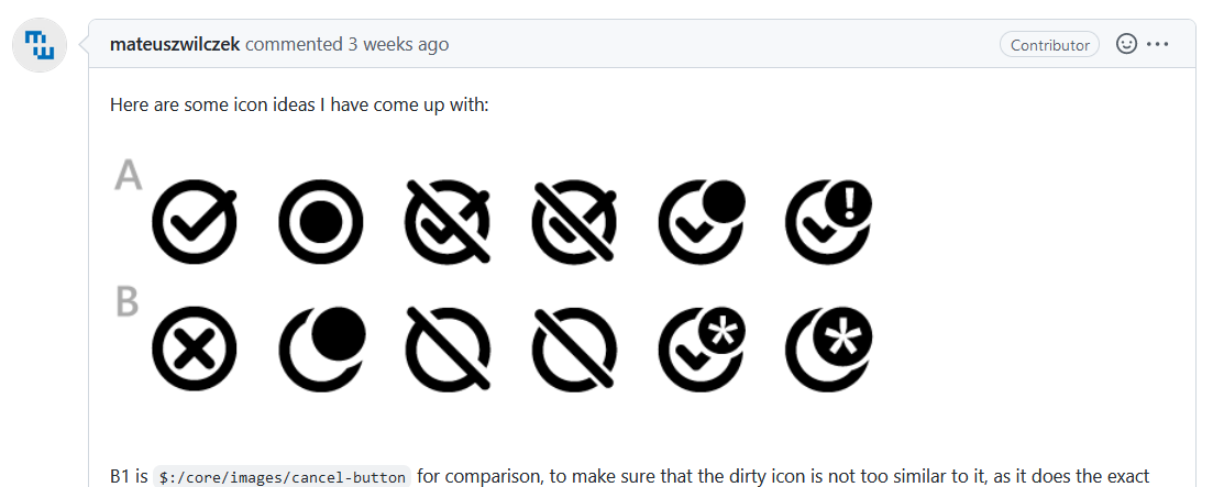
There where a lot of new icons to be considered. They look nice, but all of them except A2 have a much higher visual overhead. …
I’m exclusively using the prerelease for all my testing … and it just works as it is.
2 Likes
Has shapes other than a circle been considered?
Triangles are traditionally used for warning symbols because of shape language.
Just curious
2 Likes
One of the constraints is not to change the existing tick-in-a-circle icon that we use for when the wiki is clean (ie doesn’t need saving).
Another is that the variant of the icon used to indicate that the wiki is dirty should be similar enough to the tick-in-a-circle icon that the user recognises them as the same icon undergoing a change, rather than swapping between two different icons.
So, I think that rules out making the overall outline be triangular, but your post prompted me to experiment with a triangle-in-a-circle:
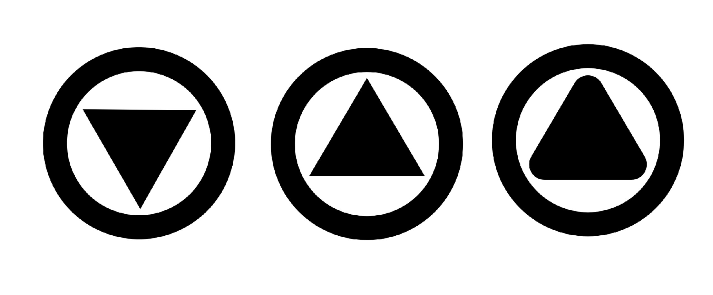
I quite the third variant.
3 Likes
While I had meant the outline, it makes sense not to change that, and I do agree- the rounded triangle in the circle does look good.
I think it works better than the circle in circle, as that gives the impression of a record button IMO
Would it be too small to have an exclaimation mark or download arrow cutout within the triangle?