17 posts were split to a new topic: Make Tiddler view and edit font sizes the same
Hi @Mark_S I agree that this is a frustrating problem, I just wanted to check whether the problem was introduced in v5.2.6 or if it also occurs in v.5.25? Looking at the GitHub history, I don’t see any relevant changes to the CodeMirror plugin.
Not an issue, just opinion:
I think the record button is less meaningful here.

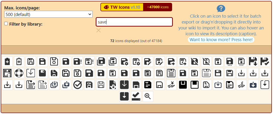
Suggestion: A small search in TW Icons shows below save icons. May be another icon can be used. I also saw in GitHub some icons were proposed for this.
2 Likes
I like the floppy disk icon idea for saving.
I good way to make it colorblind friendly is to fill the icon in when saving is recommended, and leaving it as just a line art version when there is not a need to save.
(The filled in one can still be the dirty-save color as well, but I think the two different icons would be nice.)
1 Like
Am I right in thinking that the browser storage plugin should clear memory when a successful save completes? At the moment, I’m seeing behaviour that makes me think that that is not happening. But maybe I don’t understand the lifecycle.
I’m not sure if this is specific to 5.2.6, but if you set the $:/config/NewTiddler/Tags field in GettingStarted to something with multiple words (I used “Type: Journal Entry” because I wasn’t paying attention to which field I put it in  ) it works fine for the journal button, but if you use the “New Here” option in every tiddler, it will place the text in double square brackets.
This doesn’t happen with the “New Journal Here” option though.
No, I think the browser storage plugin clears tiddler entries from local storage when and if the wiki loads with the exact same tiddler values. The rationale is that the wiki cannot tell whether a save was successful or not, but it can know with certainty what tiddlers are included in the wiki when it loads.
Completely changing the icon used for the save button has far reaching implications: it would instantly invalidate any documentation that describes how to save changes in TiddlyWiki.
As it happens, even if we could change it, I think a floppy disc icon is too archaic and anachronistic nowadays. As far as I know, it’s really only Windows/Office (and clones) that still uses the floppy disc icon, and so I don’t think it’s even universally recognised these days.
There was some discussion about the rationale for the design of the icon over at GitHub #7232. The idea is to retain the existing icon to represent the default state, with a variant of the existing icon to represent the “dirty” state. The variant needs to be both recognisable as similar to the ordinary icon, and yet different enough to clearly communicate the status.
One lesson I’ve learned over the years with icon design is to avoid overlays: for example, a simple idea for the variant would be to overlay a warning sign over the top of the ordinary icon. mateuszwilczek over at GitHub kindly prototyped such an icon:

I have often designed icons like this over the years. It is an attractive idea to have a visual language comprising elements that can be combined to represent complex, compound meanings.
However, the problem is that it requires a lot of cognitive effort to understand it: one has to grasp the relationship between the two elements, decode what each one depicts, and then try to figure out what the combination is intended to mean. That’s very demanding when the icon is shown at a small size, and in combination with other icons.
So, I’m open to further suggestions, but I think we need to take these considerations into account.
1 Like
That’s a bug: [BUG] New here with default tag "aa aa" does not work as intended · Issue #7354 · Jermolene/TiddlyWiki5 · GitHub
1 Like
Thank you for your clarification. I follow #7232 on GitHub!
Thanks for these important enhancements.
- I would recommend to include the browserstorage plugin into the empty version because this is where it is needed the most. Best you’d create prominent button t activate it.
- Also the new Diff-Match-Patch Primitives sounds great. Is there a way to apply/accept patches one by one that I did not get yet?
The “makepatches” operator produces a list of patches to describe the changes between two strings. Here’s an example of a list of two patches:
@@ -1,13 +1,14 @@
The
-human
+animal
min
@@ -542,21 +542,19 @@
e.%0A%0AMan
-canno
+mus
t hope f
I’m not sure how useful it is to split the list of patches into individual patches, but it could be done with the splitregexp operator.
1 Like
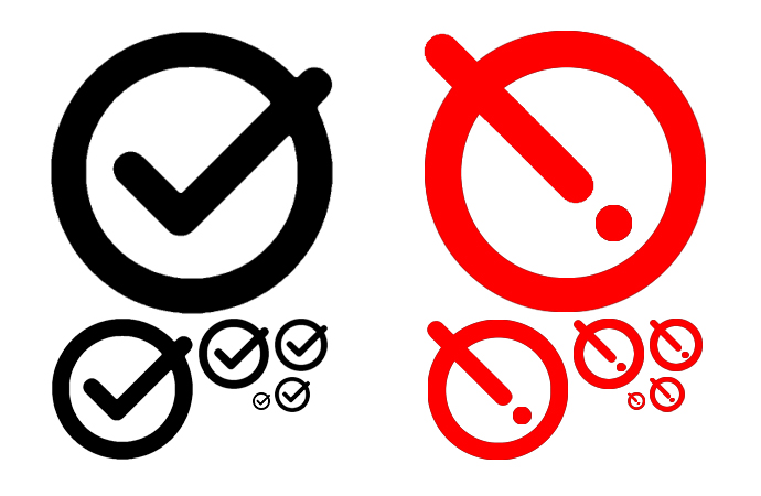
I would like the default state to stay a circled checkmark, with the dirty state a circled exclamation mark.
A red exclamation mark is pretty common for indicating something important needs attention to prevent data loss.
1 Like
I was thinking along similar lines, and started the design process with an exclamation mark in a circle, but felt that it was hard to read at small sizes (it can look like an on-off button):
For comparison, here’s the image currently used in the PR:

I think if you got rid of the middle red bullseye and replace with the exclamation (same size as the question mark shown in your picture) that that would be easier to read and understand.
1 Like
This is what I was picturing. The exclamation mark could be slanted a bit, in either the same direction as the large check mark stroke to be more similar, or opposite to give some more distinction.
I think you’re suggesting a single red circle containing the exclamation mark – we might need a sketch to clarify. If I understand correctly, that means that the outer ring is no longer a common element between the two states. I tried something along those lines but felt that the two states lacked enough common elements to be perceived as two states of the same icon, rather than two independent icpns.
Again it would be helpful to see a sketch to make sure I’m not misunderstanding your idea.
My concern would be that if we make the exclamation mark look like the tick then we’re risking them looking similar at small sizes.
Ignoring the artifacts, since I’m even less artistic with GIMP than I am by hand. Maybe.

Though you might not be able to tell, it’s the same circle as from our checkmark.
I was thinking something like this: