"Nah... not for me" - Why?

Yes. The simple introduction helps. What’s missing now is a more modern look to make it aesthetically appealing as well.

Once familiar with the very basics, it would help to have the complexity broken down into levels where the learner could progress incrementally up to the point where sufficient knowledge has been gained for his/her specific use case.

The current ‘‘non-level’’ tiddlywiki.com would still be useful for reference.

Yes, it’s an improvement. It conveys more certainty that there’s a suitable entry level.

1. Simple language = YES

2. Short bursts with minimal content in each section = YES (scaffold)

3. Hand-holding in a specific sequence = YES, definitely for non-coders, but never hide the link to fast-track for those up-to-speed.

4. Little or no need to scroll down to find the initial information = maybe.

I’ve now uploaded a DRAFT tutorial on tiddlyhost – A non-coding beginner’s guide to TW5

2 Likes

All, I see a few accounts of and suggestions for new ways to express TiddlyWiki’s features. All great suggestions.

However I want to make a point that tiddlywiki.com sometimes gets wrong and many of your suggestions also get it wrong.

I think in Journalism they call it “Bury the Lede or Bury the Lead: Which is Right? | Merriam-Webster”.

People often start with what went wrong and then talk about how tiddlywiki did it right.

I think you you should start with “What tiddlywiki does right” and provide the history lesson later if someone even cares to read it.

If someone scans the page and see the negatives at the top they will go on to think tiddlywiki is not up to it, not what you intended.

2 Likes

Thanks for the feedback. @Anakowi thanks for the link. Lots of nice stuff there, but I would echo the comment by @TW_Tones .

1 Like

Yes, I agree. I’ve edited. No one really needs to read my frustration.

I’ve just realised that “draft” tiddlers don’t necessarily disappear (or do they?) so I can delay clicking the send/post/publish button. It’s always good (in my case) to review after a decent break, change of headspace.

1 Like

To add some real-life feedback/reasons people start trying TW, here is the podcast episode which led me to discover TW myself.

Here they start talking about wikis in general. (they mention https://wiki.js.org/ (apparently beautiful in their words) and https://www.bookstackapp.com/), with reasons why they started researching selfhosted wiki solutions:

Here is the timestamped segment they start talking about TW:

There is a follow-up episode where the host says he stopped using it (not sure if he mentions why), I’ll try to find it as well.

Edit: Next episode where they do a more detailed TW review:

Still looking for the episode where they dropped it.

Edit2: Found their own wiki talking about TW pros and cons here:

https://wiki.selfhosted.show/self-hosted-apps/wikis/

Edit3: Obsidian / Joplin / Notion review:

:mag_right:FOUND it (and that reminds as well - images - I struggle with those still as well, actually I host them on imgur (I know not nice, but keeps the wiki smaller)):

2 Likes

I know it’s a popular past-time, but I’ve tried to quickly create a user-friendly starter template:

https://starter.tiddlyhost.com/

The getting started tiddler has to be short, easily visually scannable and get you started within a couple of minutes with options to dive deeper.

2 Likes

@Andy_Filan very much Like I was thinking about. Some notes not necessarily specific to your example;

  • Save as a local file and use (default save mechanisum) before
  • Mentioning “Lot’s of Extensions and Plugins” is importiant but to put it first suggest the core is weak and needs them. Perhaps start with highly usable as is.
    • Here I think we do need to introduce a standard edition as many of the issues here would be addressed.

Here is a minimal example except it includes relink My TiddlyWiki — standard starter edition

  • Suggestions welcome

[Edited] To discuss this edition Beyond empty.html a standard edition

1 Like

What is the wizard? Something to write later, or some other resource?

Just had my eye visit. I like your white on black them. Hmm. Could use a dark discord theme.

Happy for anyone to modify it and to collaborate:

https://starter.tiddlyhost.com/

Edit: Mario – removed credentials here and sent new PWD in private to Andy.

Don’t worry, these are all one-off passwords/email aliases.

Regarding:

Save as a local file and use (default save mechanisum) before

Steal this starter template
and Selfhosting (advanced)

Actually it’s more difficult to have a local html file because saving/editing doesn’t work w/o additional work, so using tiddlyhost is quicker and better UX (if I’m not mistaken). Of course this would be then covered later in the Self-hosted section or somewhere else.

Yeah, I wrote the content in ~30 min, so definitely a lot of room for improvement, but I’d keep this template as simple as possible (since it’s recommended to be copied).

IMO there shouldn’t be more than 10-20 tiddlers which can be deleted by the users later if needed.

We can link to the official TW site for a deep-dive.

In general humans are not good at scanning anything that has more than 6 items (e.g. 6 bullet points, six images, 6 words, 6 emojis) so a good practice is to keep everything nice and compact, on point.

Yes, give the user options to explore further, but the basics should be very easily digestible.

BTW: I can help to adhere to some documentation / content writing & strategy best practices - I’m starting a new role as Head of Documentation soon so it will be good exercise. Not sure if you’d be interested.

It looks good Andy, a huge improvement if adopted. Please feel free to use and edit any content I’ve uploaded if that helps.

1 Like

So I started a discussion for a standard edition

@Andy_Filan Andy if you can apply my proposed changes please do, I would hope to include something like you propose in a standard edition, with a method to remove it and other customisations if desired.

Thanks! I’ve copied over some content (tags, new tiddlers - will still do some cleanup), again, trying to keep it concise. :slight_smile: People are lazy, so they don’t read what they don’t have to (which doesn’t help them to achieve their goal to get started).
1 Like

I think that misses the problem – most people who read about TiddlyWiki for the first time are not reading it to get started, they’re reading it to judge if the tool is right for them without wasting too much time and effort. If we don’t approach this problem from this angle then the introduction will be aimed not at potential new users but at those who’re already interested.

3 Likes

People are also lazy when evaluating tools. The quicker you convince them your tool is worth trying, the bigger the advantage against the competition.

They are definitely 3 goals:

  1. To convince people to try TW
  2. To get them started ASAP
  3. Keep users using TW

Usually only people who try to get their own TW setup will stick with it. So #2 is very much connected to #1. If the experience of setting up their own TW instance is cumbersome, they won’t read or try more. And I’m not saying not to give people the option to explore more.

image

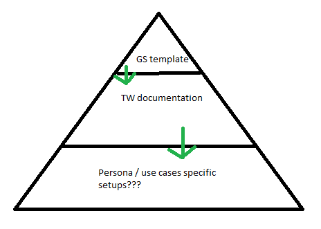
The template (let’s say getting started template) is a top of the funnel resource linking to the actual TW docs. Maybe there will be even a persona specific layer below the docs, but that’s just another possibility in the future.

So this top-of-the-funnel part needs to be to-the-point. Concise. Goal-oriented. I tried to come up with those goals here:

1 Like

I think you may be missing my point or we’re calling the same thing with two different names. I am trying to look at this like a company selling a product and aiming to get best conversion rates. If your starting point is “How do we convince people to try X?” you automatically exclude the majority of people who don’t know what X is, so you need to start at the very beginning.

How to ensure new visitors understand our product? My comparative analysis partially covered that – when you visit Notion’s or Nimbus Note’s or Evernote’s or Wordpress you get certain sense of what the tool is designed to maximize conversion, though in their cases they have the benefit of being much well known and people having already some kind of understanding what the tool is about.

Which is why I don’t agree that “Getting Started” is the first step. I also still claim that not throwing the user immediately into the tool is a better option. With a page optimized for conversion you actually get people invested into the tool before they click the big “Try for Free” button; at least that’s how I understand the motivation of big players for designing their websites the way they do (and they have an actual monetary incentive to optimize those things).

(And just so there is no misunderstand I very much agree all steps need to be optimized and I think your Starter template is a step in the right direction, I just want to point out that for every person that even tries TW, there are most likely many who never try it in the first place because they can’t quickly grasp what the tool is about, and that’s not something a better Getting Started page solves)

3 Likes

Derailing elephant - comparative analysis of TW front page

This is beautiful, kudos!

Which is why I don’t agree that “Getting Started” is the first step.

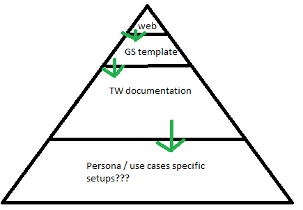
Agree here as well, the home page needs serious work. And I think your comparative analysis covers mostly the website. My comments/work are only regarding the template. If we open the discussion about the website, then to correct my amazing (lol) funnel, it would look something like this:

image

I didn’t know (apologies if I missed it) that having a new landing page/website is on the table. And although I do love TW, I think it should be a proper website IMO which is better suited to create CTAs and track conversions.

And again, the analysis is amazing work, now we just need to take actions :slight_smile: After quickly scanning it, I’m going to read it now.

Edit: Read it and completely agree - I’m not sure why that thread died? Ideally there should be some follow-up actions, maybe a poll to discuss what to replace the current landing page with, what are best-selling points for TW etc…

I don’t really know what’s on the table, I am just a small contributor, at least at this point. I think if TW is ever to stop being niche tool a bigger overhaul and some hard thinking is needed to determine who and how to market it best for.
I love all the ideas for even small changes but I am a little skeptical about the overall effect they’ll have on making it more accessible to people who aren’t already invested into TW at least the tiniest bit. That is, improving the textual content of the front-page or getting a better starter will surely help people who already know they want to try it or have the time to invest, but will do little for what could be a lot of people who don’t even understand what TW is yet.
But this leads to a question “what’s the target audience of TW?” which I am not sure the community has quite figured out yet, which is another important at deciding next steps. Because perhaps TW is meant to have a very limited audience and it’s fine if it reaches a niche group of specialists who love it for what it is. There are a lot of commercial (with free option) alternatives that might be better suited for casual users who just want something that works.

1 Like
  • To me the answer to this is first and foremost “those who would benefit from using it”.

However on further reflection we do need to consider not being all things to all people, why?, because although at the moment its a virtuous circle, eg new users inspire experienced users, who help the new users get involved.

  • I know it seems somewhat paradoxical that we are talking about how do we get TiddlyWiki to be adopted by more people, then I question if we really want every one to see us?
  • At the very least I think we could look at the funnel and make sure we direct the different users and needs appropriately, so we do not “make a rod for our own backs”. We need to ensure no single demographic dominates, we do not attract too many “high needs” users, or technically demanding users, so we can maintain the virtuous circle we currently have.
  • One way may be to try and include users and organisations who may contribute time, skills and even money without strings attached. That is “proactively target particular audiences”, even if we do so through more than one channel, and be able to dial the channels up and down if we face difficulties.

What do we perceive as is our Mission, our Vision, our purpose, our “raison d’etre” for TiddlyWiki? @jeremyruston

  • And more importantly what do we consider as our future?
  • One answer I have is;

To promote accessibility and democratic access to software. The means of control and production of software to every person, as to their need.

2 Likes