"Nah... not for me" - Why?

It is interesting.

I got very interested myself in the issue of “TOO MUCH OR NOT?”

In one way the welcome page is excellent in it’s liberality.

But I do think it an issue we can’t just have ONE method of “Universal Saving” bulit-in “Cross-Platform”.

As far as I can see we can’t.

A comment, TT

But … it’s not that kind of software. Not. Not. Not.

We could say, use TiddlyDesktop. Then, for people on smart phones, use TD to host a wiki folder and browse it locally for your phone. But there’s a fair bit of configuration people have to do for that. Too much, maybe?

So, offer TiddlyDesktop for 3 platforms, Quine for (some) iPhones, and Tiddloid for Android. Then link to the other savers with the short message “Other options.”

Edit: In relationship to the idea to using TD to host for smart phones. I always have to use TD for a few minutes to remind myself why I never use it. In particular, at the moment, if you use a wiki folder, it won’t serve up external images in the app window. You can configure the host/port and serve it up in the browser, but what if you wanted to use the app window on your desktop, while allowing small devices to use it on the local net? (v14). And of course, there’s the thing that every single wikifolder you serve has to have its own port. And you can’t serve up stand-alone wikis.

1 Like

I thought your reply v. interesting.

I kinda points to “what is the minimal effective to show?” (And only that.)

I need think on it, TT

I’m about 3 tiddlers away from completing a Beginner’s practical introduction to using TiddlyWiki as a standalone app. AND…

It’s really been a challenge to NOT over complicate things. Now if anyone’s interested in this, where is the best place to share? Github? And be kind, I’ve written it as an absolute beginner myself.

My thoughts of late are that anyone landing on TW’s doorstep is either/and/or:

  • someone with the knowledge to understand the current support resources, and therefore would likely be fairly able to develop what they need using a variety of non-TW-related tools.
  • not willing to pay for XYZ for a proprietary solution
  • just love getting their hands dirty.
  • has tried XYZ and it doesn’t hit the mark

I still believe the “HelloThere…” page should be aimed at the LCD, beginner, with a not too obstrusive link to a fast-track for coders.

3 Likes

Very interesting discussion. Many valid points from Anakowi and Simon. I am a user since TW Classic 2.6. Used TWC 2.8.1 in some of my wikis until 2021. Converted my wikis to TW5 early this year. I am learning TW with Grok. This is my immediate request for the optimization of TW:

  1. Standardize the writing and delivery of plugins/themes/scripts/macros
  2. Do not shorten/abbreviate the code
  3. Include as many comments as possible in the code

Why am I asking this? Because going through the code of plugins/themes/scripts is the easiest methodology to learn, understand, and most importantly copy and adapt the code for our own purpose, especially for those of us that are not programmers and do not have enough time and/or skills to do so (include here all of us that are 55+ years old, barely used Fortran in school, and though Basic was not useful to learn).

The easiest way to learn something is by example. I would bet many new users won’t be discouraged if TW could be easily adapted to their own requirements by modifying existing code that is very well documented and open to all.

Alfonso

1 Like

A tiddlyhost site and link from here, add to link.tiddlywiki.org once released.

Self documentation is a good idea, but to see other info and examples its wise to ALSO link back to the documentation - currently Tiddlywiki.com

As this thread goes on a it rings the bell.

I think TiddlyWiki.com is ace.
And there is my thought.
It is the reference point for making & tweaking TW.

But, in terms of “products” out there “on sale”: well they don’t need to be anything looking like TiddlyWiki.com do they?

That is my point.

What are we wanting to promote FIRST: TW or specific applications built with it?

A question, TT

Yesterday I very nearly reached… “Nah… not for me!”

At the very least, as a quick fix, the sections listed under “contents” on the official website could be organised more logically. It needs to start with:

Is TW5 right for me? — instead of HelloThere. Any tiddler that aims to “sell” the concept belongs here… and be given some marketing polish. The content here should include the “overview” videos that have been carelessly dropped into the Learning section.

Learning — needs to be broken down into 2 main sections, with a logical pathway (numbered):

  1. Getting Started – that is, getting the wiki working, no frills. Suitable for non-coders.
  2. TW5 concepts – sorted into 3 learning groups:

beginner – well explained for non-coders (who may never venture beyond this point);
intermediate – introducing essential syntax for widget construction and/or application);
advanced – onward and upward

All the other existing content (sections) need to be rewritten (scaffold learning style) – broken down to suit the 3 learner-groups.

1 Like

I agree with this assessment. Looking at your audience here, I think you’ve got 2 major personas:

  1. Researcher-types who need to organize their knowledge
  2. People into selfhosting wanting to move away from existing tools

This is my 5 minute assessment, so I might be wrong.

Personally I mostly fit #2. Yes I struggled to collect various info across Google docs, text files, 3rd party solutions that didn’t stick (OneNote, Evernote…), but only after having my own server I started researching alternatives more in depth. Why? Because I am afraid of losing my data if I get locked out of my Google account for any reason, I like to be able to access my notes when offline, I don’t trust Google that much anymore (they are canceling services left and right), I was unhappy with content discoverability, UI, limitations of existing tools.

My own really quick (and subjective) SWOT analysis would be something like:

S:

  • You own your data
  • Extensibility
  • Large array of plugins
  • Strong foundational concepts (transclusion)
  • Search, tagging, no vendor lock-in
  • Free
  • Passionate user base

W

  • (IMO) Very steep learning curve
  • Outdated website / resources
  • No proper (or well-documented?) mobile support
  • No robust one-deploy setup/guide covering web, multiple mobile devices, desktop

O

  • Improve mobile support / guides or deployemnt templates
  • Common examples of a robust setup with synchronisation, versioning, off-line access
  • Modern website & started TW theme
  • better plugin discoverability
  • Highlight the amount of freedom Extensibility of TW brings and showcase most used/most popular ones

T

  • Loss of support
  • Shrinking user base

Just BTW I discovered TW by listening to the Selfhosted podcast (the host tried but later abandoned TW for their own use).

PS. I do really love TW and advocate for it to anyone who has a knowledge base management issue to solve, but due some of the above it can be a bit of a hard sell sometimes.

PS2: I was not convinced to commit to TW until I didn’t customize my instance to have at least some basic navigation/content tree/search shortcuts. For me saving Tiddlers into a what I perceived as a “black hole” and not seeing where it gets saved / filled under was definitely a change of mindset to which I had to adjust to. Now I trust TW with so much important information, it’s scary. :smile:

2 Likes

Thanks for your contribution @Andy_Filan

Did you know this means “Quick to learn”, learn lots in a short amount of time makes a steep curve, the alternative is a “long learning curve”, its not steep and takes a lot more time to learn the same amount.

  • ie Vertical axis is learning/knowledge, horizontal access is time.
  • What did you mean?

I would contest a number of your assertions as not true “in reality”, but it does not matter because they were true for you in practice, thus they need to be addressed.

I presume this is because you downloaded the empty.html ?

  • I think we should have a standard edition which addresses these common negative experiences out of the box.
  • empty.html has it place but more for expierenced users to start with a minimum configuration

Please list, what you found, resolves these Getting Started Issues. Along with mine;

  • Contents tab
  • Current session history tab
  • Menu bar with versions of key sidebar tabs such as open / History / new today
  • A favourites or tiddler bookmark tool
  • Additional features on the tag drop down including create sidebar tab with list or items so tagged.
    • ability to subfilter eg tab of “todo not done”
  • Make additional buttons visible out of the box such as the more dropdown buttons
  • A few quick references and links to doco for particular issues eg date handling

More I am sure?

This is what I meant (source):

A “steep learning curve” means something may be difficult or challenging to learn at first, but that once you have gained the knowledge needed, everything clicks into place and makes perfect sense.

And I think that describes my experience well :slight_smile:

presume this is because you downloaded the empty.html ?

As a selfhoster I started with the docker container. I tried 2-3 and currently are using this one: nicolaw/tiddlywiki:latest

I really can’t remember what starter template I used. I still use the TW folder instead of one file though.

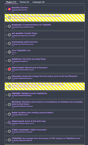
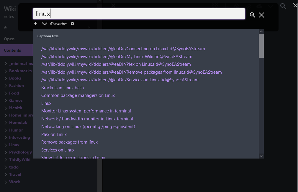
Here are a screenshots of my plugins and how my UI looks like now:


I might have uninstalled some after I’ve gotten used to other ways to explore my wiki, but these are the currently installed ones (I definitely don’t use all, e.g. I don’t use the dailynotes one).

Okay. I have seen this thread, and threads like it, for so many years. I am getting tired of this.

So here is a prototype landing page. TiddlyWiki — a non-linear personal web notebook

I am not so interested in the feedback of long-time users. I am much more interested in feedback from people like @Anakowi and other fairly new people. If you had come to TiddlyWiki and it looked like it does in the link above, would this have increased your openness to working with it? Is this something we should strive toward?

  1. Simple language
  2. Short bursts with minimal content in each section so as not to overwhelm people
  3. Hand-holding in a specific sequence
  4. Little or no need to scroll down to find the initial information
2 Likes

Sorry, this is not related to the topic, but the comment about the confusion over badges made me think of this scene: We dont need no stinkin' badges a la "Blazing Saddles" - YouTube

Comment: It should open either with the sidebar closed, or using the Open tab. Otherwise, the user might be confused by why there are 2 pages of text above the landing tiddler. That is, you can’t be sure that the sidebar text is going to be on the side.

oops. Yes, I simply downloaded from tiddlywiki.com and changed HelloThere. You are right, the sidebar should be hidden because it is confusing for mobile users.

Yes. The simple introduction helps. What’s missing now is a more modern look to make it aesthetically appealing as well.

Once familiar with the very basics, it would help to have the complexity broken down into levels where the learner could progress incrementally up to the point where sufficient knowledge has been gained for his/her specific use case.

The current ‘‘non-level’’ tiddlywiki.com would still be useful for reference.

Yes, it’s an improvement. It conveys more certainty that there’s a suitable entry level.

1. Simple language = YES

2. Short bursts with minimal content in each section = YES (scaffold)

3. Hand-holding in a specific sequence = YES, definitely for non-coders, but never hide the link to fast-track for those up-to-speed.

4. Little or no need to scroll down to find the initial information = maybe.

I’ve now uploaded a DRAFT tutorial on tiddlyhost – A non-coding beginner’s guide to TW5

2 Likes

All, I see a few accounts of and suggestions for new ways to express TiddlyWiki’s features. All great suggestions.

However I want to make a point that tiddlywiki.com sometimes gets wrong and many of your suggestions also get it wrong.

I think in Journalism they call it “Bury the Lede or Bury the Lead: Which is Right? | Merriam-Webster”.

People often start with what went wrong and then talk about how tiddlywiki did it right.

I think you you should start with “What tiddlywiki does right” and provide the history lesson later if someone even cares to read it.

If someone scans the page and see the negatives at the top they will go on to think tiddlywiki is not up to it, not what you intended.

2 Likes

Thanks for the feedback. @Anakowi thanks for the link. Lots of nice stuff there, but I would echo the comment by @TW_Tones .

1 Like

Yes, I agree. I’ve edited. No one really needs to read my frustration.

I’ve just realised that “draft” tiddlers don’t necessarily disappear (or do they?) so I can delay clicking the send/post/publish button. It’s always good (in my case) to review after a decent break, change of headspace.

1 Like