Multi-Column Layout / Storyview

Hello Tiddlywikians,

it’s been a long time without development updates for the MultiColumn Layout

Now I’m about to start an overhaul and I’m wondering if anybody is still using it.
It would be great to get some feedback what you like and what not.

  • What could/should be removed?
  • What could/should be added?

Also, does anybody have some experience with the newest versions of TW in combination with this plugin? Are there problems that need to be addressed?

I’ve been away from Tiddlywiki for a couple of months and now I see this great functions/procedure thingy and I’d like to know how it works and if the multi-column layout could profit from it…
Do I have to go down that rabbit hole? Are there things that are possible now that weren’t possible before? Like new CSS tricks, new macro tricks and so on?

I’m grateful about every reply,

Thank you and all the best wishes from Southtyrol,
Simon

8 Likes

Great to see you back @BurningTreeC, I hope you enjoy the new TW features, and don’t hesitate to ask if you have questions.

1 Like

Thank you @jeremyruston and thanks for your welcome! :slight_smile:

Oh I have many questions about the functions and procedures and don’t know how/where to start yet.
I’ll have to read an introduction and see where and how they are used before I know what to ask.

1 Like

One question: has TW become more performant?

Welcome back @BurningTreeC I value your contribution to the community and tiddlywiki immensely.

  • This is tricky one, because I belive it is an importiant solution that allows tiddlywiki to operate in a particularly useful way. I like that is is available in the stable of solutions, but beyond learning how to use it, I have not yet needed what it does, for myself or posible clients, but then I work a lot in the possible, rather than the practical.
    • This may be similar to mentat, streams, kanban and other inspired solutions.
  • I would however be sad if it were not available.

I think I raised it before, but provisioning it with some css that better scales the titles out of the box and by number of columns, so it scales is my only desire from memory.

  • Unless you just want an excercise to learn these new features I would not bother reengneering the multi-column layout just to use the new features. If you did it would no longer be compatible with earlier versions (not that importiant).
  • I suspect as you learn about the TW 5.3.x improvments you will start to see new oportunities, but until then it may not be profitable use of your time. Why do I say this?, because, to me, the key advantages of 5.3.x is the opening of new development and code patterns in TiddlyWiki script going forwards, since you have built multi-columns already, there is less value reengineering it.
  • I and a few others have already posted extencivly since the release of 5.3.0 so have some search and browse time in talk.tiddlywiki and dont hesitate to ask the community.
  • I could write something for you but it would be quite a tome.
  • Some quick tips
    • Functions and custom operators from them, are fantastic for modularising, reusing and naming filters, and have a nice benifit that when used as a <<variable>> output plain text.
    • Procedures to me so far are just macros with less parameter substitution.
      • I recently discovered a gap here :frowning_face: but the old macros remain of course.
    • The parameters widget is useful inside tiddlers, macros and custom widgets.
    • The ability to write new custom widgets or intercept existing widgets has immence value, along with the $fill and $slot widgets (although they look verbose).
  • Others with a more detailed understanding will have a technical view on this. I would say not specificaly “more performant” but there are more opportunities going forward to improve performance, but we need only do this if we face an intractable performance issue and I have not yet seen one.
  • As I alluded to earlier I think the value of 5.3.x is it breaks many barriers, and introduces the possibility of new and better code patterns. Its about the future rather than the past.

Welcome back and I hope this is a kick start.

2 Likes

Hi @BurningTreeC
Like @jeremyruston I encourage you to use TW 5.3.1 features in this overhaul. One reason is to read your code in such plugin and learn how to use TW new features in real life :wink:

1 Like

Thank you @TW_Tones for your very detailed answer.

could you please elaborate a little bit about this?
You mean the tiddler titles?

Yes, I’m interested in the new opportunities of the new improvements.
But I guess the way I use tiddlywiki scripting I’ll have to find out my use-cases on my own.
Sometimes I feel like I’m using things in a more “creative” way :smiley:

I will look up the forum for how-to’s and explanations, thank you again.

Best wishes and thank you for your welcome,
Simon

Hi @atronoush ,

thank you for your input.
I’m not quite sure about if I should use the new improvements because I lack the understanding of them.
So for now I think I start overhauling without the new improvements and if I find the time to learn them and I get ideas where to use them I may implement solutions using them. But that seems still far away to me.

Best wishes,
Simon

A question for everyone:

should the top bars disappear?
They’re mostly there for design.
They just use space.
They can be used to drag all tiddlers from a single column to another wiki.

1 Like

I did not know that! I thought they just showed which column was active.

I have no problem if they can be turned off but I want to be able publish items in the header like a menu bar to provide navigation and help info etc…

1 Like

@BurningTreeC

A few suggestions and issues I have faced.

  1. The buttons in the right bottom panel could be made into a hamburger menu as shown here by @Mohammad Page Layout a Powerful Feature in TiddlyWiki - #2 by Mohammad to avoid cluttering in mobile UI. The hamburger shall close automatically once a button is selected.

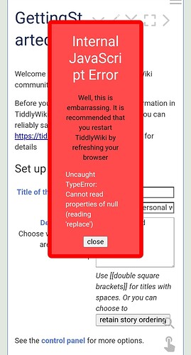
  2. Context menu plug in by @ahanniga shows a red colour error message when the multicolumn layout is activated (no issues while using the context menu plug in with MCL installed but MCL layout not activated)

https://mcl-context-menu-bug.tiddlyhost.com/ check this demo wiki

  1. Can a YouTube like UI be created using MCL with search box in the toptoolbar and video suggestions in the bottomtoolbar.

  2. Can theme, layout and storyviews be specified for each ensemble seperately.

  3. Can ensemble be made into a standalone plugin that works with non-MCL wikis also

  4. Is there a way to limit the tiddlers that can be searched for and opened into the storyriver of each ensemble using certain filters.

Hi @TW_Tones

could you elaborate a little bit on this? How should this look like?

Thank you

Hi @arunnbabu81 ,

with a bit of wikitext and css you can create a PageTemplate ($:/tags/PageTemplate) that contains such a hamburger menu. I don’t think I want to add that by default. You can hide the bottom right panel in the options.

I’ve checked this error message and it’s probably because MCL uses a different View- and Edittemplate. The contextmenu plugin doesn’t find the node with the data-tiddler-title tag. I would need some advice from the contextmenu plugin creator for how to solve this issue so that both plugins work well together.

I will not create that, but I can imagine that someone with knowledge in wikitext and css can do that, yes.

Not at the moment, but it’s a good idea and I will think about it

Yes.

Could you please specify how that should look like, how it should behave and so on?

Thank you for your feedback and ideas!
Best wishes,
Simon

I have notes for different topics like finance, automobiles, electronics and so on which are organised using tags or fields. What I was thinking is like this - while creating an ensemble if it can be specified by using a ensemble-filter field that only those tiddlers with a particular tag or field can be open when a particular ensemble is active…but I guess it won’t be easy to do it. One way I could think of is to customise the searchbox in the GitHub topbar so that it searches for only those tiddlers which statisfy the ensemble-filter criteria. I don’t think there won’t be many people wanting this feature. So I think this feature request can be ignored.

Creator of context menu plug in is @ahanniga . Hope he see this post so that this bug can be rectified. May be @fastfreddy can also help you since he have created an addon for the context menu plug in (he must be knowing about context menu plug in more than any other users of the same)

@BurningTreeC

  1. Can the default sidebar be made to appear on hovering the three line menu icon.
  2. Can there be an keyboard shortcut for undo closing a tiddler - sometimes we may accidentally close a tiddler from the story river using Alt+C shortcut. Is it possible to revert this action - ie, reopen the last closed tiddler in the storyriver using Alt+R keyboard shortcut

should the top bars disappear?
No I use them and they are very useful

  • I revisited MCL and a lot of this is good in the current iteration
  • It would be nice if we could add the menu bar plugin.
  • otherwise its great.
  • I meant both the tiddler titles and buttons. However I revisited MCL and see that the Zoom function ctrl-zoom and ctrl + and ctrl - allow this to be done quite effectively.
    • Perhaps these shortcuts could be added to the documentation as they work well with MCL
  • Perhaps when adding columns or opening an Ensemble one could set the the zoom level to an appropriate or previous value.

It seems I was looking at an older version than the latest MCL so I am going to review its functions and usability again.

  • Thanks for this wonderful solution
1 Like

I have being looking to see if I can name each column and have that displayed above each column. Ideally it would remain in place while scrolling the column below. This would allow me to name each column like a Kanban Board, not only helping myself but making it apparent to someone visiting the site.

  • later I would want to craft an add “card” (tiddler) to column button and a popup to edit cards (tiddlers). eg menu option.
  • An ensemble would be equivalent to a kanban board.
  • Building a Trello equivalent tool is feasible.
1 Like
  • The sidebar cannot be made to appear on hovering that easily
  • An “undo” shortcut would make it necessary to keep track of a history of events which I think should be a separate plugin. It would be a lot of work I guess
1 Like