Memory Keeper Research Tool: Documentation Page

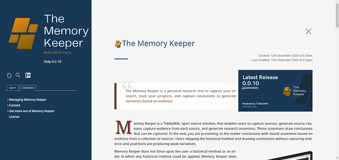
The Help page or documentation page of Memory Keeper is itself written in TIddlyWIki is an amazing example of shaping TiddlyWiki for real world projects.

This TiddlyWiki edition is designed and maintained by @clsturgeon the developer of Memory Keeper.

It is simple in use and beautiful in design. The only drawback is it needs big screen.
5 Likes

@Mohammad Thanks for this. Can you provide specific issues (I know there are some) of responsiveness? All my help/documentation and MK use the Navigator theme; with some major CSS overrides. I hide numerous elements.

The obvious clunkiness is the sidebar. By default it is hidden on small screens. When hidden, the user can use a top bar (which is fixed) to expose it. Iā€™d like to fix this sidebar. Iā€™m not a fan of showing the sidebar at the top on small screens.

I also have issues with multiple tabs. On small screens we see multiple lines of tabs. I want a better solution.

What else?

I use the Edge devtools and then turn on device emulation to let me set the size of screen. (On a Windows machine, pressing F12 brings up the devtools).
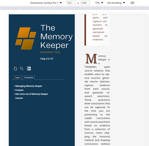
The below screenshot shows Memory Keeper Research Tool: Help page on surface pro 7 (912x1368 pixels)

As you said this is matter of responsiveness! The sidebar seems to wide in small screens.

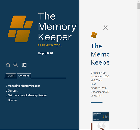
@Mohammad I think devtools does not refresh the page when you select a device to simulate. After you select a device go to the address bar and refresh/reload the page. On small screens the sidebar should be hidden.

If you even resize the window for example snap the browser window to the left to occupy half of the screen you see again the same issue.


screen size: 1080*1920