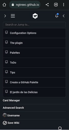
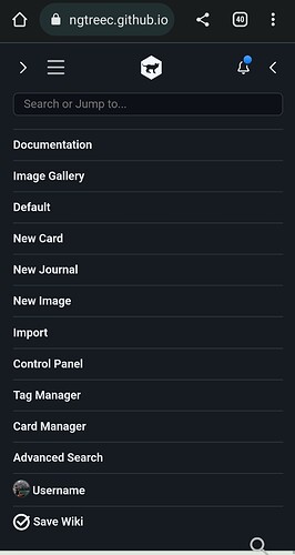
[MCL] GitHub style TopBar

Hi TiddlyWikians,

I’m splitting the thread A multi-column Layout / Storyview for Discussion about the GitHub styled TopBar

I want to discuss certain aspects of it and what you’d like to see implemented

For example, the notification Button at the moment shows a blue indicator if there are tiddlers with the Tag ToDo that don’t have the Tag Done and clicking it opens those tiddlers.
There are many ToDo-List solutions out there and I don’t know if I should implement my own or if I should implement a mechanism so that users can use their own with the notifications button…
Or maybe the notifications button should do something totally different? Maybe you have a great idea…

Also, if you have some ideas for the dropdowns what functionality they should provide, don’t hesitate to post here :slightly_smiling_face:

You can see a Demo of the GitHub-styled TopBar at MultiColumn Layout — a non-linear personal web notebook

As always, open for ideas and criticism,

best wishes,
Simon

1 Like

Ciao @BurningTreeC

Quick note … I think it a great spin-off from MCL!

If you put this out as a self-contained plugin I’d suggest you also include abilities for a BottomBar too??

Just a thought
TT

Hi @TiddlyTweeter ,

how should that BottomBar look like? What are your ideas?

Your thoughts are always welcome,
Thanks,
Simon

1 Like

@BurningTreeC

This is what I got after experimenting with the new github styled topbar and tiddly dark theme GitHub - ahanniga/tiddly-dark: A themed version of TiddlyWiki5 focussed on managing programmers notes

Check the both dark themes by clicking on the topbar ensemble links

1 Like

eek! Well it could be a zillion things. :smiley:

  • One thing we tend to neglect in TW is promoting ourselves and a BottomBar is good for that. The idea here is the bar is transparent except for the two linking badges …

  • I also think that what you are doing at the top can also be done just as well at the bottom??

  • I do think on mobile phones it is quite common to footer the screen. @telmiger did some good layouts using the bottom with icons. Like this …

Just ideas
TT

1 Like

I would like to have a way to hide the TopBar in certain Ensembles of my wiki. Is there a way to do that?

Just remove the tag $:/tags/TopToolbar or $:/tags/TopBar from it???

Part of the issue is once it is created accessing it since it loses an edit access. Simply go back to normal TW where you can edit it normally.

TT

Removing the tag $:/tags/TopToolbar from $:/plugins/BTC/multi-column-github-toolbar/ui/TopToolBar will remove the topbar from all ensembles

The issue here is whether Ensembles, on load, should auto-tag associated “ToolBars” in the way they do already with “Stylesheets” JUST for that ENSEMBLE being needed–i.e. tag only ONE associated “Toolbar”.

Personally I think it is a good idea.

BUT I’m reluctant to burden @BurningTreeC with yet more work.

TT

Hi @BurningTreeC,
this looks great.
I like the foreshadowing of a multiuser realtime functions in the bell and the usericon.
And it is an interesting choice of pictures you have in your gallery.

That’s something that will be integrated. Dynamic Ensemble-based tags for the top and bottom toolbars

2 Likes

Hi @JanJo , Grüße nach Deutschland! :slight_smile:

Thank you for your kind words, the top toolbar is not even finished, there are still things missing … I’m working on it.

Best wishes,
Simon

Hi all, now the GitHub-style Topbar plugin is v0.3.0
I’ve added styles for narrow screens now and fixed some issues

Best wishes,
Simon

2 Likes

Can you add an option to adjust the padding or margin for the buttons at the both ends of the topbar.

As shown in this image the buttons are partly overlapped by my custom sidebar based on JD’s whitespace theme.

Ciao @BurningTreeC

Quick comment …

I thought it might be a good idea that when an Ensemble is loaded from the GH style TopBar that the loaded ensemble is highlighted in the list some way?

Why? So that the user gets visual feedback of which Ensemble is currently loaded.

Just a thought,
Best TT

Hi @arunnbabu81 ,
yes I can do that

Thanks,
Simon

Hi @TiddlyTweeter ,

I did think about that, too
But that would mean to compare the currently loaded tiddlers with the list stored in the Ensembles
If the list of the currently loaded tiddlers changes - because we can add/remove tiddlers - then this comparison doesn’t work anymore

Do you have another idea?
Simon

Hi @BurningTreeC

I think on load it is a good idea to highlight which ensemble was loaded?
I try and explain …

I agree that once loaded a user can change the content of an ensemble.
That is a more complex issue as the user would need know how to save one too.
In those cases they don’t need anything extra as they grasp what ensembles are?

But, I was thinking in my point most, of end-use where folk ain’t changing things, just reading.

There I think some kind of highlight of the loaded ensemble makes sense?

Just thoughts
TT

@BurningTreeC
There is some issues when we use search box in the GitHub style topbar in mobile. Even after clicking on the selected search result, the menu bar persist


Thanks for reporting @arunnbabu81 , I’ll change that asap

Best wishes,
Simon