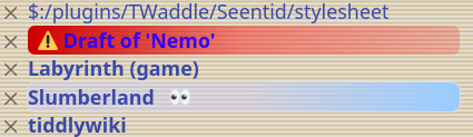
Thanks to diving into how @twMat’s “seentid” plugin works (Presenting: Seentid - highlight sidebar title seen in viewport) and it’s CSS trickery, I was able to solve a small wishlist I’ve had in mind for some time - making the Drafts stand out more in the list of open tids.
It’s a bit of a kludge - it’s based off recognising the specific string Draft of ' as the start of the title, so a normal tid which starts the same, would be recognised this way. That’s unlikely to happen though!
This can be dropped into any locally configured stylesheet (tagged $:/tags/Stylesheet), and then tuned to local taste. I’ve got the colours hardcoded in, but I’m sure could be improved with TW palette smarts (that’s not something I’ve looked into yet)
Good call. I should rework other of my CSS tweaks into proper palette awareness in the future too/
Anyway, here is the TW palette friendly version of my current DraftOf css (and is a bit different to the previous version overall)
.tc-sidebar-header a.tc-tiddlylink[href^="#Draft%20of%20%27"] {
  color: <<colour dirty-indicator>>;
  width: 90%;
  border-radius: 5px;
  outline: 1px solid <<colour dirty-indicator>>;
  padding-right: 0.5em;
  &::before {
    color: white; /* this only affects the emoji which is already full-colour, but I saw weirdness in some edge cases when it wasn't set */
    background: <<colour dirty-indicator>>;
    margin-left: 0.5em;
    margin-right: 0.5em;
    padding-left: 0.5em;
    padding-right: 0.5em;
    border-radius:1em;
    content:"⚠️"}
}
This would be a very welcome development, but perhaps it needn’t be so “loud”…? Might it be bold and in an off-palette colour, I wonder?
The “unsaved” tiddlers that appear at the bottom when the TW’s reloaded; I get that. But do drafts merit so much alarm?? Just a question for further discussion.
I imagine there are many styles that would suit folks, and I’d hope others would contribute their own preferences. Mine is built from my existing CSS tweaks (which bolds all links anyway), and my own tendency to be distracted (so having very obvious “this is where I am” and “this is where I have left things unfinished” is definitely what I want).
PS: never let it be said that I have good colour instincts. At least, not without a LOT of refinement and feedback!
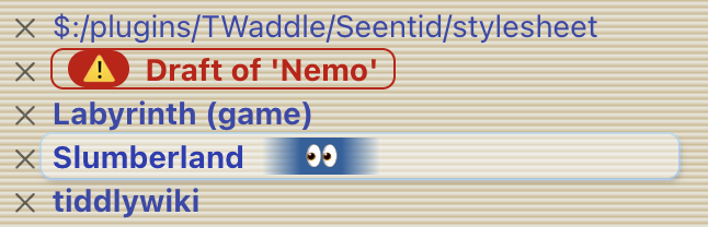
Here is a much more muted and simpler version which simply sets the background to a dirty indicator tint (it may not work well on a dark theme due to it relying on a background tint)
(aside: only in tweaking for this minimal version did I find the <<colour xyz>33 style colour handling. I think this opens some nice options for my own future CSS tweaking!)
So sorry, Nemo-san! I wasn’t attacking your style, though it may have seemed so. Thank you for putting me straight. I certainly deserve the rarely-used-on-TalkTiddylyWiki thumbs down! <TailBetweenMyLegsEmoji>.
But the topic you brought up is pertinent. “Draft of…” should stand out more in the sidebar. CSS tweaking would do it.
dont worry, no offence taken, sorry if I came across as rebuking.
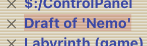
I have had it in mind to bring up “can we make the labels of drafts more obvious in the sidebar?” for some time, and had assumed it would involve a new class or similar deep code shenanigans. tid’s have their tags included in their CSS class already, allowing a lot of flexibility for them to differ in appearance, but I think if that was added to the labels on the side, it’d probably ruin a lot of custom CSS (eg, I have the following set for my custom stylesheets. It’s not pretty, but they stand out nicely, reminding me that stylesheets can do weird and wonderful things - but the same wouldn’t be appropriate for the sidebar. )
Anyway, I’m glad I held off on suggesting sidebar items have equivalent tags, and while I can see the potential value in them for some uses (eg: colour coding the items in the ‘Open’ tab according to various tag/categories, I can also imagine it being a lot of extra code in TW for little actual use in the real world). Whether this is something others want or not, I think it’s more of a 5.4.x topic discussion perhaps?