Lighten tags editor by only showing "add new tag" on hover

Simple edit of stylesheet to make an edit form look a bit “lighter” by:

  1. Hiding the border on the edit tags row
  2. Removing the shadow on the edit tags row
  3. Only showing the “add new tag” element when mouse over the edit tags row

Helped me building an app with heavily customised tiddlers, but not unpleasant for general use.

Edit form - original:

Edit form - after:

Edit form - after (hovering over tags row):

$:/my/Styles
(or any tiddler tagged $:/tags/Stylesheet)

.tc-edit-tags {
	box-shadow:none;
	border: none;
}

.tc-edit-add-tag {
	visibility: hidden;
}

.tc-edit-tags:hover .tc-edit-add-tag {
	visibility: visible;
}
7 Likes

Nice modification one can adopt with a meer stylesheet. Nice stuff.

I too have some ideas for improving the tag editor but perhaps it’s time to add a little customisability.

  • Like you I think this can be achieved with an optional add on eg alternate tags editor and hide the default.

eg; Clear all tags button, add tag from list determined via a filter and more.

Thanks for the inspiration

1 Like

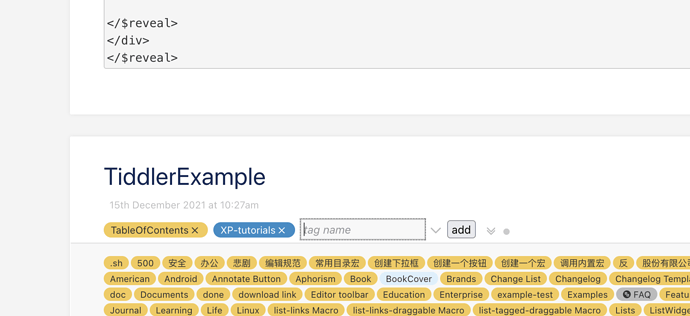
There was a plugin that allows edit tags on view mode, I think it is xp-aggregation plugin by Keaton Lao TiddlyWiki XP by Keaton Lao

Demo: TiddlyWiki xp — A chance to experience TiddlyWiki very quickly

But it does so by modifying $:/core/ui/ViewTemplate/tags , I think there should be a better solution, despite it is very useful.

And I think this could be release as a standalone plugin, because I’m using Hyper-Table plugin, not using aggregation plugin’s dynamic table anymore.
Hi @linonetwo,
I have recently visited the CPL and the TW xp edition and was really surprised with the work that has been done in the Chinese community!
I like the CPL feature that notifies users of new updates for installed plugins.

Thank you for sharing this.
Best wishes

4 Likes