Bingo!
The one or the many?
The infinitude is exactly one big promo issue, I think?
Just early thoughts, TT

Bingo!
The one or the many?
The infinitude is exactly one big promo issue, I think?
Just early thoughts, TT
Right. I’m gonna use two visual metaphors that I hope explicate the issue graphically …
1 - Advanced Yoga (TW Developer) … Once you know what you doing you can do this …
2 - Intermediate Yoga (TW Starter) … All learners need to work a bit before you get there …
My point? What is TiddlyWiki for?
I very much doubt most users ever need to master “leg behind the head.”
A comment, TT
Brave go at visualising. In part my original point of is most people don’t plan to be a yoga guru even if they may dream about it. In a similar way we want users to consider there value adopting tiddlywiki without becoming a tiddlywiki guru, unfortunately I think people see a tiddlywiki guru as a JavaScript coder and this turns them off even starting.
It makes me wonder if we introduced white through black belts like karate they would see the value in the intermediate belts without a belief in reaching black belt. Perhaps we should start a thread the TiddlyWiki achievement belts for example Understanding the Meaning of Karate Belt Colors or perhaps we have stars, or fishes and we display the fishes we believe we can handle.
… as an entry point it might work if an entrantee had free choice on belts / cats / stars / fish levels.
Just a comment, TT
Even here, I notice the plurality of ways of moving toward becoming “power users”.
Some people begin going to town with fields and table-like data structure, some with complex tag-based TOC and navigational structures, others with css and layout tweaks, others with transclusions and macros, others with various plugins…
I’d be reluctant to put these into any linear order, because any one of those development routes might be the most important learning path for a given user.
Grok Tiddlywiki is great at offering one careful more-or-less linear path, but it’s just one path – geared toward a certain kind of learner with certain kinds of tasks (managing notes as a new employee).
Touching again on original question, I do think a well-designed (graphically engaging, and readable) landing page is valuable… the challenge (as folks notice) is to find the balance between simplicity and power.
-Springer
yes, I said as much myself recently. Then we need to find another metaphor but one which ideally deals with both the plurality and the progressive levels.
Actually its starting to look like different paths , almost like snakes and ladders, where the snakes get you back to something you bypassed earlier.
I may be naïve, but I am confident we can find a model/metaphor which is useful to most people, and on which we could hang key documentation.
What about the TiddlyWiki galaxy model?

Architecture of the TiddlyWiki galaxy model
Then people would accumulate stars and planets in various spiral arms.
Do I sound like a “mad man”, an “add man”?
This is not Off topic - Such a theme could be the theme for a landing page such that the metaphor indicates;
"There is more, much more, just explore".
Looking at landing page content;
Part of promoting TiddlyWiki is explaining the name,
In the process of developing a standard starter edition as above I wrote Its All in the name addressing this somewhat. Copy below.
Please also see my attempt to find a metaphor for tiddlywiki Landing Pages -- Can TiddlyWiki Learn From Them? - #37 by TW_Tones where The TiddlyWiki Galaxy may be a good one.
Is anyone here handy with annotating images?
Images my be copy written
IMO way to abstract. … The OP lists some landing pages with a “powerful 1 liner”, where all of them will also work for TiddlyWiki.
So we can steal them - remix and we would probably good to go.
The second brain - to own your thoughts. – done
Then there need to be some more detailed Edition links with a “call to action”
and we are done.
What about:
"TiddlyWiki is,
A Recipe Book.
[Demo thumbnail]
A Personal Blog.
[Demo thumbnail]
A Second Brain.
[Demo thumbnail]
A Digital Journal.
[Demo thumbnail]
A Notetaking Wiki.
[Demo thumbnail]
TiddlyWiki is whatever you want it to be.
all saved into a single file, saved anywhere you want,
and it all starts here, with your first tiddler."
Nice! A very concrete overview of applications to convey the multitude and give the visitors actual starting points aligning with their interests, and with direct links to demos or editions for this.
I’ve just spent a couple of days (hours) with Obsidian… I suppose that’s nowhere near enough time to make an evaluation. The initial cosmetic appeal wears off quickly. The limitations emerge and while most are due to my lack of knowhow, I’ve found more promise of success with TW given that I want to move beyond the basics, despite my difficulty with the TW learning curve.
I see that TW has a development history and a rich community with experience. I feel what marketing there is, doesn’t do TW justice. It’s missing out there in the arena. What is most easily found are usually via 3rd party appraisals — “best note taking apps”, “alternatives to…”, etc. where the summation of what TW offers seems out of date and out of touch (reviews written by those who couldn’t make TW live up to their personal objectives?) I can see TW does what Obsidian sums up in key-words that match current trends. Obsidian is benefitting, having filled a conceptual market gap. For example a Sitepoint tutorial that targets those keywords, basically a plug for Obsidian.
There’s quite a bit of discussion taking place in these threads — and I feel that the momentum needs to keep going. So close. A huge knowledge & experience resource exists.
Yeah, it has some great content for someone wanting a blueprint for that end result, but very quickly becomes laborious to adapt to one’s own need.
When I’m looking at new web-apps, for example, I often end up on the “pricing” page hoping to find what is offered at different tiers, to help me decide where to start. Maybe something along those lines could work? …branching off to niche landing pages offering distinct learning pathways, which can also be reached directly via different channels (reviews, alternatives-to, and popular search terms).
More random thoughts:
Obsidian doesn’t market itself as a “wiki”, but seems rather closely related. TiddlyWiki could enjoy a timely relaunch – simply as TW5, the way build your knowledge warehouse note-by-note. The sky’s the limit.
Food for thought:
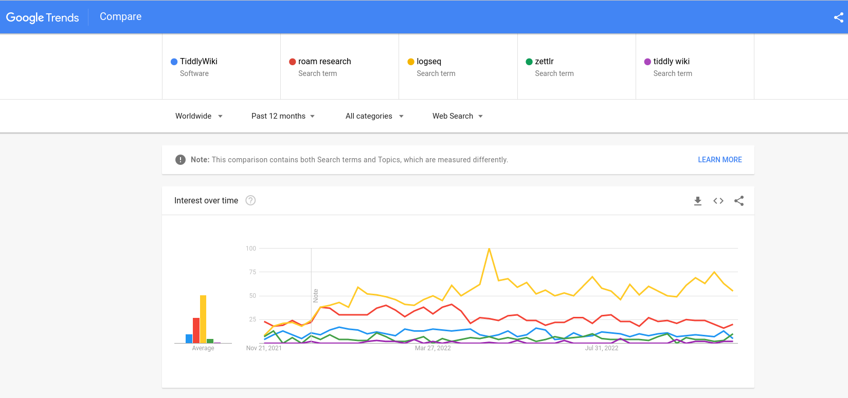
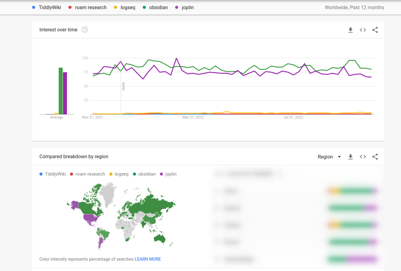
I removed obsidian and joplin as these two have much large numbers, not sure why.
I’ve also used this before :https://rednotebook.sourceforge.io/ (not sure if their landing page is good)
Thanks
Lucas
@Odin think this is a great start and I would like to have this as a template - but it would defintively need a linkcatcher with the action to switch to the normal layout if you click a link.
Thanks @JanJo @arunnbabu81 I don’t recall seeing @Odin’s prototype before, it’s very impressive.
I have experimented with a different approach: to put the landing page in the “before story” area, but position it behind any open tiddlers. The landing page also moves out of the way when any tiddlers are open by shrinking and fading.
Try it out here:
https://tiddlywiki5-git-landing-page-experiments-2023-jermolene.vercel.app/
The PR is on GitHub:
I made a quick demo of how this could make use of layouts.
http://szen.io/landing/
I think it is useful to get the landing page out of the way as fast as possible to start to work.
@jeremyruston, I am still fascinated with your federatial design because it illustrates the philosophy. Could we have a variant of this as a landing-page?
IMO while this is a neat animation, a new user might believe that this is the way a standard wiki behave, and I find text behind the main content to be very distracting. Maybe blurring the background and/or a back arrow in the bottom left would be better ? Love the design of the landing page tho, great job @Odin.
I think it would be great to add a scrolling animation when jumping to “get started”, because it’s not obvious that the page was scrolled. A sticky nav and/or a return to the top button in the footer would be great to navigate between the landing page section.
I think the landing page made by @Odin is the best target. Maybe the preview of tiddler with links that don’t work could be change it. I have doubts about what is the best replacement if there is it.
I think the use of link to trigger changes in the layout, it will result confusing to some users. How I return to landing page. There isn’t any warning about the link used as link to doc. Or if the link opens a tiddler in the story river (something unknown for newcomers) or it opens a modal dialog.
The Landing is positoned behind, however its links continue working.
Did you try that page on a mobile phone? It doesn’t work for me.
There is a wall of text in front of the small sections with the icons.
A small sidenote:
Have you seen the Memory Keeper — Help (clsturgeon.github.io) by @clsturgeon ? It is not a landing page, but it is amazing, simple and light. It can be turned out to a page layout. Only it is not responsive!