Nice! A very concrete overview of applications to convey the multitude and give the visitors actual starting points aligning with their interests, and with direct links to demos or editions for this.
I’ve just spent a couple of days (hours) with Obsidian… I suppose that’s nowhere near enough time to make an evaluation. The initial cosmetic appeal wears off quickly. The limitations emerge and while most are due to my lack of knowhow, I’ve found more promise of success with TW given that I want to move beyond the basics, despite my difficulty with the TW learning curve.
I see that TW has a development history and a rich community with experience. I feel what marketing there is, doesn’t do TW justice. It’s missing out there in the arena. What is most easily found are usually via 3rd party appraisals — “best note taking apps”, “alternatives to…”, etc. where the summation of what TW offers seems out of date and out of touch (reviews written by those who couldn’t make TW live up to their personal objectives?) I can see TW does what Obsidian sums up in key-words that match current trends. Obsidian is benefitting, having filled a conceptual market gap. For example a Sitepoint tutorial that targets those keywords, basically a plug for Obsidian.
There’s quite a bit of discussion taking place in these threads — and I feel that the momentum needs to keep going. So close. A huge knowledge & experience resource exists.
Yeah, it has some great content for someone wanting a blueprint for that end result, but very quickly becomes laborious to adapt to one’s own need.
When I’m looking at new web-apps, for example, I often end up on the “pricing” page hoping to find what is offered at different tiers, to help me decide where to start. Maybe something along those lines could work? …branching off to niche landing pages offering distinct learning pathways, which can also be reached directly via different channels (reviews, alternatives-to, and popular search terms).
More random thoughts:
Obsidian doesn’t market itself as a “wiki”, but seems rather closely related. TiddlyWiki could enjoy a timely relaunch – simply as TW5, the way build your knowledge warehouse note-by-note. The sky’s the limit.
Food for thought:
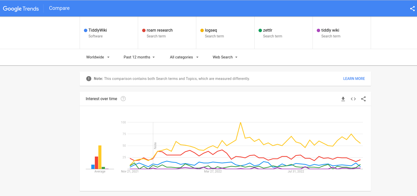
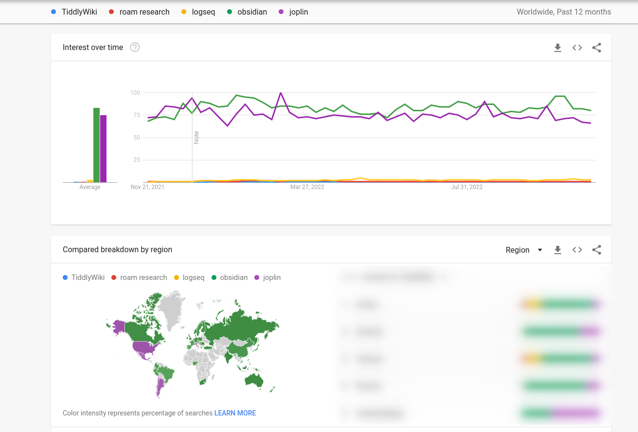
I removed obsidian and joplin as these two have much large numbers, not sure why.
I’ve also used this before :https://rednotebook.sourceforge.io/ (not sure if their landing page is good)
Thanks
Lucas
@Odin think this is a great start and I would like to have this as a template - but it would defintively need a linkcatcher with the action to switch to the normal layout if you click a link.
Thanks @JanJo @arunnbabu81 I don’t recall seeing @Odin’s prototype before, it’s very impressive.
I have experimented with a different approach: to put the landing page in the “before story” area, but position it behind any open tiddlers. The landing page also moves out of the way when any tiddlers are open by shrinking and fading.
Try it out here:
https://tiddlywiki5-git-landing-page-experiments-2023-jermolene.vercel.app/
The PR is on GitHub:
I made a quick demo of how this could make use of layouts.
http://szen.io/landing/
I think it is useful to get the landing page out of the way as fast as possible to start to work.
@jeremyruston, I am still fascinated with your federatial design because it illustrates the philosophy. Could we have a variant of this as a landing-page?
IMO while this is a neat animation, a new user might believe that this is the way a standard wiki behave, and I find text behind the main content to be very distracting. Maybe blurring the background and/or a back arrow in the bottom left would be better ? Love the design of the landing page tho, great job @Odin.
I think it would be great to add a scrolling animation when jumping to “get started”, because it’s not obvious that the page was scrolled. A sticky nav and/or a return to the top button in the footer would be great to navigate between the landing page section.
I think the landing page made by @Odin is the best target. Maybe the preview of tiddler with links that don’t work could be change it. I have doubts about what is the best replacement if there is it.
I think the use of link to trigger changes in the layout, it will result confusing to some users. How I return to landing page. There isn’t any warning about the link used as link to doc. Or if the link opens a tiddler in the story river (something unknown for newcomers) or it opens a modal dialog.
The Landing is positoned behind, however its links continue working.
Did you try that page on a mobile phone? It doesn’t work for me.
There is a wall of text in front of the small sections with the icons.
A small sidenote:
Have you seen the Memory Keeper — Help (clsturgeon.github.io) by @clsturgeon ? It is not a landing page, but it is amazing, simple and light. It can be turned out to a page layout. Only it is not responsive!

I think we’ve got broad agreement that we should adopt a landing page like Odin’s.
I hope there is also an understanding that Odin’s work is a quick mockup that reuses the existing tiddlywiki.com content, and so does not (yet) address many of the other criticisms of e.g. the Getting Started tiddler.
But the crux of the matter right now is that we don’t have a good way of switching between the landing page view and the ordinary TiddlyWiki view. In Odin’s original prototype, clicking the “Try it out!” button will switch back to the ordinary TiddlyWiki view, which I think works reasonably well (albeit there is no obvious way back).
The problem is figuring out the behaviour of links within the landing page content (and the related problem of handling permalinks).
It has been proposed that we should just automatically switch layouts whenever a link is navigated. But I think the user experience is terrible: an abrupt switch between two completely different contexts, with no obvious way to get back, and no relationship between the two contexts. No website in the world works like that.
Hence my prototype that I linked above: an attempt to combine the landing page more tightly with the ordinary TiddlyWiki view. I think it is promising; there is a consistent and coherent visual hierarchy, and everything works as usual from a TiddlyWiki perspective. From the perspective of a new user, the user experience is as if links were opening in a modal, which are a reasonably familiar user interface feature. But I acknowledge that it still needs plenty of work; for example, the animation won’t be to the taste of all users, and the internal links within the landing page don’t work at the moment.
From my perspective, the problem of combining the landing page with TiddlyWiki’s ordinary interface is critical. We do not have a viable path for giving TiddlyWiki a landing page unless we solve that challenge. There’s no point discussing improvements to the landing page prototype unless we have a viable path for deploying it.
Thank you! I like it a lot too, but I’m not sure it’s suitable for tiddlywiki.com. I think the issue again might be that that it is confusing for end users if we depart too much from the ordinary TiddlyWiki view. It would also be difficult to get good performance for the scroll effects (the Federatial home page is a simple static site without the full weight of TiddlyWiki itself).
It could be one of the ways that a standard wiki behaves when deployed as a website. It’s a pretty universal solution to the problem of making a conventional seeming website that can expand into a TiddlyWiki.
Blurring content is still a performance bottleneck for low powered devices so I’m wary of relying on it for a users first experience of TiddlyWiki. At one point we blurred the background of modals and found it caused problems for some users.
I think this problem has been solved as seen in many news articles and other web pages that need to show two very different “kinds” of material, like so:
They have an image that covers the full screen above the fold. When you scroll, this image stays fixed but there is additional content that is scrolled into view on top of / in front of the image. And not only static text but also other visual effects triggered by scroll depth. Eventually, you scroll down far enough so the image scrolls up and you reach the contents below the image. (This could appear like the rolling up of a roll-down-curtain, revealing the content behind the image, or that the contents are sequentially below the image.)
In our case it could be the landing page section at top, with arbitrary content accessed through scrolling.as described. And, scrolling far enough, you get to the actual TW display. The landing page can still be accessed by scrolling to the top and/or there could be a button in the top menu to make it scroll into view (e.g pulling down the roll-down-curtain again).
Hopefully there could also be some way to disable the display of the landing page section so I already-community-members don’t have to see it in their daily visits to the site.
Can you point to an example?
I think you’re suggesting that the landing page should be at the top, with the ordinary TiddlyWiki layout immediately below it. The trouble is that the landing page is quite long; there’s several pages of scrolling to get past it.
I’ll post it when I stumble over one.
Well, do we want people to be exposed to it or not? I don’t think the length is a problem if on the landing page (maybe better referred to as “landing section”) there are links interspersed that navigate to the TW part, and also some revealwidget to hide/show the landing section, parhaps a button in the topmenu.
(But of course, the whole page could perhaps as well have two “tabs”, one for the landing page and one for TW. I believe this idea has been mentioned before. I think it is pretty no-nonsense and anyone will grasp it right away.)
We would need an animation like this to swotch between layouts.
I found a demo on CSS Tricks that shows the basic visual idea: On the page, directly search for the headline reading “Gotchas”. When you do the initial scroll in that demo, the effect is limited to flipping the darkblue background to the pink one, but the websites I have in mind have other effects and events. Anyway, as you see, further scroll eventually pushes that part away and the actual content comes into view.
I like it. The animation, in contrast to an immediate switch, and the sideways flip, makes it clear you go “somewhere else”. I like it. There could be a little hovering button to flip between the two; on the landing page it says “Try it out! → " which, on the TW page, changes into " ← Welcoming page” or some such.
Is this reasoning right:
It would be advantageous if the landing page is loaded without the actual TW being loaded. Then we don’t have to be so nervous about including images! Perhaps even include a demo of TW in the form of an InnerWiki - this “objectifies” TW and makes it less intimidating than actually being inside / using a TW. (Do consider they’ve never seen the beast before. I mean our baby.)
Well we should demonstrate that we are able to do this in TW itself.
I added an animation…which was a little tedious because there is no delay feature in the core. I would love to have @EricShulman 's timeout for this in the core.