Idea: approach to palettes and themes

The current palette system is quite unapproachable to an average user. Creating a new good looking palette requires:

  • going through over a hundred of palette colors
  • some UI design guidelines, experience, or experimentation to know what color contrasts between what UI elements look best

There are ways to make one’s life easier, e.g. @pmario palette manager plugin. In addition I used IBM’s carbon design guidelines (about contrasts between elements and which colors to mix) and autocomplete plugin to easily input color values from a defined palette. I found the whole experience of creating the palettes much more difficult than I think it should be.

I understand that the current state of things probably results from a slow evolution of the palettes, which had a limited number of colors in the beginning (and then it made perfect sense), but it got more complex with time and added UI elements.

I think the main problem boils down to the fact, that the current palette is responsible both for defining what colors to use in general and mapping which colors are used where in UI.

I think it would be much easier to create and adjust TW looks if these two roles were delegated to separate components.

There have been some efforts to simplify the use of palettes, see this GH issue with Captivate Theme — gives your wiki a pop of color by @cduran and Color Play — playing with colors and palettes in TW (tiddlyhost.com) by @Mohammad. The captivate theme goes a long way already as a proof of concept. Below is my rough idea of how the system could be designed to be a bit more flexible and universally applicable.


Palette base

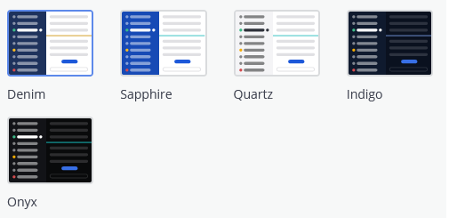
This would define the what “base colors” to use, something like the three color scheme in Captivate theme. This would define (all optional, if not present then inherited from “parent” palette):

  • base color - text, backgrounds, common buttons
  • accent color - accents, tags, links, something like primary now

These above are more or less covered in Captivate, organized as three different colors, but notice that most of the schemes have two of the three colors similar anyway.

I would propose that the base palette additionally contains a set of “colorful” accent colors, e.g. red, yellow, green, blue, violet. These would be translated by palette map into useful palette-compatible colors, for applications see below.

Palette map

This would map which base colors and their lighter/darker or less/more saturated derivatives are used in which UI element. So a decision to use a dark/light theme would be independent of the palette base, we could use a given palette base with a dark map, light map, light-story-dark-sidebar map, or high contrast map.

Ideally, the palette map would have some kind of hierarchy/inheritance, so e.g. if I want all tables to stand out (in tiddler info or in text), I can do it from one place.

Workflow, possibilities

Creating/editing base palette will be as easy as choosing 2–3 colors for base elements and accents, same as in Captivate.

Optionally, one can assign the further “colorful” accents, e.g. red, green, yellow colors that play well with the given base colors.

Light/dark, low/high contrast, bright/dark sidebar are a decision for the palette map. These would require more skill or experimentation to adjust right, but then with a good set of palette maps, the user should be satisfied with choosing one of the options and playing with the palette base only.

Custom colorful UI elements (e.g. user defined classes for colorful highlights, version badges in tw-com docs, colorful boxes/ribbons in utility plugins like Shiraz) could be dynamically based on palette base colors. So if I create a green highlight or red high contrast warning sign, I can use the palette base colors (probably modified through appropriate macros or palette map to adjust for the contrast/lightness), and be sure they stay looking good in a dark palette map with a different definition of what the default green or red tint is.

3 Likes

Indeed, the palette manager is a great tool. Yet it seems ot me that there’s more “birds-eye-view” that should be possible. Like a 2D concept map of which palette color relations fit which level of contrast, distinguishing reading-grade contrast from recognitional contrast…

For example, sidebar-foreground and sidebar-muted-foreground (and the hover variants of each of these, if defined) and sidebar-tiddler-link-foreground and sidebar-tiddler-link-foreground-hover all require reading-grade contrast against page-background.

Other palette-relations functionally require recognitional contrast — such as between sidebar-muted-foreground and sidebar-foreground, or indeed between tiddler-link-foreground and foreground.

Last, some palette relations merely invite recognitional contrast (but not in a mission-critical way). For example, the site-title-foreground doesn’t really need to differ from tiddler-title-foreground and/or primary. Having these differ in ways that aren’t salient for color-blind visitors doesn’t undermine the accessibility of the site.

Ideally, each palette would have a way to carry fields or tags that mark, for the whole palette: (1) its colorblind-accessibility (confirming that reading-level contrast DOES exist across all places where it’s needed, and recognitional-contrast DOES exist at least wherever it’s functional, like making links stand out from ordinary text), and (2) dark vs light.

2 Likes

I’ve done very little with palettes in TW. I’m not a particularly visual person, and it’s always, “Later.” But I when I do, I would really love better tools. I wonder if a live preview would be possible using the Innerwiki Plugin. I haven’t thought about an implementation yet.

Or perhaps we could do something similar to what I do at http://letters.sauyet.com/#/themes/. It would need to be significantly more sophisticated…and dynamic.

On that site, everything is based on 15 color variables, divided into four groups. A sample palette looks like this:

  "Sunday Papers": {
    "neutral": "#ece5f4",
    "border": "#98b8c6",
    "accent": "#666666",
    "primary-background": "#ffe1de",
    "primary-text": "#444444",
    "primary-highlight": "#fbd2d2",
    "primary-accent": "#c1d7e1",
    "secondary-background": "#c1d7e1",
    "secondary-text": "#444444",
    "secondary-highlight": "#c1d7e1",
    "secondary-accent": "#d9b5c2",
    "tertiary-background": "#d9b5c2",
    "tertiary-text": "#444444",
    "tertiary-highlight": "#d9b5c2",
    "tertiary-accent": "#c1d7e1"
  },

And it’s used for the page, and also to create a quick demo of the scheme, which is used in the theme picker (really just a palette picker, I guess) and as a favicon for the site, using only five of those colors:

SundayPapers

The code that generates this is fairly simple, because these palette previews are so simple. We would need a lot more sophistication for a full TW palette.

I would find it useful to integrate such a view into a palette editor.

1 Like

I love this idea of a compact “thumbnail” for each palette!

Yet the actual contrast between text and background is so essential to a palette’s usability that mere color-blocks could not meaningfully do the work of representing even the basic gist of a palette… At least some token text (or iconic line/squiggle set) needs to appear within each box to give us a sense of that reading-grade contrast.

1 Like

I’m hoping that the same technique would be dynamically available inside a palette editor. The thumbnail is nice, but I can imagine changing highlight-background and getting an instant impression of what it would look like.

Yes, I was assuming that. The trick is to make line/squiggle text small enough to look text-like, but not so small that the whole thing doesn’t work as a snapshot. For my letters site, the colors were enough to demonstrate the palette. Here we’d need a LOT more, and I’m guessing we couldn’t squeeze it all into one view of the page, but perhaps in three or four. For instance, one might have a modal open, and another notifications and alerts. One of those three would have a tabs widget, another would include a top-bar, etc. I don’t know if I’ll have any time to try this soon, but it’s at least going to be in the back of my head for a while.

That would be another possibility for TW, not as abstract like my idea from OP, but surely a lot easier to create, and still not overwhelming to edit:

  • stay with single palette tiddler as it is now,
  • expose/prioritize a handful of colors that need to be edited to change the palette; 15–20 would be the upper limit to keep this comfortable,
  • these would then be inherited by other palette colors, if needed through some macros that adjust for contrast/lightness,
  • the individual “deeper” palette colors could still be manually assigned a specific value if desired.

This would be a great improvement to creating new palettes, and it would retain the possibility of fine-tuning individual colors if desired, but not force to do that.

It would be actually more or less doable with the current palette system. The IBM palettes I created do not use more than 15–20 unique color values I think: I used the spectrum of 10 grey values for most of UI, two or three shades of primary blue, one yellow for alerts, and green/red for diffs.
Some of the core palettes like Nord and Solarized, or the Dracula (not core, but linked on tw-com) also manage to look alright with a small number of colors.

So we might need >100 colors in palette to be able to control specific UI elements, but we can generate these based on 15 unique color values.

I had the idea of creating a “palette rig”, that is a palette that would start with this handful of configurable colors, and all the proper palette colors would inherit from these. I never got to it, but I might revisit the idea now.

The problem with the current Vanilla theme is that some elements are dependent on each other in weird ways, so they are really difficult to keep on same contrast level. I can’t recall what was it exactly, I think table in tiddler info has same colors as table in tiddler body, and there was surely something with sidebar as well.

I’ve been trying something and wondering if it’s worth pursuing. It’s a tiddler to show a thumbnail based on the current palette. Even in its incomplete stage, it shows the basic idea, and demonstrates some flaws, as in certain places the contrasts do not match the actual palettes. But it’s close, and with work could become much closer. Of course there’s much more content to add.

This shows it in action, a thumbnail that’s responding to a change of palette name from a dropdown:

thumbnail

(The pixelated backgrounds above are an artifact of my screen capture/convert to gif process. They’re not in the actual thumbnails.)

You can try it yourself by downloading this and dragging the resulting file onto any wiki:

Thumbnail.json (4.3 KB)

My thought would be to build enough to cover a fairly wide swath of TW output in the default layout. Obviously if we wanted more, we could show this with multiple distinct thumbnails, or combine them all into one. I was using this screenshot as my target:

So, first of all, does this look useful enough to be worth pursuing? It looks like a fair bit of work to get it as close as possible to a realistic palette demo. I haven’t decided myself whether it’s worth doing. Do others find this compelling?

Second, if it is worth pursuing, then I have a few questions for those who might have better understanding than I do about SVGs. Together they boil down to, “How can I optimize my process?”, but there are distinct questions:

  • My text handling, in procedure line-text, was a reasonable first pass, but I don’t think it’s flexible enough. The heights are ok, and I mostly like the capital vs other heights, with a 3:2 ratio for those. But I use a shared parameter for character width and letter-spacing, and I don’t think this will scale well to different text situations. I think right now the text looks too heavy, but if I lower that parameter, the gaps look wrong. Is there any advice for how to handle this?

  • I would love it if embedding SVGs from other tiddlers worked well. What I’ve done is to extract the SVG markup from those tiddlers, add heights, widths and positions, add dynamic colors, and add missing closing tags, all inline in my main SVG tiddler. Is there a way I can simply embed one SVG embedded in a tiddler inside another, controlling the size, position, and fill color without repeating the internal SVG source?

  • Are there any suggestions for how to simulate bold or italic text with lines like these? Is it simply a skew transformation and wider rectangle, respectively? Or is there more?

  • I’m looking around for nearest containing nodes that have a color assigned, finding that class in $:/themes/tiddlywiki/vanilla/base, and using the palette key from there, and sometimes starting from a rendered color and finding it in $:/palettes/Vanilla, trying to guess which key is the most appropriate choice. This is a tedious and error-prone process. Is there a better technique to find which palette key is in force in some rendered output?

1 Like

This looks very impressive @Scott_Sauyet! I think it we’re going deeper in this idea, it might make sense to split the topic, because I think these are two quite different things:

  • improving the presentation of palette when editing or choosing it – like Mario’s Palette Manager or your demo,
  • improving the rules behind how the palette works and how to make creating/editing them easier – like the Captivate theme or my theorizing about the reduced number of “base” colors to edit.

Now back to your demo. It surely would be great to have this thing in a more complete form. However, I’m not sure if it is worth the effort needed. In the end, instead of imitating all elements of TW, we could just create a UI, like your selection box, to quickly flip though available palettes and view their appearance “live” in TW itself. I’m not sure if creating something that looks “almost like TW” just for palette preview is necessary. And it would probably become complicated with themes that go further away from Vanilla.

I thing the preview you have created can be useful if made less complex and smaller. If it used more symbolic elements for the sidebar/tiddler/text, it would be a great replacement for the “swatches of surprise” that we currently have in the palette settings.

I’m talking about a very simple symbolic preview like this one in Mattermost:
image
It would be incomparably better than

To sum up:

  • simple symbolic preview as a replacement for the current “swatches” in the control panel, it doesn’t have to reflect all the colors, just the most important ones
  • instead of creating an advanced preview it should be easier to create a UI to quickly change the current palette – if it’s needed at all
  • this all just helps to present the palette, making it easier to edit or create is another topic
2 Likes

You may be right, and I have the ability to do that, but I’m going to wait a little while because I think of this tool a little differently than you suggest:

These clearly are two different ideas, but I think that a better editor would really help bring to life the simplified palettes and especially the creation of them.

I think that’s fine for selecting palettes that have been created and tested. But when developing and testing them, we really don’t want someone stuck because they accidentally created an all-black palette. That’s how I was thinking of this. That it would also improve the palette selector is more of a happy accident.

“Smaller” is a non-issue. This is created as an SVG; it will scale up and down as needed. “Less complex” is certainly a real concern. It’s the reason I paused here. There’s a lot to do, and it’s not clear to me how much benefit there is. I really like that Mattermost demo, but TW UIs are much more sophisticated than Mattermost, even in just the standard layout.

The detail I was going for was to try to capture as much of that sophistication as possible, but I think it would likely get overwhelming. In the site I mentioned above, the schemes could be shown pretty simply with just the swatches, but as @Springer pointed out, they are not enough to show things like text/background contrasts. I’m not sure what is an appropriate balance.

And “just the most important ones” gets back to the origin of this thread. I don’t have time to respond now, but I’ll try to do so soon.

Again, I think that is true for a palette-switcher, but not a palette-builder. The UI I had with a drop-down of palette names was just a tool to help me build/test the SVG. I would imagine that if used for a switcher, it would look much like Mattermost; if used for a builder, it would just be part of an automated preview.

I think it’s a nice ancillary tool in a builder. It does none of the logic, but offers immediate visual feedback as the user makes changes.

You won’t be terribly surprised… but it turns out that the smallest things can make a preview seem to fail — even when it’s such a minimalist preview.

In particular, the swatch assumes that tiddler titles “display as links” setting is off, while the site title (for example) is not a link. Also, it looks for directly-named values, but doesn’t seem able to follow <<colour xxx>> referrals… The result is that the preview — even this simple one — can misrepresent where the contrasts are:

image

This tool would need to track when palettes refer some parts to other color-names (and doing so is a large part of what could make palette-building manageable!). Solar Flare, for example, doesn’t have its own site-title-foreground color, and instead points to <<colour tiddler-title-foreground>>… Neither that color nor the page background end up getting cashed out at their ultimate values in the preview:

I don’t envy the challenge of getting this kind of tool to behave, and understand if you’d turn to other things rather than obsess over getting this right!

Still, I do hope something like this is possible, and that someone will have not only the requisite css / svg chops, but also the patience to wade through the steps needed to iron out the kinks!

No, not surprised at all.

We could easily add a small number of settings for things like this. The trouble is that as TW is infinitely customizable, there would always be things not covered. Again, this makes me wonder just how worth it this might be.

Oh, of course, that explains why things didn’t look right. When looking at a palette tiddler, I somehow assumed I was looking at source, and that the <<colour ... >> expansion would have happened by the time I used it. That I could definitely fix. It might even simplify the implementation slightly. (Or not, as I guess I don’t know what to do with missing colors, like button-background in Blanca.)

I think I can iron out some of the kinks, such as the color delegation. Handling other settings (title-links, for instance) is more of a challenge. If there are only a few, we could probably handle it, but we’d have to see how far we wanted to go, as there are far too many factors to account for.

I still am not sure whether this is worth pursuing, but if it is, I think the most important question is about the level of detail we’d want to cover. The screenshot I supplied above has an awful lot to implement…

1 Like

I’m actually more optimistic about this one: Any text “squiggle” (in sidebar or within tiddler-ish box) should simply render as a link sandwich: non-link foreground, tiddler-link (maybe with underline-style added, for iconic link-recognition purposes) then return to non-link foregroud. Of course, tiddler titles rarely appear mixed like that, but it’s easy enough to “get it” about how the regular foreground and link-foreground interact.

It’s true that external links can be an entirely different color, and none of this gets at hover effect colors (not to mention further tabs/tables/modals, etc.). But all that strikes me as getting a bit into the non-essentials (ideally, external links and hover variations on links are close in color to tiddler links, and differ only in something like a degree of hue, saturation, or value).

1 Like

My concern is about $:/config/Tiddlers/TitleLinks. Variables like this change how a TW is rendered, and if we wanted to cover that, we need a toggle for that value to use in showing the thumbnail. That wouldn’t be a big deal on its own. But how many others would we want to include? Each would need separate handling in the thumbnail generator. It could get unwieldy quickly.

I don’t see why. Putting a link sandwich in each of the places where text can go is an easy way for people to recognize what color applies if/when they have a link in that <h2> tiddler-introducing position (which also can happen when caption is serving as header, even if “display title as link” setting is off), and also what the standard color is. Similarly for the title of the wiki, and for text within the dummy tiddler, and any text mockup within a tiddler subtitle area, etc… If it’s a link-sandwich, then people can see the normal foreground and the link foreground, even though they might rarely expect to use both.

I can certainly try it, but I think it would just be distracting and lead to even more busy thumbnails. But I’m thinking that there are too many settings built in, never mind how it might be customized, to handle them all. One of my ideas was that this would be one of several views, and if that’s the case, perhaps the one that showed notifications and alerts could also show title links. But again, complexity always seems to grow. And that scares me.

1 Like

I have not read this whole topic and I appreciate you all looking into this. It’s true we could do more with a tiddlywiki aware preview. I just have a couple of points;

Don’t throw the baby out with the bath water. The color macros an perhaps some new ones are used within tiddlywiki and we could use these in even smarter ways.

  • There a lot of color resources out there that help people select complementary an contrasting colors. A range of different color wheels for example.
  • It would be nice if we could use macros either when setting a or modifying a pallet or even when changing one color. For example what if you could indicate the background color is the complement of the foreground color as represented in this color wheel?
  • Or choose a few colors and have all the details change according to one of these color schemes.

Just food for thought.

I have skimmed through the topic but I have still some thoughts from my recent palette development. There are a large number of tab and tab background colors all of which have a complex interplay, so it is not as simple as just choosing the background for the entire wiki, this is what makes it hard to map the colors to something like base16.

This kind of thing — calculated transformations on existing colors — would be amazing.

It’s true that visual contrast does not neatly map onto mathematical contrast, and some “complementary” or visually contrasting colors are terrible against each other for reading contrast (green text on magenta background? No thanks, even without color-blindness!)… But it would be fantastic to go beyond allowing for exact palette value duplication (which many palettes take advantage of). It would be ideal to leverage css-based calculations to specify transformations of other palette colors.

For example, various link-related hover values could be based on their corresponding tiddler-link color, simply intensifying its contrast (dialing darker by 15% when the link is already displaying as a darkish color on a light palette, dialing up the brightness by 15% if the tiddler-link, before hovering, is a lighter color within a dark palette).

I second that.

This is exactly what the Captivate theme is doing: calculating all colors from a palette of three base colors. And it works very well.
Now that I think of it, it does employ the model of a palette base (which it calls color scheme) and palette map (which it calls theme: light/dark/tan).

Taking this idea further, the “maps”/“themes” could be made easily accessible and editable, while remaining separate from the “palette base”. Captivate does all this behind the scenes, it takes the color scheme and theme as input, e.g. “blue sky” color scheme and “dark theme”, and creates a plain palette in current TW format.
So it shows that all the necessary color transformations can be done in TW.

1 Like

I did not think it easy but desirable. We need the relationships between elements to be known.

@Springer last time I looked into color wheels there are ones designed specificaly to give practical and pleasing colors based on color theory.

I realy think if we design a solution with another layer in it to base pallets on such curated color collections.