How to use the colour macro as an attribute value

As someone who has often struggled with having pasted some value in as an attribute or parameter, not noticing the presence of internal wiki-dependent stuff (and then being flummoxed about how to get things to appear as intended), I suspect that the == notation would feel very friendly to exactly the people who can be thrown off by the current behavior.

It reads to me like “Please make this attribute/parameter equal what this upcoming thing equals (i.e., how the following string would get parsed if it were encountered in a tiddler).” This feels quite elegant to me!

1 Like

I’ve been working on a PR that fixes usage of the colour macro as a style attribute, amongst other things:

The PR does not implement the triple equals sign for wikification idea suggested above. Instead, it uses a simple “wikify” operator.

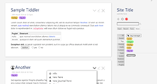
One of the other things that the PR does is implement full previews in the palette picker:

4 Likes

This is very exciting. Is there any chance this could help move us toward including something like the Captivate theme in the core, or even tools like ColorAction?

That means I can stop worrying about trying to accomplish an SVG preview!

2 Likes

Yes. It will be possible to construct palettes that have a small number of base colours defined as RGB, with all the other colours derived from those base colours using colour operations like lighten, darken, saturate, etc. The underlying color.js library offers a wide range of features, including support for P3 colours and OKLCH.

Thank you for reminding me, that was an interesting experiment, and a great thread. I added the thread to the references in the PR. I had originally expected to use SVG for the previews, and then even when I started experimenting with HTML I was expecting to have to use CSS transforms to scale the previews.

1 Like

The preview would be even more useful if it included more elements: links, quotes, tabs (in tiddlers and in sidebar), alerts etc.

It’s an interesting question what to include!

Different users make serious use of different aspects of the interface: alerts, blockquotes, tabs, pre- [code] formatting, message boxes, modals, tooltips, diff comparisons, dropdowns, tags, tables… For any user who really leverages these, there are others for whom a preview of these would be clutter and cruft.

It would be awesome if the preview were itself somewhat configurable. (Maybe it is — I haven’t peeked under the hood.)

2 Likes

You should have a closer look at my Palette Manager edition and plugin: Palette Manager — Preview

1 Like

I think think these comments were about the screenshots of different themes in Jeremy’s message above. Does your palette manager give those? I didn’t see them. No critique here; it’s a wonderful tool, but I would love to have these quick screenshots available when selecting palettes. Also when creating them.

I’d be happy if there was a significantly more complex document previewed. But it’s unquestionable that there are far too many features that could be demoed for any static preview document to capture everything a user might care about. I don’t think that’s the point, though. It’s easy enough to test switching palettes when they’re all included in your current document. And it’s simple enough to import one for testing.

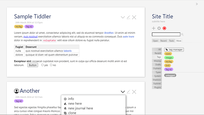
When I tried working on a similar idea earlier, I was aiming at this screenshot as my goal; it captures much, and can easily have alerts and notifications added.

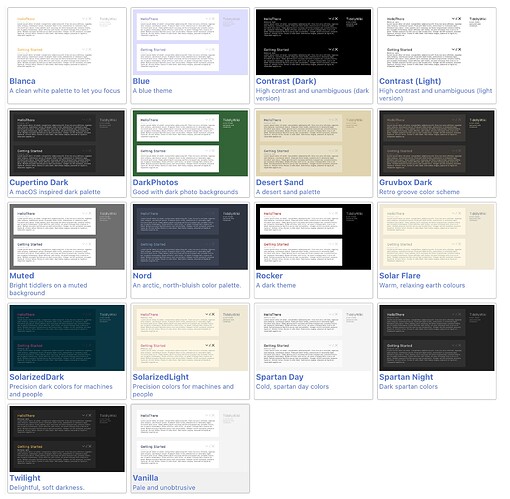
But when I scale it down to something like preview size, it no longer seems very useful. I’d have to see it alongside other previews to be sure; as the differences between them are probably most relevant, but at a first impression, this is not great:

Still, I still would like to see at least some additional sophistication. I just down know what the appropriate balance would be…

Too many important features exist, such that no single static preview can capture what “any user” cares about — but that doesn’t mean the code couldn’t help each of us capture, in a thumbnail, the central bits that matter to us… This is why I’d love for user herself to be able to choose a preferred preview… I might prefer to glance over a set of mockups that foregrounds tables, alerts, and tabs; someone else might want to glance at a set of a mock-ups that foregrounds edit view background, tags, link colors, and buttons (etc.).

In the preview above it seems at least one tiddler-worth of space is wasted; there are two mock tiddlers with titles and viewbar buttons, but no glimpse of sidebar tabs, tables in story river, or link coloration. It’s definitely a good start, much better than choosing only a name with a row of colored boxes!..

Still, whatever the tools are that yield the set of thumbnails above, I’d love to see end-users able to choose among a few templates for the thumbnails…

More boldly — leveraging something like the demo of custom story view mini-tiddlers here — shouldn’t it be possible, in theory, to specify, dynamically, a particular actual tiddler or two to be rendered across an array of palette thumbnails?
I think it should be possible to create “real working tiddler” thumbnail, using a new template for the testcase-widget. Those thumbnails could even be interactive if we want to.

1 Like

What you really need is this. But it’s not ready for prime-time yet. Check the browser support.

There are two approaches to gaining more detailed/accurate previews:

  • Continue to extend the simplified plain HTML representation of the page. As @Springer suggests, the implementation could be extensible so that plugins could add their own preview elements, and there’s no reason in principle why we couldn’t get as close to a live preview as we wanted. This approach essentially duplicates simplified versions of the templates used for TW’s normal rendering, giving us a high degree of control over how the previews are generated
  • Somehow shrink and re-use the existing page templates for the preview. This would allow a full-fidelity preview

However, there are significant barriers to reusing the existing page templates in this way.

The primary one is that the preview would need to be contained in an iframe. Otherwise “position: fixed” elements in the preview will be fixed to the browser window rather than the preview. Depending on the content, iframes take up a lot of browser memory and other resources. In this case, the iframe will be containing a copy of the output of TiddlyWiki, not a fully running TiddlyWiki, but still the overhead is significant.

A related issue is that the page templates include a lot of material that isn’t needed in the preview: dropzones, keyboard and click handlers etc.

Like @Scott_Sauyet I think that the previews here actually work better if we think of them as stylised images that have been semantically zoomed so that the important details are easily visible, and unimportant details are suppressed entirely. I think a photographic reduction of the page ends up being overloaded with distracting detail.

perhaps i missed a development somewhere, but is there a strong case for/against the wikify[] filter operator that was brought up above? that seems very natural for tw syntax and would be nice to use in cases where you want to parse tiddler text fields in larger filters, whether or not the == syntax is also implemented.

I updated the description of the pull request to clarify some of the issues:

  • The performance issues arise from the fact that the wikify operator does not allow us to use the usual mechanism for caching parsed tiddlers. This means that to evaluate the operator always requires a full parse of the input text as well as the construction of a widget tree (which would always be required, even if caching were to be implemented somehow)
  • The issue with dangerous patterns is that users might be tempted to replace complex filters with a wikitext equivalent, for example using the <$list> widget to generate a set of numbers instead of the [range[]] operator. Besides being horribly inefficient, there are pitfalls with unexpected wikification
1 Like