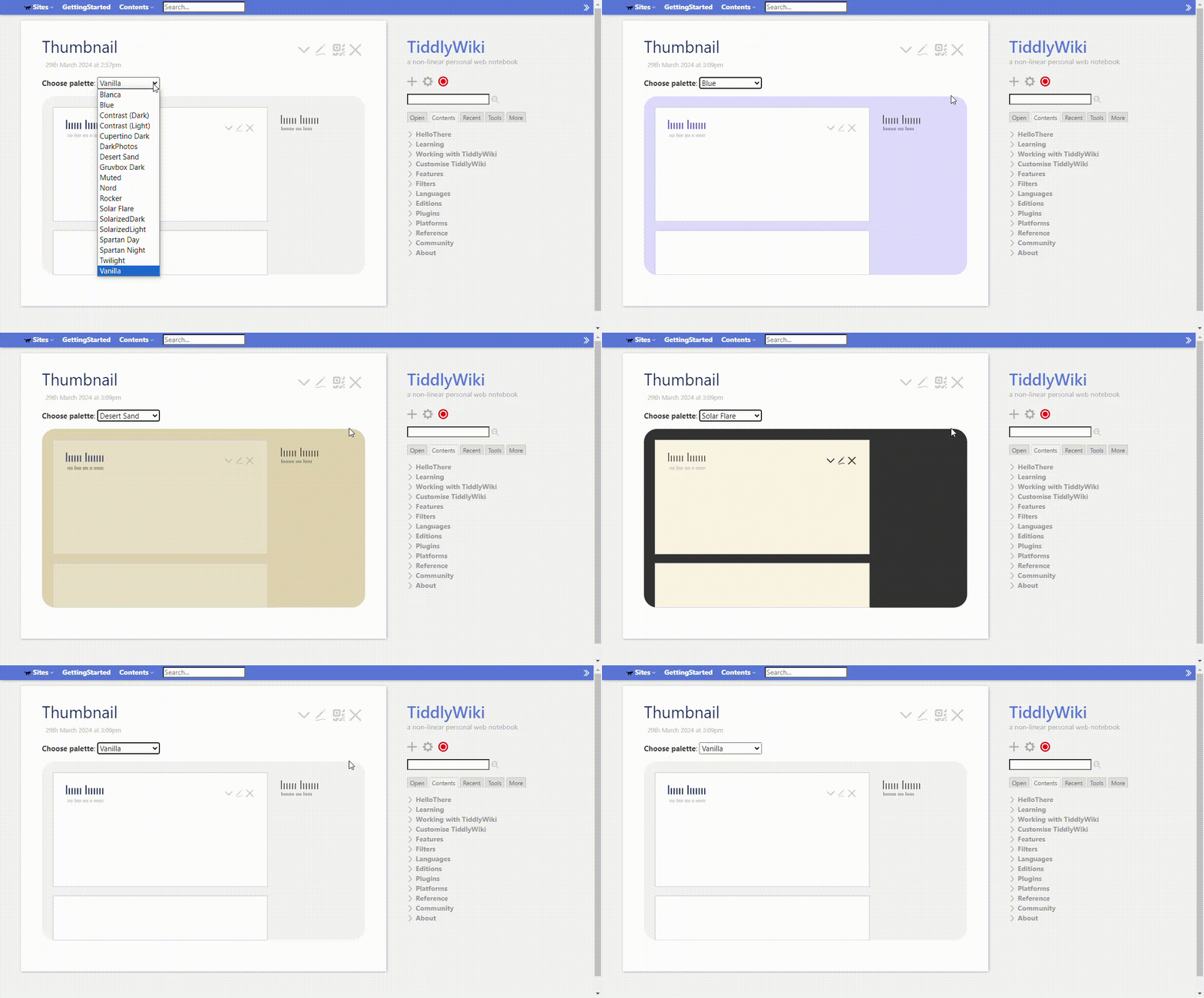
Indeed, the palette manager is a great tool. Yet it seems ot me that there’s more “birds-eye-view” that should be possible. Like a 2D concept map of which palette color relations fit which level of contrast, distinguishing reading-grade contrast from recognitional contrast…
For example, sidebar-foreground and sidebar-muted-foreground (and the hover variants of each of these, if defined) and sidebar-tiddler-link-foreground and sidebar-tiddler-link-foreground-hover all require reading-grade contrast against page-background.
Other palette-relations functionally require recognitional contrast — such as between sidebar-muted-foreground and sidebar-foreground, or indeed between tiddler-link-foreground and foreground.
Last, some palette relations merely invite recognitional contrast (but not in a mission-critical way). For example, the site-title-foreground doesn’t really need to differ from tiddler-title-foreground and/or primary. Having these differ in ways that aren’t salient for color-blind visitors doesn’t undermine the accessibility of the site.
Ideally, each palette would have a way to carry fields or tags that mark, for the whole palette: (1) its colorblind-accessibility (confirming that reading-level contrast DOES exist across all places where it’s needed, and recognitional-contrast DOES exist at least wherever it’s functional, like making links stand out from ordinary text), and (2) dark vs light.
