Should palettes help with html details?

Responding to this thread (How to use the colour macro as an attribute value - #26 by Springer) …

I realized that nothing in our default palette setup applies to details elements.

I’ve been using stylesheets to add background to details summary elements (usually with alpha-reduced variation of color as the background for the drop-down details content, and a left border to help reader recognize the “reach” of what’s covered by the summary idea). I have even learned to harness palette values so that the colors for details follows changes of palette rather than being hard-coded and clashing badly…

Proposal:

Could <summary> and <details> elements get default values in our palettes?

Rationale:

It’s very bad that there’s no visual cue to tell where the details content ends:

Here’s just a quick example from one of my wikis, for comparison:

This is currently accomplished with stylesheet code:

 details > summary {
   text-indent: 0em;
background-color: <<colour alert-background>>
}

details {border-left: 2px solid <<colour alert-background>>; background-color:<<colour alert-background>>44;}

This will work even better now that all the standard palette colors have 6 digits!

… Wouldn’t everyone prefer something like that (perhaps different in some small way, using something other than alert perhaps) to be built into palettes for details elements? (Anybody who already has their own css of course would get no interference, since their stylesheets would override the palette…)

3 Likes

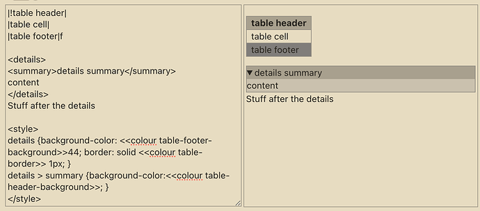
I think, as an initial step, they could follow the styling used for wikitext table elements…

image

1 Like

Sure. table-header-background in the palette is probably the most logical choice for details summary background (and border for the content).

It’s unfortunate that most of our existing palettes in fact do not specify a value for table-header background color.

But at least the few palettes that do include this value could have it carry over to the analog for headers (summary elements) within the html details structure, and anyone who wants details summaries to pop could do so within the existing palette.

(Of course people who put tables inside a details element might want a stylesheet for tables nested inside details container. That’s a niche case, though — and a better problem to have than simply having no visual help available with grokking the scope of an open html details content.)

It’s not easy to prevent the border from “crowding” the summary element, but one coherent palette approach might look something like this:

Have not considered the wider implications, but I do much prefer your version @Springer and could see myself using it for myself

Note: some “official” palettes, such as Contrast Dark, are “broken” (out of the box) with table headers.

So perhaps we need a place to review our palettes for internal issues before adding features. :grin:

You can review the palettes at: Palette Manager — Preview – All the palettes I did fix already use a WL suffix.

I think I’ll create some PRs with my adjusted palettes. They are not perfect, but fixed quite some problems.

Issues can be reported at: Issues · wikilabs/plugins · GitHub

2 Likes