How to put an info tab in the sidebar

Hi, I’m currently trying to put a new tiddler tagged with $:/tags/SideBar that displays the info tab and has a function similar to $:/core/ui/SideBar/Open: This is what i have done for now:

\whitespace trim

\define drop-actions()
<$action-listops $tiddler=<<tv-story-list>> $subfilter="+[insertbefore<actionTiddler>,<currentTiddler>]"/>
\end

\define placeholder()
<div class="tc-droppable-placeholder"/>
\end

\define droppable-item(button)
\whitespace trim
<$droppable actions=<<drop-actions>> enable=<<tv-allow-drag-and-drop>> tag="div">
<<placeholder>>
<div>
$button$
</div>
</$droppable>
\end

<div style="position:relative;">
<div class="tc-tiddler-controls" style="position:absolute;right:0;">
<$reveal state="$:/config/TiddlerInfo/Mode" type="match" text="sticky">
<$button set=<<tiddlerInfoState>> setTo="" tooltip={{$:/language/Buttons/Info/Hint}} aria-label={{$:/language/Buttons/Info/Caption}} class="tc-btn-invisible">
{{$:/core/images/close-button}}
</$button>
</$reveal>
</div>
</div>

<$macrocall $name="tabs" tabsList="[all[shadows+tiddlers]tag[$:/tags/TiddlerInfo]!has[draft.of]]" default={{$:/config/TiddlerInfo/Default}}/>

<hr> 

<div class="tc-sidebar-tab-open">
<$list filter="[list<tv-story-list>]" history=<<tv-history-list>> storyview="pop">
<div class="tc-sidebar-tab-open-item">
<$macrocall $name="droppable-item" button="{{$:/core/ui/Buttons/info}}&nbsp;<$link to={{!!title}}><$view field='title'/></$link>"/>
</div>
</$list>
<$tiddler tiddler="">
</$tiddler>
</div>

I’m struggling with a couple of things:

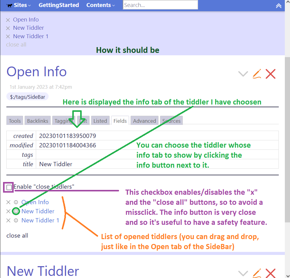
  • 1 - I can’t get the info of a specific tiddler to open. I can only display a empty TiddlerInfo panel.

  • 2 - the info button that replaces the close button in $:/core/ui/SideBar/Open does not work (I would like it to open the info of the tiddler it is next to).

    However, this last feature is not essential, it could also be quite complicated to implement. I can do without it, what is important is that it can open the info in the sidebar of a given tiddler


I think the solution for point "1" is in `$:/core/ui/Buttons/info` where one can select witch tiddler info to dispay (and not the empty TiddlerInfo panel)

The easiest way to use the tiddler-info template is, to create a tiddler with this content.

tags: $:/tags/Sidebar
caption: Info

<$tiddler tiddler={{$:/HistoryList!!current-tiddler}}>
{{||$:/core/ui/TiddlerInfo}}
</$tiddler>

It alsways shows the info from the last tiddler clicked. The last tiddler clicked is stored by the core in th $:/HistoryList tiddler current-tiddler field

5 Likes

I’m not 100% sure, what you want to achieve, but I do guess, that my example is similar to what you describe. I personally would want to have a bit different functionality.

The result looks like this:

5 Likes

It is not 100% what i’m looking for (it would be handy if there was a way to select the tidler whose info I want to view more quickly. The system with “current tiddler” is a bit awkward because it is not immediate to change which tiddler is the current one)
But it’s a great imput. It works fine.
If i manage to solve this little inconvenience and if I find a way to select the tiddler which will then have the info displayed I will update this topic. Thank you pmario :slight_smile:

1 Like

I have a history and focused tiddler tool. I need to go to bed, already falling asleep. I can do more tomorrow but see this below code, the image tiddlers are attached;

  • You can see how in the code I set the focus, and thus how to read it.
  • Sounds like you know what else to do

Click a red icon to set the focus on the current tiddler, green has focus.

I can share the full solution after some review and checking.

simple-focus.json (3.4 KB)

Night

I will check it out. Thanks and good night!

You are right, there should be a more generic text input and dropdown, that works similar to the search-dropdown from the sidebar. …

Users may want to add

  • a filter which selects the tiddlers which should be “considered”
  • a temporary tiddler, where to find the input text
  • and some user interaction actions that should be executed eg. with ENTER or ESC …

… just brainstorming

1 Like

You do not need two buttons; you can work with one button. I renamed it to $:/PSaT/focus-tiddler/image/fbutton

This button is edited for fill="currentColor"

<svg width="22pt" height="22pt" class="tc-image-close-button tc-image-button" viewBox="0 0 128 128">
<path fill="currentColor" fill-rule="evenodd" d="M64 128c35.346 0 64-28.654 64-64 0-35.346-28.654-64-64-64C28.654 0 0 28.654 0 64c0 35.346 28.654 64 64 64zm0-16c26.51 0 48-21.49 48-48S90.51 16 64 16 16 37.49 16 64s21.49 48 48 48zm0-16c17.673 0 32-14.327 32-32 0-17.673-14.327-32-32-32-17.673 0-32 14.327-32 32 0 17.673 14.327 32 32 32zm0-16c8.837 0 16-7.163 16-16s-7.163-16-16-16-16 7.163-16 16 7.163 16 16 16z"/>
<path fill="currentColor" fill-rule="evenodd" d="M65.086 75.41l-50.113 50.113c-3.121 3.121-8.192 3.126-11.316.002-3.118-3.118-3.123-8.19.002-11.316l50.114-50.114L3.659 13.982C.538 10.86.533 5.79 3.657 2.666c3.118-3.118 8.19-3.123 11.316.002l50.113 50.114L115.2 2.668c3.121-3.121 8.192-3.126 11.316-.002 3.118 3.118 3.123 8.19-.002 11.316L76.4 64.095l50.114 50.114c3.121 3.121 3.126 8.192.002 11.316-3.118 3.118-8.19 3.123-11.316-.002L65.086 75.409z"/>
</svg>

And your code has extra style on buttons. Note to style="color:red"> and style="color:green">

<$list filter={{$:/PSaT/focus-tiddler/button!!display-filter}} variable=nul>
<$list filter="[all[current]!match{$:/HistoryList!!current-tiddler}]" variable=nul>
<$button tooltip="Set focus on this tiddler" to=<<currentTiddler>> class="tc-btn-invisible" style="color:red">
{{$:/PSaT/focus-tiddler/image/fbutton}}
</$button>
</$list>
<$list filter="[all[current]match{$:/HistoryList!!current-tiddler}]" variable=nul>
<$button tooltip="Focused on this tiddler" class="tc-btn-invisible" style="color:green">
{{$:/PSaT/focus-tiddler/image/fbutton}}
</$button>
</$list>
</$list>
1 Like

Thanks for that @mohammad it was a button from my archives. I have found getting buttons coloured through the view template not straight forward.

Another thing I would add now was height and width 1em so when transcluded its right sized.

But the old problem (for me only perhaps) is if you put such a button in a tiddler and tag it $:/tags/ViewToolbar the color is lost on the toolbar.

  • It may also be a good idea to include the trailing “;” eg style="color:green;"

After a few days of trying, I’ve almost found a solution which is satisfying (and which I hope other users like as well). But unfortunately I’m stuck on some points.
This would be the result:


I think it could, if working, replace "Open" in the sidebar for users who would find a feature like this useful. This is the code:
\define lingo-base() $:/language/CloseAll/

\define drop-actions()
<$action-listops $tiddler=<<tv-story-list>> $subfilter="+[insertbefore<actionTiddler>,<currentTiddler>]"/>
\end

\define placeholder()
<div class="tc-droppable-placeholder"/>
\end

\define droppable-item(button)
\whitespace trim
<$droppable actions=<<drop-actions>> enable=<<tv-allow-drag-and-drop>> tag="div">
<<placeholder>>
<div>
$button$
</div>
</$droppable>
\end

<hr>
<$tiddler tiddler={{Open Info!!TiddlerInfo}}>
{{||$:/core/ui/TiddlerInfo}}
</$tiddler>
<hr> 

<$checkbox field="CloseTiddlersAbility" checked="on" unchecked="off" default="closed">&nbsp;
<$list filter="[{!!CloseTiddlersAbility}match:[off]]" emptyMessage="""Dis""">En</$list>able "close tiddlers"</$checkbox>

<div class="tc-sidebar-tab-open">
<$list filter="[list<tv-story-list>]" history=<<tv-history-list>> storyview="pop">
<div class="tc-sidebar-tab-open-item">
<$macrocall $name="droppable-item" button="<$button message='tm-close-tiddler' tooltip={{$:/language/Buttons/Close/Hint}} aria-label={{$:/language/Buttons/Close/Caption}} class='tc-btn-invisible tc-btn-mini tc-small-gap-right'>{{$:/core/images/close-button}}</$button>

<$button tooltip={{$:/language/Buttons/Info/Hint}}aria-label={{$:/language/Buttons/Info/Caption}} class='tc-btn-invisible tc-btn-mini tc-small-gap-right'>
<$action-setfield $tiddler="Open Info" $field="TiddlerInfo" $value="XYZ"/>
{{$:/core/images/info-button}}</$button>

<$link to={{!!title}}><$view field='title'/></$link>"/>
</div>
</$list>
<$tiddler tiddler="">
<div>

<$macrocall $name="droppable-item" button="<$button message='tm-close-all-tiddlers' class='tc-btn-invisible tc-btn-mini'><<lingo Button>></$button>"/>
</div>
</$tiddler>
</div>

:arrow_up: 
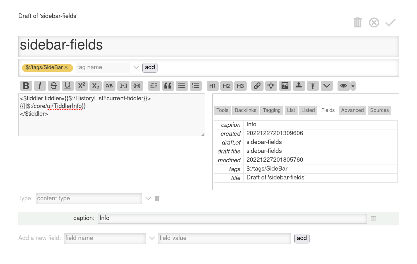
This tiddler has 2 additional fields:

  • “CloseTiddlersAbility” with value either “on” or “off”
  • “TiddlerInfo”: its value controls whitch tiddler’s info should be desplayed

But still I can’t do the following things:

  1. For now the checkbox puts a value (either on or off) in a field. But I don’t know how to make the buttons that close tiddlers not work if the field value is “off” I thought about using a MessageCatcherWidget, but I didn’t manage to get far.

  2. This should be easier, i.e. defining a droppable item that does work (I really wanted to do this part myself but couldn’t find any useful info on the subject)

  3. Lastly, in the code, where I put “XYZ” as a placeholder I would have put {{!!title}} so as to display the title of the tiddler whose info I want to see. Unfortunately what happens is that it literally puts "{{!!title}} in the field and doesn’t transclude anything. I think it’s a problem of me not knowing the correct syntax for the occasion (?)

If you have no clear idea on how to proceed, even some hints are greatly appreciated

Solved I think point 1. I wrapped around the buttons I want to disable this $list filter:

<$list filter="[[Open Info]get[CloseTiddlersAbility]] +[match[off]]" variable="ignore">
buttons to be disabled
</$list>

they disappear if the value of the field is “off”