How to keep a button on the same line as a link? (+ I share some changes I made to to be more comfortable using tags)

Inspired by this recent topic I updated the tiddlers that manage my tag-pills (both the appearance of the tag-pill and its dropdown). I had already presented some of my solutions some time ago.

Now I’m sharing the updated tiddlers:
$ _rga_ListItemTemplate_Tag-name.json (378 Bytes)
$ _rga_ListItemTemplate_Tag-head.json (205 Bytes)
$ _rga_Template_List-Numbered_Status.json (389 Bytes)
$ _core_ui_TagTemplate(2).json (1.4 KB)
tiddlers(21).json (1.1 KB) - (test and a little stylesheet)

Snapshot:

You can see:

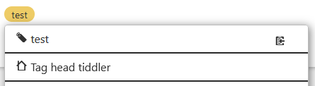
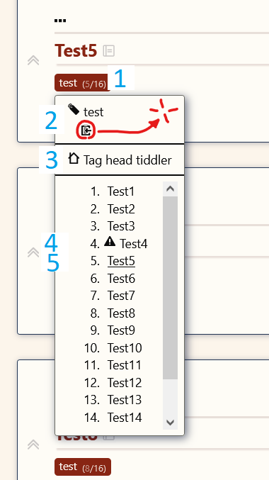
  1. Next to the pill tag the two numbers indicating the total number of tiddlers tagged “test” and the relative position of the current tiddler in that list
  2. Link that leads to the tag-tiddler (and a button that copies the tag name to the clipboard)
  3. The “tag-head”. If the tag-head field of the tag-tiddler is not empty, the value of the field will appear here as a link to a tiddler. I use this field to put a “main” tiddler that is above all tiddlers that have a tag, but different from the tiddler-tag itself. (e.g. if I have a “Books” tag I could have as a tag-head: “What is a book?”)
  4. I use a current-state field to report the conditions of my tiddlers. Here in the example the tiddler “test4” needs to be revised. (In fact in the current-state field the tiddler has $:/core/images/warning)
  5. Finally, as per @TW_Tones’ solution in one of the topics mentioned above, the current tiddler (test5) is underlined

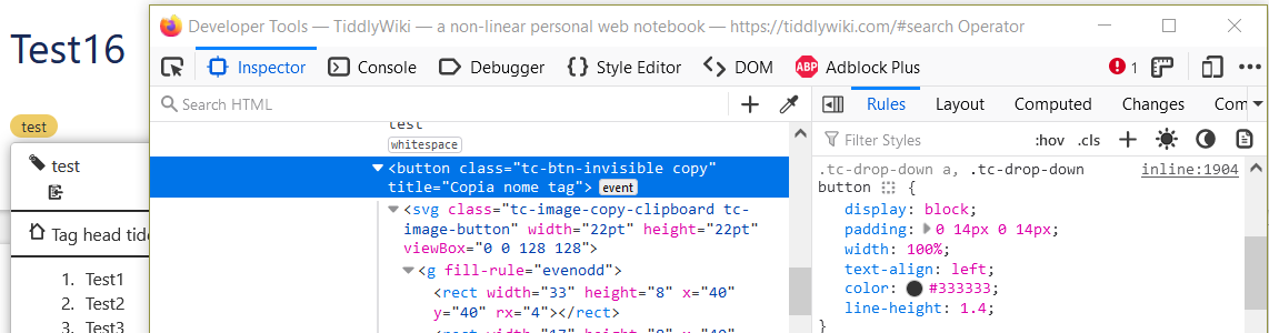
  • Unfortunately I encountered a small problem: (2)
    The button that should copy the tag name does not remain on the same line as the link to the tag-tiddler. I didn’t understand how to do it.
    Ideally I would like it to be fixed on the right (as indicated in the image) But in reality I just need it to stay on the same line as the link.

Does anyone know how I should do it?

1 Like

This is a CSS issue—links and buttons in the tag dropdown get display: block; width: 100%; applied by default. This means you’ll need a more specific style to overwrite the default behavior.

In $:/rga/ListItemTemplate/Tag-name, I added the class copy to the copy-to-clipboard button:

<div class="tc-menu-list-item">
<$link to=<<currentTiddler>>>
{{$:/core/images/tag-button}}&nbsp;<$view field="title"/>&nbsp;<$button tooltip="Copia nome tag" message="tm-copy-to-clipboard" class="tc-btn-invisible copy" param={{!!title}}>
{{$:/core/images/copy-clipboard}}
</$button>
</$link>
</div>

In your stylesheet, add a corresponding definition:

.tc-drop-down button.copy {
  display: inline-block;
  float: right;
  width: fit-content;
}

Results: image

TW has a lot of CSS, so rather than digging into the core stylesheets to find out what’s going on, I like to use my browser’s inspector tool to diagnose the problem. Here’s what I found out hovering over the ‘copy’ button (screenshot taken after I’d added the ‘copy’ class to the button, but before I’d defined it):

3 Likes

The drop down makes use of a class that tends to cause it, I have been somewhat frustrated with this myself, sometimes rather that a space between elements in the same line using a non-braking space &nbsp; is sufficient.

Either go with @etardiff’s solution, or extend tc-menu-list-item either in a stylesheet tiddler, or the tiddler you’re using to build the menu.

.tc-menu-list-item {
  white-space:nowrap;
}

Thank you @etardiff!

I hadn’t noticed, thank you very much

I use the browser indsector tool too, but thank you anyway for recommending me to use it, always a good idea to remember to use it. :grinning_face_with_smiling_eyes:

2 Likes