Could you setup a minimal demo wiki (with all those plugins installed) and share the link here!
This way one can better understand the issue and give a try for possible solution!
Its solved now.
<div class="flex-col text-justify">
{{!!text}}
</div>
I assume that the wikitesxt formatting was not preserved because I didn’t used line break before and after {{!!text}}
Sttot was planning to write a grid layout plugin, but he is busy writing his paper recently!
Please find attached a simple example called RHS-include
rhs-include-body.json (1003 Bytes)
It makes use of the new cascade for the viewBody template, and works on tiddlywiki.com.
Basically if a tiddler has the field rhs-include containing a tiddler, it will transclude that tiddler on the righthand side of a two column table ands transclude the current tiddlers body in the left hand side.
You could change it to detect is there is a matching echart and instead transclude that, then it will only occur for tiddlers with an echart.
Alternatively your original filter can be rewritten, like I suggested elsewhere
as simply
[all[current]is[tiddler]!tag[$:/tags/SideBar]!TheBrain[no]!tag[Journal]]
Possibly even
[all[current]![system]![shadow]!TheBrain[no]!tag[Journal]]
as the current tiddler is not set in the sidebar.
But I would have thought
[all[current]TheBrain[yes]]
Could include the echart ?
I want to clarify a few things
-
I use Krystal horizontal layout plug in in almost all my wikis (some things may not work in Krystal like in the classic layout of TW).
-
One day when I was experimenting with my wiki, I thought of changing the backlinks (reference) section at the bottom of the tiddler. I thought it would be better to use
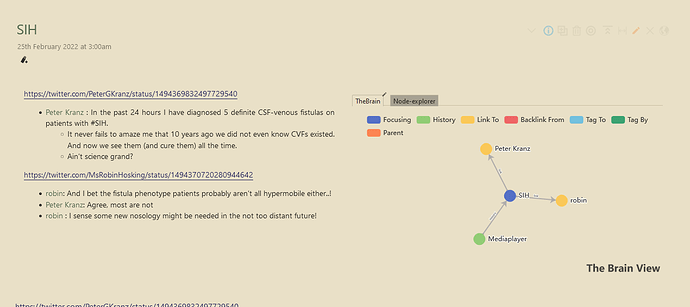
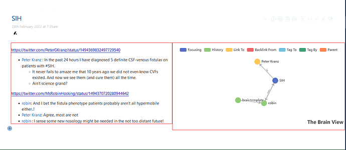
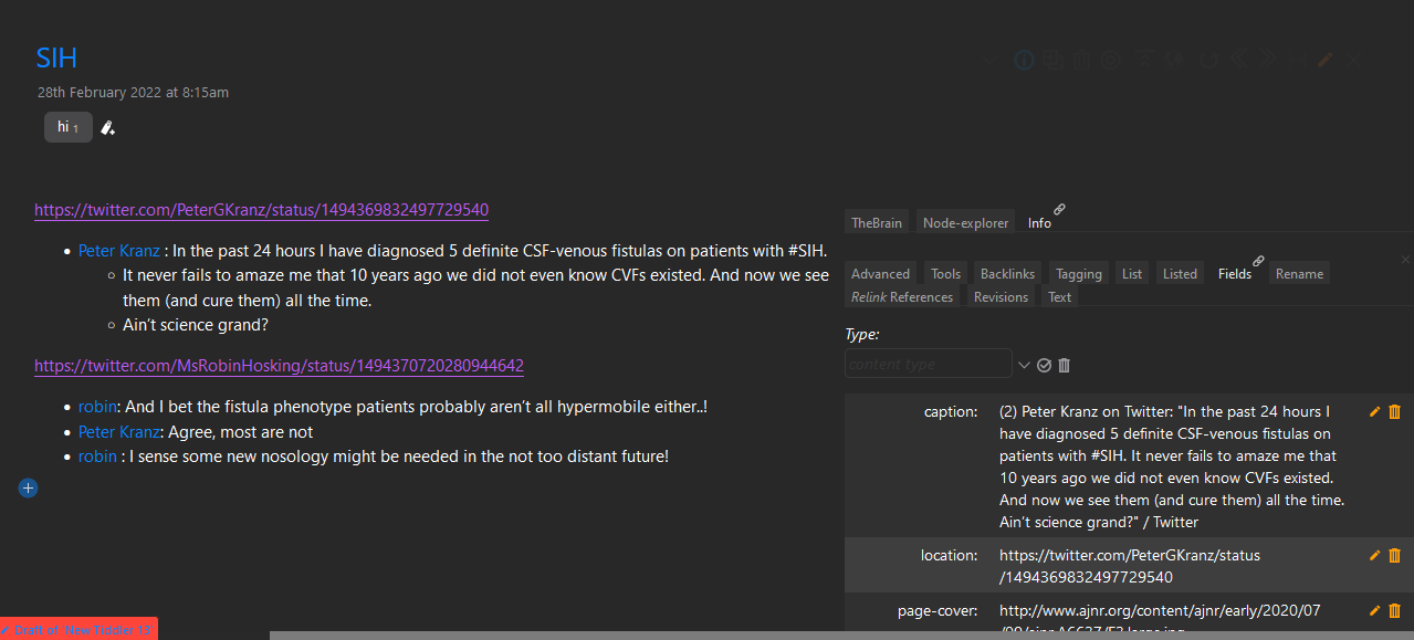
node-explorer of Shirazinstead of theTOC Generic plug inI was using since node-explorer can edit the referenced/backlink tiddlers within the reference section itself. Then I thought I will addTheBrain Echartsalso to the reference section along with the node-explorer using thetab macroto give a side by side graph view also. Then I thought why I have to keep the reference section at the bottom of the tiddler. Instead keep it to the right side of tiddler body which was inspired bySubpagesconcept by Jeremy in AMBIT. But in Krystal horizontal story river, theright floatofSubpageswas not working. So I usedShiraz Flexigridoption and transcluded thereference section( includingnode-explorer of ShirazandTheBrain echartsusing a tab macro) to the right side of the tiddler and tiddler body to the left side of the tiddler. And it was working OK.Here you can see
tiddler body(text) to the left andreference section( includingnode-explorer of ShirazandTheBrain echartsusing a tab macro) to the right.Given below is the code I am using now.
<$list filter="[all[current]!is[system]!is[shadow]!tag[$:/tags/SideBar]!tag[Journal]]">


<div class="flex-row justify-content-center">
<$list filter="[range[1]]" variable="ignore">
<div class="flex-col text-justify">

{{!!text}}

</div>
</$list>
<div class="flex-col">

{{||Bottom Tabs viewtemplate - without folding}}

</div>
</div>
-
Only problem with this approach for me was that the
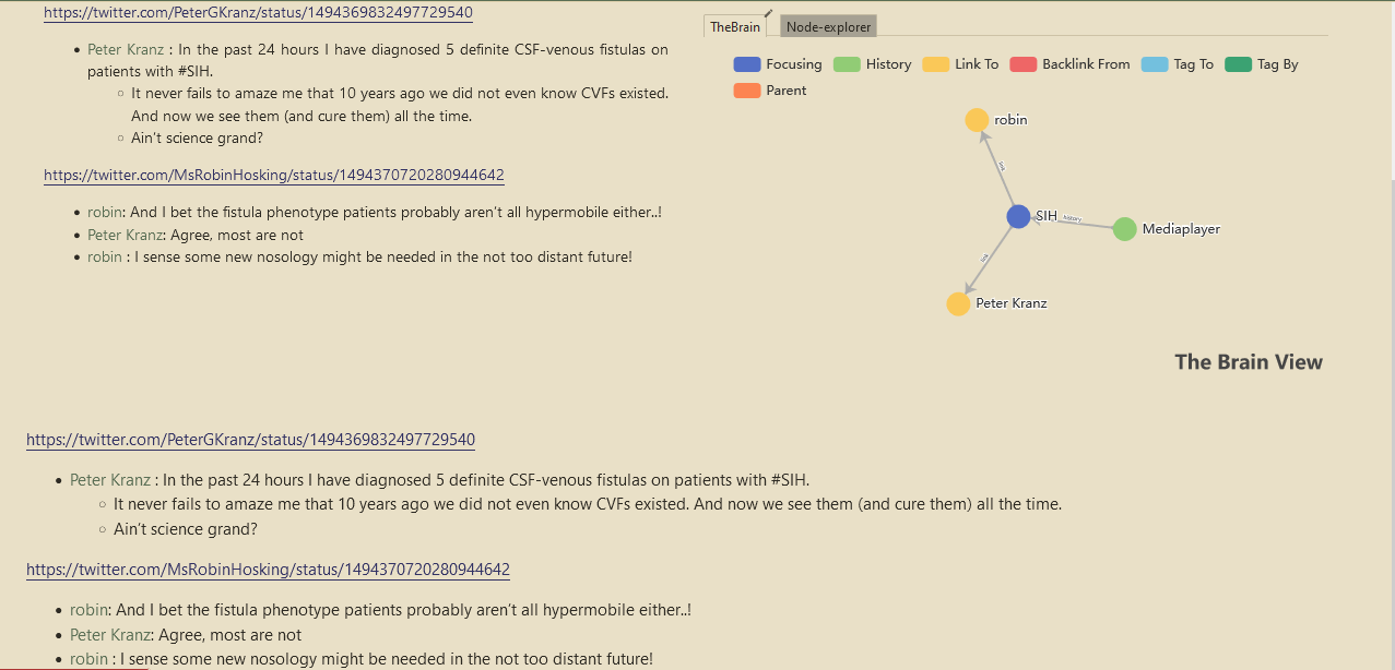
$:/core/ui/ViewTemplate/bodywill also display the tiddler body and will result in duplication of the tiddler body. This is what I am trying to avoid.See the duplicated tiddler body (text) above and below.
-
I could add
hide-bodyfield to the tiddlers with thenew viewtemplate for References(inlcuding node explorer and TheBrain) and set it toyes. But I wantalmost all the tiddlersin my wiki to have the new viewtemplate for Referencesexcept for system, shadow tiddlers and a few specified tiddlers i create which can be marked by a specific tag or field.Its not feasible to manually addhide-bodyfield to all tiddlers I create. For making this easier , I can create a customnew tiddler buttonwhich will addhide-bodyfield automatically. But I was checking whether I can avoid creating a customnew tiddler button. That’s when I started thinking about the ways to hide the$:/core/ui/ViewTemplate/bodyfor all tiddlers except the once I mentioned before. It would have been easier if there is a way to hide one viewtemplate when another another viewtemplate is used on the same tiddler.` May be it should be feature request -
I don’t think your solution remove this obstacle of duplicating the tiddler body contents in view mode. Correct me if I am missing something.
This thread was created when I had doubts about how to use the Flexgrid of Shiraz in a viewtemplate for References to float the node-explorer and TheBrain Echarts to the right of tiddler body.
What i need now is way to avoid duplication of the tiddler body contents wherever the new custom viewtemplate for References is applied . That’s why I had to create one more thread regarding the ways to hide the $:/core/ui/ViewTemplate/body
I have I belive shared all you need to get this done. I have shared the method and techiques but since I dont have your configuration I could not build the actual solution.
You can
- Look at my code and steel the methods
- or share a basic wiki with us and i can configure it for you
- or I could have a go putting your above code in a body template and give it back to you but that way I cant test it.
Basicaly you should be able to move what was in your view template to the body template.
By the way your filter can be shortened.
May be I don’t have enough knowledge to understand it . For the time being I am not going to pursue further with this project. I have wasted soo much time behind it. Will revisit when my mind is fresh. Thank you for the help.
Sharing demo wiki into discourse is not easy like in github.
Yes, because you are in the text field, transcluding the text field.
IMO, the way around it is to add a new and conditional viewtemplate with your mindmap. Then style the text field and this new template to show side by side. I would put this styling inside the very new viewtemplate because it will need to dynamically use the current tiddlers title.
This shows the basic idea :
title: braintemplate
tags: $:/tags/ViewTemplate
text:
<$list filter='[all[current]has[SOMECONDITION]]'>
<div class="rightside">

{{TheBrain}}
</div>

<style>
[data-tiddler-title='{{!!title}}'] .tc-tiddler-body {
  border:1px solid red;
  width:50%;
  clear:left;
}
[data-tiddler-title='{{!!title}}'] .rightside {
  border:1px solid red;
  width:50%;
  float:right;
}
</style>
</$list>
Position this template above the bodytemplate, i.e by clicking the $:/tags/ViewTemplate tag and dragging it to above the bodytemplate.
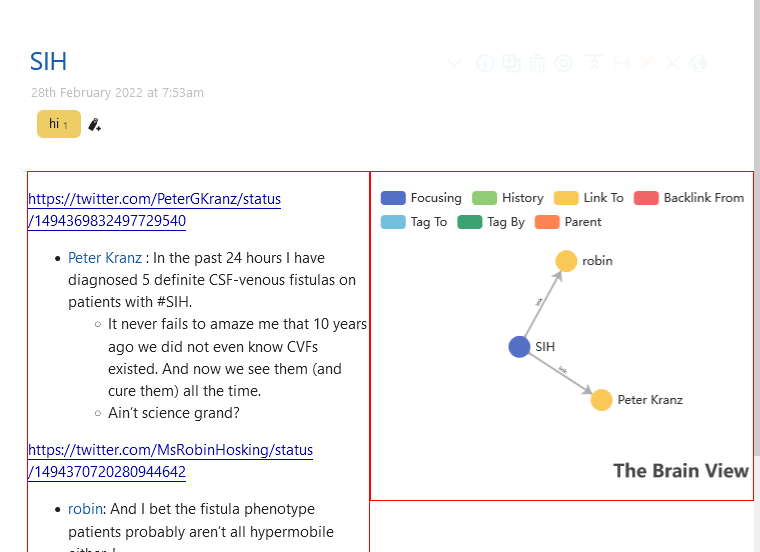
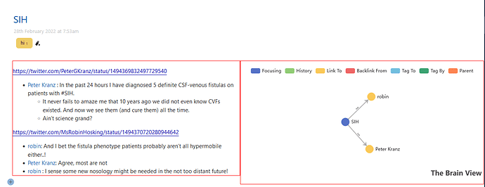
@twMat Did you edited the code after posting initially. When I first used your code .rightside was floating at the right top of the tiddler overlapping the viewtoolbar buttons. So i added margin-top:146px; to [data-tiddler-title='{{!!title}}'] .rightside { and then both .tc-tiddler-body and .rightside came at the same level side by side. I thought finally I got it working and was happy. But when I viewed the tiddler in the maximized state (only seen in krystal horizontal plug in), although .tc-tiddler-body and .rightside where at the same level, the nodes of the TheBrain graph were moving out of the screen/tiddler to the right.
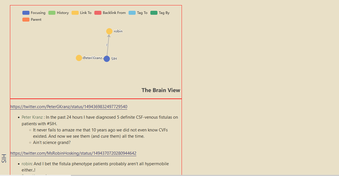
So I deleted the initial code and copied the code from the forum again. Now the .tc-tiddler-body and .rightside are seen one above the other with graph view on the top.
I forgot to take a snap of initial code which almost worked.
Here is the code I am using now.(I am not sure whether both are the same or not, that why asked it)
<$list filter='[all[current]!is[system]!is[shadow]!tag[$:/tags/SideBar]!tag[$:/tags/ViewTemplate]!tag[Journal]!tag[tweaks]!TheBrain[no]]'>
<div class="rightside">

{{TheBrain}}
</div>

<style>
[data-tiddler-title='{{!!title}}'] .tc-tiddler-body {
  border:1px solid red;
  width:50%;
  clear:left;
}
[data-tiddler-title='{{!!title}}'] .rightside {
  border:1px solid red;
  width:50%;
  float:right;
}
</style>
</$list>
Thank you for taking time to help. Hope to solve this soon.
When you’re doing a lot of chopping and changing, Ctrl-C everything. Then…
Ah, yes I did. I thought I realized a somewhat better solution even though the first also worked. I think the initial styling was like this:
<style>
[data-tiddler-title='{{!!title}}'] .tc-tiddler-body {
  border:1px solid red;
  width:50%;
}
[data-tiddler-title='{{!!title}}'] .rightside {
  border:1px solid red;
  width:50%;
  position:absolute;
  right:0;
}
</style>
But, in my edited code, you can see if just removing clear:left; will position them correctly. You can also see what happens if the widths are set to 49% instead.
This the code I am using now
<$list filter="[all[current]!is[system]!is[shadow]!tag[$:/tags/SideBar]!tag[Journal]!tag[$:/tags/ViewTemplate]!tag[$:/tags/Stylesheet]!tag[tweaks]!TheBrain[no]]">
<div class="rightside">

{{TheBrain}}
</div>

<style>
[data-tiddler-title='{{!!title}}'] .tc-tiddler-body {
  border:1px solid red;
  width:50%;
}
[data-tiddler-title='{{!!title}}'] .rightside {
  border:1px solid red;
  width:50%;
  position: absolute;
  right:0;
  margin-top: 146px;
}
</style>
</$list>
I don’t know whether it’s the right to use margin-top:146px; , it somehow works.
float:right; never used to work in krystal horizontal layout plug in.
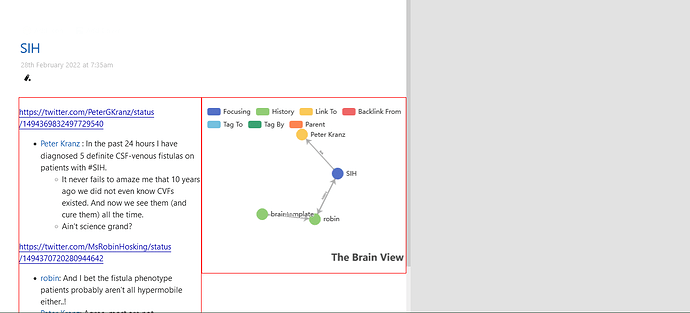
Non maximized state of tiddler
Maximized state of tiddler
Another thing that i noticed is when the filter used was smaller, i had to use margin-top:164px;. Any idea why is it so?
<$list filter="[all[current]tag[hi]]">
<div class="rightside">

{{TheBrain}}
</div>

<style>
[data-tiddler-title='{{!!title}}'] .tc-tiddler-body {
  border:1px solid red;
  width:50%;
}
[data-tiddler-title='{{!!title}}'] .rightside {
  border:1px solid red;
  width:50%;
  position: absolute;
  right:0;
  margin-top: 164px;
}
</style>
</$list>
Edit: When i reverted back to the first code, I had to use margin-top: 164px; there also.
Anyways it works as I intended. Thank you so much for your help @twMat
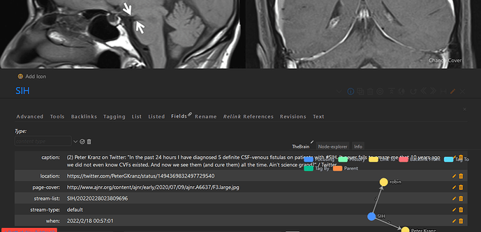
I had a small problem with the above code. When the tiddlerinfo viewtoolbar button is clicked, the thebrain on the right side will overlap the opened tiddlerinfo section like shown in the below image.
As a work around, I added the tiddlerinfo into the braintemplate using a tab macro like this.
Is there any other workaround for this?
Also can I incorporate your side-editor into this tabs for easy editing of tiddlers (If yes, can you suggest how to do it) Side-editor wont work easily with krystal horizontal story view. That why I am thinking in that direction.
You can try to set the z-index for the popup and the Brain side, i.e in the style parts defined previously, you can see if this works
[data-tiddler-title='{{!!title}}'] .rightside { z-index:10; }
[data-tiddler-title='{{!!title}}'] .tc-titlebar .tc-popup { z-index:20; }
(that first z-index:10can be directly inserted in the previous definitions, it does not have to be a new definition).
What do you mean with “into this tabs”? Where?
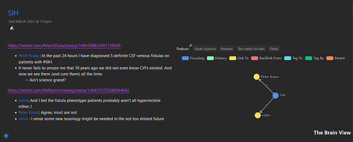
Check the second image in my today’s post. On the right side, you can see a tab instead theBrain graph view
This is my current setup.
This the braintemplate used currently
<$list filter="[all[current]!is[system]!is[shadow]!tag[$:/tags/SideBar]!tag[Journal]!tag[$:/tags/ViewTemplate]!tag[$:/tags/Stylesheet]!tag[tweaks]!TheBrain[no]!has[page-cover]]">
<div class="rightside">

{{||Bottom Tabs for viewtemplate - without folding}}
</div>

<style>
[data-tiddler-title='{{!!title}}'] .tc-tiddler-body {
  border:1px solid transparent;
  width:50%;
}
[data-tiddler-title='{{!!title}}'] .rightside {
  border:1px solid transparent;
  width:50%;
  position: absolute;
  right:0;
  margin-top: 146px;
}
</style>
</$list>
Bottom Tabs for viewtemplate - without folding is the tab macro used.
<<tabs "[[TheBrain]] [[Node-explorer]] [[$:/sq/ui/ViewTemplate/rename-tiddler]][[Text editor for tabs]] [[$:/core/ui/TiddlerInfo/Fields]] [[$:/plugins/jd/plainrevs/TiddlerInfo/Revisions]]" "default:[[TheBrain]] ">>
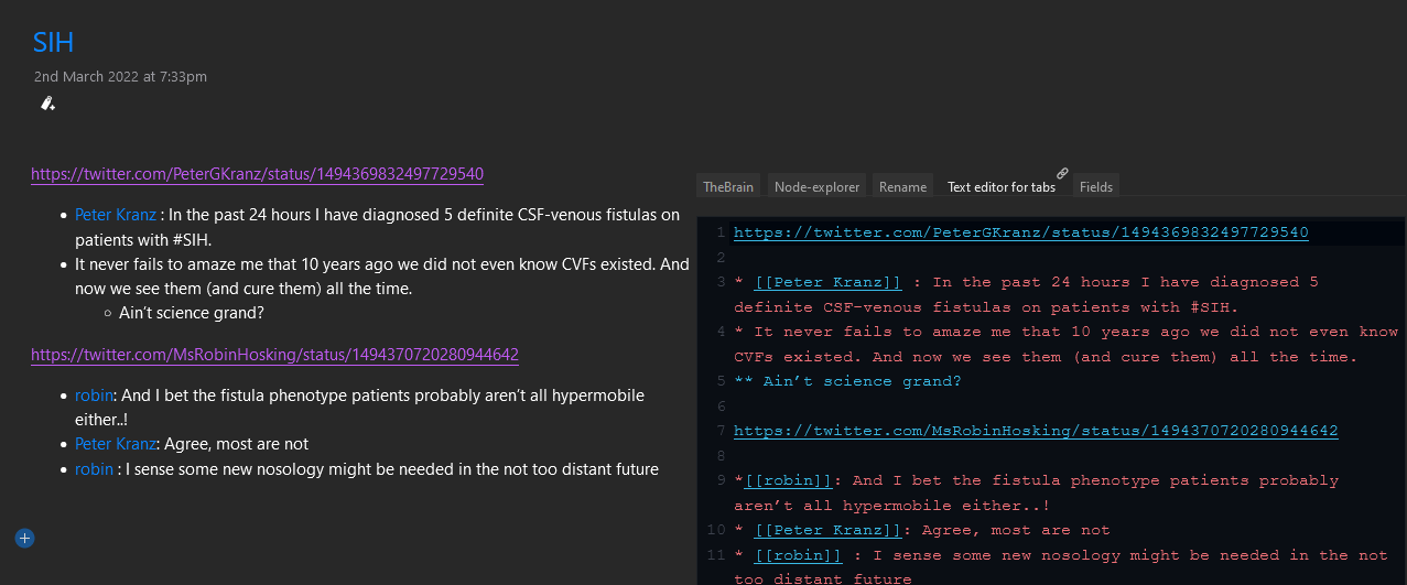
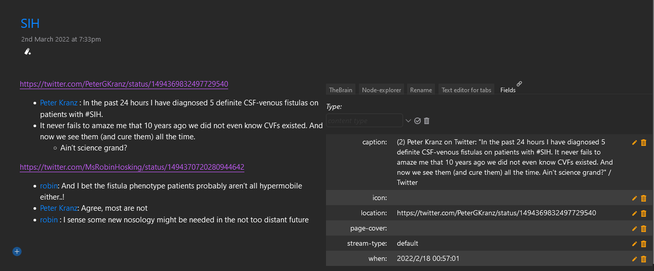
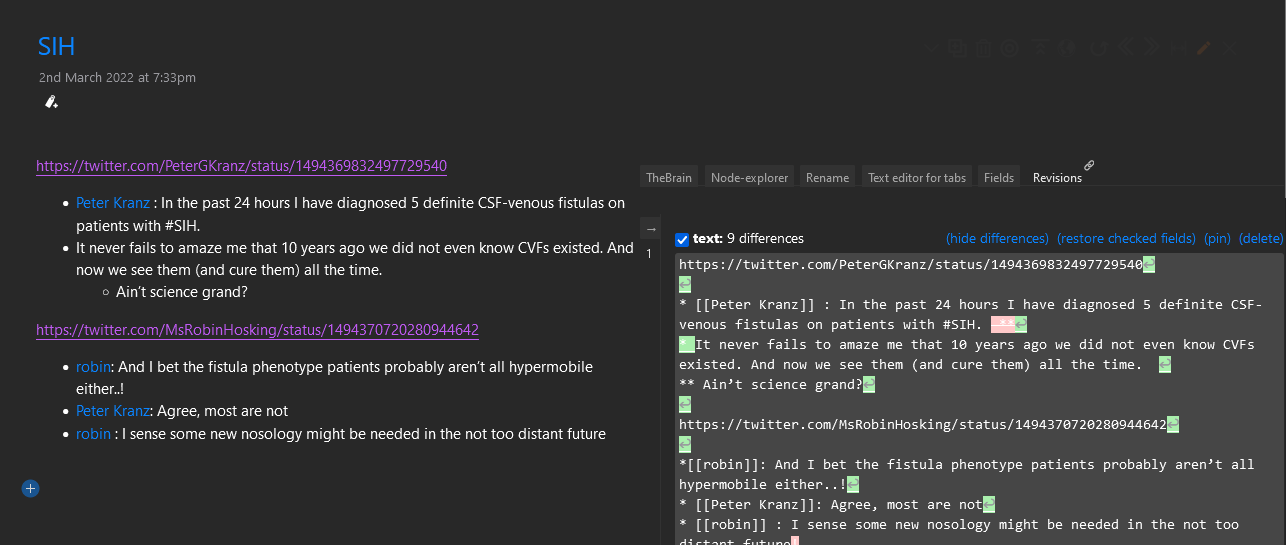
Contents of the tab macro include a text editor tab, field tab and revisions tab also.
I cloned the core text editor tiddler and removed the editor toolbar buttons to create Text editor for tabs. Is it ok to do so?
Field tab was taken from Saq’s UI experiments wiki.
Revisions tab is taken from JD’s revisions plug in.
These are just some experiments I am doing. Not my main wiki.
I have some questions
-
Is it possible to hide the
.rightsideusing some button so that it seen only when the button is pressed. The.tc-tiddler-bodyshall occupy the entire width of the screen when the.rightsideis hidden. Is it possible ? Not an urgent thing. Was just exploring some UI ideas which came to my mind. -
Is it possible to hide the
.rightsidewhen the wiki is opened in mobile phone. Or is it possible to bring the.rightsideto the bottom of the tiddler by using another viewtemplate when the wiki is opened in mobile phone. -
z-indexthing didn’t worked. I will check later once more.
To get the SideEditor into a tab would take some redesigning depending on which aspects of the SideEditor would you want. It is designed to float and be resizable, so I’m guessing you don’t want that, but there is also the “hover features”. And maybe you’re not interested in all the button controls? The more of those things you cut out the easier it should be because it is basically just an EditTextWidget and some buttons. I’m afraid you’d be the one who experiment with it all but I’d be happy to assist with specific questions.
One method could be to enclose all of the listwidget content in a revealwidget. You can use a field in the current tiddler to store the state.
Everything is possible but different degrees of fiddling. There is the InfoMechanism to find out what size of screen is used, which you can use as a condition to show one template or the other or no template etc.
If this works, I may not need to incorporate SideEditor into the setup.
For these two, I will get back to you after reading and experimenting a little with it.
Sure, I don’t see why it would be a problem. (Doesn’t that pretty much leave just a EditTextWidget?)
