Here I have a custom layout of card like tiddlers UI. Card size can be changed using buttons or keyboard shortcuts or context-menu. That’s all working well.
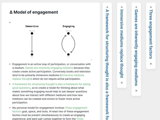
Now I am trying to implement a collapse and expand card option inspired by this roam research theme as shown in this post - Multi-Column Layout / Storyview - #47 by arunnbabu81 and screenshot below.
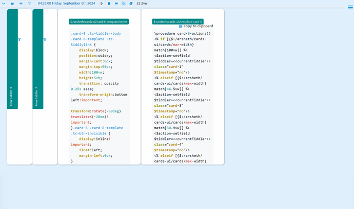
I was able to partially implement it as seen in the screenshot below.
But I want some help in
- aligning the expand button above the tiddler title.
- tiddler title to be filling the card’s 80% height
- also the expand button is not visible at tiddler or card width less than 7px. I want the card width to be atleast 3px.
- The stylesheet for the collapsed tiddler is at My TiddlyWiki — a non-linear personal web notebook
- Template of the collapsed tiddler is at My TiddlyWiki — a non-linear personal web notebook
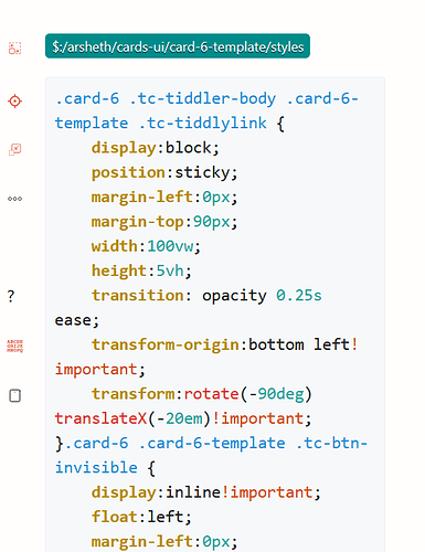
- Card can be collapsed by using the third button from the top on the left side of the tiddler (hover on the left side of the card to see those buttons -see the screenshot below)
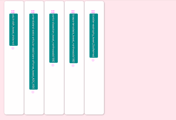
A similar functionality is seen in krystal horizontal view - My ~TiddlyWiki — a non-linear personal web notebook


