How can we use CSS to fill to end of a table cell?

Folks,

How can we use CSS to fill to end of a table cell?

  • When some table rows have a lot of text and others do no there is a large gap before we see the value in the next column
  • How could I cause the whitespace to the right of a table cell to be filled with dots or dashes?

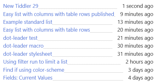
Looking something like this;

This is a long value...detail1
Shorter................detail2

Please try this on tiddlywiki.com

<$list filter="[all[tiddlers]!is[system]!sort[modified]limit[10]]">
   <tr><td><$link/> </td><td><$view field="modified" format=relativedate/></td></tr>
</$list>

I can use borders but I only want the dots after the value in a table cell. eg

  • Perhaps If I could lift the boarder higher?

When complete I will post a new How to quickly list results in columns.

So I bookmarked this article the other day but haven’t taken the time to really go through it but I remember the author talks about just this subject. Might be of help.

3 Likes

We have an example here at TalkTW that people can start with: a macro to create toc like table with dot leader

1 Like

I tried that @Brian_Radspinner on TiddlyWiki.com with dot-leader-example.json (1.1 KB)

But it appears not to be working.

This “filling” seems to me to be a gap in CSS facilities, and all the “work arounds” are either over complex or verbose, and have their own problems. All an anathema to what I am trying to do. I may just go with the border-bottom.

Thanks all anyway :nerd_face:

You’re so picky :grin:

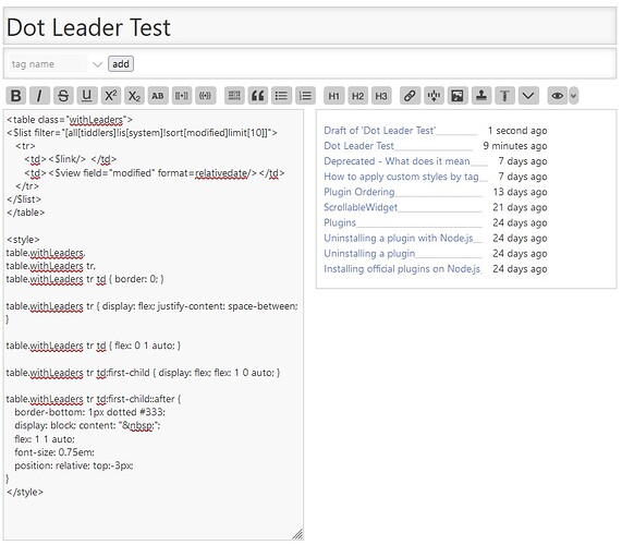
How about this then:

<table class="withLeaders">
<$list filter="[all[tiddlers]!is[system]!sort[modified]limit[10]]">
   <tr>
      <td><$link/> </td>
      <td><$view field="modified" format=relativedate/></td>
   </tr>
</$list>
</table>

<style>
table.withLeaders,
table.withLeaders tr,
table.withLeaders tr td { border: 0; }

table.withLeaders tr { display: flex; justify-content: space-between; }

table.withLeaders tr td { flex: 0 1 auto; }

table.withLeaders tr td:first-child { display: flex; flex: 1 0 auto; }

table.withLeaders tr td:first-child::after {
   border-bottom: 1px dotted #333;
   display: block; content: "&nbsp;";
   flex: 1 1 auto;
   font-size: 0.75em;
   position: relative; top:-3px;
}
</style>

This is how it looks for me:

1 Like

Thanks, I went ahead with the border solution and published it here because I was really after a simple solution How to Easily List items with columns!

@Brian_Radspinner your example is particularly good for two column lists;

  • and say page numbers

Snag_1315278c

But notice how my published solution need not use the <table> tag.

  • Is there any way to reduce the complexity in the wikitext, in your example, even if the styles remain complex?

Sure is…

<$list filter="[all[tiddlers]!is[system]!sort[modified]limit[5]]">
   <tr class="dots"><td><$link/> </td><td><$view field="modified" format=relativedate/></td></tr>
</$list>

<style>
tr.dots { display: flex; justify-content: space-between; }

tr.dots td { flex: 0 1 auto; }

tr.dots td:first-child { display: flex; flex: 1 0 auto; }

tr.dots td:first-child::after {
   border-bottom: 1px dotted #333;
   display: block; content: "&nbsp;";
   flex: 1 1 auto;
   font-size: 0.75em;
   position: relative; top:-3px;
}
</style>
1 Like

First of all, you should create valid HTML code for the table using TABLE and TBODY elements.

Then you could use nth-child(odd) pseudo class for styling like so. In the example I use the STYLE element to be easily copy / pasted. In TW we should use a stylesheet tiddler.

IMO it’s easy to read and looks much nicer as dots

<style>
.myTable tr:nth-child(odd) {
background: #ccc
}
</style>

<table class=myTable><tbody>
<$list filter="[all[tiddlers]!is[system]!sort[modified]limit[10]]">
   <tr><td><$link/> </td><td><$view field="modified" format=relativedate/></td></tr>
</$list>
</tbody></table>
1 Like

Thanks @pmario an alternative that may suit many.

I know I am living dangerously omitting tags, but it does work. If I was publishing on the internet, or need something more sophisticated I would add these tags.

  • Also the table tag introduces boarders I do not want on tiddlywiki

My variation on your suggestion is;

<style>
.nthrow tr:nth-child(odd) {
background: #f2f2f2
}
</style>

<div class=nthrow>
<$list filter="[all[tiddlers]!is[system]!sort[modified]limit[10]]">
   <tr><td><$link/> </td><td><$view field="modified" format=relativedate/></td></tr>
</$list>
</div>

Although, I think with a little work we could find another way than <td> to do the columns and justification, and not bend the rules. :nerd_face:

To all, I think the range of different ways to present a list item that have being raised here are fantastic. I think a macro or one of the new features being discussed that will appear in TiddlyWiki 5.2.4+, will be a good idea allowing users to select from anyone of these, perhaps with a simple keyword.

The list widgets template parameter can achieve this to some degree, the main issue in my mind is how to pass the one or more values for each row, or column to the macro.

Maybe some thing like this with current tiddlywiki

\define row() <$link/>|<$view field="modified" format=relativedate/>

<$list filter="[all[tiddlers]!is[system]!sort[modified]limit[10]]">
   <<display-row  formatname>>
</$list>

Where “formatname” triggers one of the alternative row layouts suggested here.

Thanks all for your contributions.

Like @pmario I think you should create valid html code!
I also suggest use flex instead of table. Tables are fragile.

1 Like