Grok TiddlyWiki 2.0 is live!

Hi everyone,

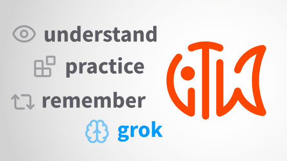
I’m happy to announce that major revisions to my Grok TiddlyWiki learning resource are done, on schedule and under budget. :stuck_out_tongue:

Changes

These revisions bring GTW up to date with many of the newest features in TiddlyWiki: procedures, functions, <% conditional expressions %>, custom widgets, parameterized field transclusions, and so on. Macros and similar older ways to achieve the same things are de-emphasized but still discussed. I’ve also read through the entire book and gotten a fresh set of reviewers, and we’ve corrected a number of things that had gotten slightly out of date over the years or could just be explained better (plus a couple of outright errors that had somehow escaped detection for three and a half years – oops!).

Perhaps conspicuously missing from this edition are cascades and more details and exercises on the newer filter run prefixes (e.g., :map, :filter, :reduce). I do hope to incorporate those in a future revision – they just didn’t quite fit in this one with the time budget I had available.

Your feedback is always welcome, preferably emailed to me or using the send feedback link at the bottom of an associated section in the book.

Getting it

You can find the new version on the website at Grok TiddlyWiki — Build a deep, lasting understanding of TiddlyWiki. You can also now directly clone a copy to your TiddlyHost account (so you can save your progress and customize the book), and the source code is now published on GitHub.

Housekeeping

A huge thanks to those of you who have helped this round by reviewing the changes or providing other kinds of assistance, especially @vilc and frazier, and to those who have already donated to support my work on this edition. For anyone who wanted to help but didn’t get a chance to turn around feedback in time, feel free to send it on as you get to it and I’ll incorporate it in the next update.

On that note, donations would be much appreciated, as always – while I enjoy working on GTW and love helping the TiddlyWiki community, the fact remains that these revisions took more than $4,000 worth of my time at my normal hourly rate and there are a lot of projects I could be working on. Partially funding my work ensures that I stay cheerful about the amount of time I’m volunteering and have a good reason to prioritize it, ensuring the project remains as sustainable over the long term as TiddlyWiki.

Also, if it’s been too long for anyone since they last talked about Grok TiddlyWiki and TiddlyWiki itself on their blog, social media, etc., this might be a good moment!

17 Likes

Congratulations @sobjornstad. Grok TiddlyWiki was already an outstanding piece of work and these improvements and updates really consolidate its position. The writing is authoritative and friendly and I think very effective.

I’ve thoroughly enjoyed reading through it, and digging into the interactive features. It’s hard to convey how much work there is here.

One neat thing that may not be obvious to visitors is that almost the entirety of Grok TiddlyWiki is packaged as a plugin. As an experiment, I dragged the plugin into an empty TiddlyWiki, and saved and reloaded. Grok TiddlyWiki adds an unobtrusive row of links to the sidebar. Clicking “home” opens the familiar Grok TiddlyWiki interface.

I would like to update the banner for Grok TiddlyWiki on tiddlywiki.com. Do you have any thoughts on a suitable graphic, and an appropriate caption? I’d like to draw attention to your donation link as well.

2 Likes

The new fish icon will fit nicely between the paws of Motovun… :grinning:

During the review process I have suggested we could make a banner referring to the three core concepts of GTW as described in How to Use This Book:

I made a simple banner based on this idea, feel free to comment or build upon the idea:

gtw-banner-1 gtw-banner

As to the caption on the card, my quick idea was something like “Comprehensive guide to TiddlyWiki, from the very basics to the advanced concepts”.

Thanks, I was going to share what we’d already talked about but you beat me to it :slight_smile:

Great, thank you that’s very helpful. Do you have a vector version of the fish artwork?

A TW-optimized SVG is included in GTW in $:/logo:

<svg width="48" height="48" viewBox="0 0 128 128"><path d="m52 20c-6.2473 0-12.209 1.307-17.602 3.6641a4 4 0 0 0-2.0645 5.2676 4 4 0 0 0 5.2676 2.0645c3.2459-1.4186 6.7353-2.371 10.398-2.7754v75.961a4 3.8182 0 0 0 4 3.8184 4 3.8182 0 0 0 4-3.8184v-75.961c3.6622 0.40389 7.1508 1.3546 10.395 2.7715a4 4 0 0 0 5.2676-2.0645 4 4 0 0 0-2.0645-5.2676c-5.3914-2.3549-11.354-3.6602-17.598-3.6602zm64.314 4.0137a4.0004 4.0004 0 0 0-0.86718 0.02539c-13.878 1.9337-26.774 12.535-31.262 26.758a4 4 0 0 0 2.6113 5.0176 4 4 0 0 0 5.0176-2.6113c2.6635-8.4417 9.665-15.547 17.5-19.068-2.4158 6.8505-5.3144 17.324-5.3144 29.865 0 12.544 2.9003 23.019 5.3164 29.869-7.843-3.5151-14.841-10.61-17.5-19.068a4.0004 4.0004 0 0 0-7.6328 0.001953c-2.5292 8.065-6.3143 14.462-12.184 18.85v-49.652a4 4 0 0 0-4-4 4 4 0 0 0-4 4v56.658a4.0004 4.0004 0 0 0 5.6055 3.6641c8.7248-3.8206 14.684-10.462 18.693-18.424 6.0974 9.7054 16.291 16.55 27.148 18.063a4.0004 4.0004 0 0 0 4.1308-5.75s-7.5781-15.278-7.5781-34.211 7.5781-34.211 7.5781-34.211a4.0004 4.0004 0 0 0-3.2637-5.7754zm-94.781 9.7539a4 4 0 0 0-2.7402 1.3652c-6.7183 7.7224-10.793 17.844-10.793 28.867a4 4 0 0 0 0.013672 0.035156c0.014358 17.988 10.852 33.505 26.383 40.297a4.0004 4.0004 0 0 0 5.6035-3.666v-24.666a4 4 0 0 0-4-4 4 4 0 0 0-4 4v17.852c-9.614-6.455-15.988-17.364-15.988-29.852a4 4 0 0 0-0.007813-0.041016c0.01028-9.0419 3.3297-17.26 8.8242-23.576a4 4 0 0 0-0.39258-5.6426 4 4 0 0 0-2.9023-0.97266zm10.467 14.232a8 8 0 0 0-8 8 8 8 0 0 0 8 8 8 8 0 0 0 8-8 8 8 0 0 0-8-8z" fill="#ff4600"/></svg>

If this doesn’t work properly outside of TW, here’s an optimized SVG as exported from Inkscape:

<svg width="128" height="128" version="1.1" viewBox="0 0 128 128" xmlns="http://www.w3.org/2000/svg">
	<path d="m52 20c-6.2473 0-12.209 1.307-17.602 3.6641a4 4 0 0 0-2.0645 5.2676 4 4 0 0 0 5.2676 2.0645c3.2459-1.4186 6.7353-2.371 10.398-2.7754v75.961a4 3.8182 0 0 0 4 3.8184 4 3.8182 0 0 0 4-3.8184v-75.961c3.6622 0.40389 7.1508 1.3546 10.395 2.7715a4 4 0 0 0 5.2676-2.0645 4 4 0 0 0-2.0645-5.2676c-5.3914-2.3549-11.354-3.6602-17.598-3.6602zm64.314 4.0137a4.0004 4.0004 0 0 0-0.86718 0.02539c-13.878 1.9337-26.774 12.535-31.262 26.758a4 4 0 0 0 2.6113 5.0176 4 4 0 0 0 5.0176-2.6113c2.6635-8.4417 9.665-15.547 17.5-19.068-2.4158 6.8505-5.3144 17.324-5.3144 29.865 0 12.544 2.9003 23.019 5.3164 29.869-7.843-3.5151-14.841-10.61-17.5-19.068a4.0004 4.0004 0 0 0-7.6328 0.001953c-2.5292 8.065-6.3143 14.462-12.184 18.85v-49.652a4 4 0 0 0-4-4 4 4 0 0 0-4 4v56.658a4.0004 4.0004 0 0 0 5.6055 3.6641c8.7248-3.8206 14.684-10.462 18.693-18.424 6.0974 9.7054 16.291 16.55 27.148 18.063a4.0004 4.0004 0 0 0 4.1308-5.75s-7.5781-15.278-7.5781-34.211 7.5781-34.211 7.5781-34.211a4.0004 4.0004 0 0 0-3.2637-5.7754zm-94.781 9.7539a4 4 0 0 0-2.7402 1.3652c-6.7183 7.7224-10.793 17.844-10.793 28.867a4 4 0 0 0 0.013672 0.035156c0.014358 17.988 10.852 33.505 26.383 40.297a4.0004 4.0004 0 0 0 5.6035-3.666v-24.666a4 4 0 0 0-4-4 4 4 0 0 0-4 4v17.852c-9.614-6.455-15.988-17.364-15.988-29.852a4 4 0 0 0-0.007813-0.041016c0.01028-9.0419 3.3297-17.26 8.8242-23.576a4 4 0 0 0-0.39258-5.6426 4 4 0 0 0-2.9023-0.97266zm10.467 14.232a8 8 0 0 0-8 8 8 8 0 0 0 8 8 8 8 0 0 0 8-8 8 8 0 0 0-8-8z" fill="#ff4600"/>
</svg>

Thank you @vilc that’s great.

Hi @sobjornstad @vilc I took the liberty of trying out a minor change to your design to try to make it a more colourful and a bit more fishy. I’m very happy to go with your artwork if you prefer.

Grok TiddlyWiki Badge

3 Likes

I think this works quite well to enhance the fishyness…

  • Spacing of the letter in the three words seems a little loose
  • Maybe place ‘understand’ and its line a little higher in the image so it’s not quite as tight with the logo
  • I’m not sure if it’s the descender of ‘practice’ but the distance between the word and its line looks to vary from the second to the last letter

I am not a graphic designer… IANAGD.

4 Likes

I see that the banner and some changes to the text are already online on tiddlywiki.com, that’s great!
I like your idea very much, its much more engaging. My design was supposed to be more of a quick mockup anyway.

Should someone have time to improve it, I agree with @Ant’s points about spacing. It might be difficult to get the spacing good everywhere on the curves with a global setting, it might be necessary to tweak the kerning between each individual characters. A more condensed font might help too.
I’ll try some ideas I have with the colors and placement of elements.
I’m also thinking if there are any shorter words that adequately convey the meaning we want, but nothing comes to my mind.

Agree with everything said so far about the new live version.

I like the “NEW 2.0” ribbon that slides off when you hover, slick!

gtw-banner-waves-cold

and another color version closer to Jeremy’s design:
gtw-banner-waves-warm

I hope I managed to get the spacing a little bit better, but the colors could still take some tweaking.
If anyone would like to take this further, here’s my Inkscape SVG file (inside a json tiddler, because forum update rules).

gtw-banner-waves.svg.json (184.7 KB)

How about a dark one?
gtw-banner-waves-dark

1 Like

Sorry for spamming, this is the last for today. In any case, I think it looks the best if the gradients are darker down/ lighter up
gtw-banner-waves-light

The gradients could be made better looking by using the mesh gradients (if sticking to SVG/Inkscape, or use any not-strictly-svg software), but that’s more work.
Do you all think this is going somewhere promising?

image image

Great stuff thanks @vilc – I prefer the paler version because it makes the logo easier to see. I’ll update the site tomorrow.

1 Like

and this is how TIL I get dizzy when I’m reading wavy text :slight_smile:

I love the first one. It looks perfect to me.

@sobjornstad , an amazing effort and it remains a critical resource for learners. Congratulations and thank you for persevering.

Bobj

1 Like

Thanks @vilc I’ve updated the icon here

1 Like