ECharts - Bringing amazing visualization tools to TiddlyWiki!

Sample Charts

I have tried to create some examples from ECharts Docs

To give a try:

  1. download attached JSON Echarts-Examples-Set01.json (4.1 KB)

  2. drag and drop the downloaded JSON into ECharts — Awesome Visualization Library for TiddlyWiki5

Screenshot

This is a screenshot of example 4

img_765_%pn

Remarks

@Sttot - if you find above examples useful feel free to add to TW-Echarts doc
Please note that: the ECharts refresh button does not work and one has to close the tiddler and reopen it! Check this with exmp04/demo

3 Likes

More Examples

  • TagCloud
  • TheBrain

To give a try

  1. Download the attached JSON Echarts-TagCloud-TheBrain.json (501 Bytes)

  2. open https://tiddlywiki.com
    2.1. install Echars as described in first post or drag and drop from (ECharts — Awesome Visualization Library for TiddlyWiki5)
    2.2. Install Hotzone
    2.3. drag and drop Echarts-TagCloud-TheBrain.json from step 1 above

  3. Open the sidebar TheBrain and see how Tiddler Graphs work

  4. Open the TagCloud in the sidebar and see how Tag Clouds work

Screenshots

  • TagCloud
    img_771_%pn

  • TheBrain

img_780_%pn

5 Likes

Thank you very much! I will add these.

I will try to fix this refresh issue.

1 Like

I have been reading this thread with great interest and have checked out the plugin. I have found it quite intriguing and I’m anxious to start using. I haven’t quite figured out how to use it in my application yet so maybe one of you can give me some pointers. I have a ton of tiddlers with data in their fields which I’d like to plot in various ways. Each tiddler represents a segment of railroad mileage between two cities. The data in the fields represents how many miles are between the two cites, what date that mileage was constructed, abandoned or sold, etc. I want to be able to plot the number of miles constructed in any given year or decade for example. How can I use ECharts to accomplish this? Right now, I’m using filters and simple bar charts, but I want something more eye appealing.

An intriguing and truly fascinating thread, for me.

Thanks to all of the contributors!

Happy New Year,
Hans

I am not an expert in data visualization. But you can try to depict these routes in a diagram, where the points are cities and the sides are railroads, and the side lengths are related to the length of the railroad, and the color and style of the sides may reflect other information about the railroad.

Another example would be to plot a bar graph of mileage per year. ECharts can region select the bar graph to present the part you wish to see.

2 Likes

I found another echarts implementation in tiddlywiki while searching for tiddlychess in GitHub today. Might be useful for someone.

4 Likes

This looks cool! I’ve always wanted something like this to track my habits inside tiddlywiki and see visualisations like longest streak, etc. Maybe it is possible with echarts, but being the newbie that I am, not sure how much work it will take to actually implement this with my data. If anyone has already had some luck in this regard, would be great to know.

I guess what I’m looking for is a way to feed Echarts data by using lists and filters rather than a JSON file.

1 Like

There is an example of using filter in the documentation

3 Likes

Perfect! Thanks. I hadn’t looked that deeply yet. Very helpful.

1 Like

Have had a lot of fun the last couple of days playing around with Echarts. Here’s a screenshot of one of my charts using filters in the data file:

Not very exciting yet because I haven’t entered a lot of data, but it’s just what I was looking for!

Loving this plugin so far!

2 Likes

@nav @Mohammad @HistoryBuff @arunnbabu81 Version v0.0.4 adds a newbie-friendly way of using.

For example, if we want to use the graph here, then we put its code (note: the contents of the Edit Code and not the contents of the Full Code) into the $text parameter.

<$echarts $text="""
option = {
... (Content is too long so omitted)
"""/>

Or you can store it in a tiddler, such as [[ExampleOfTextData]], and take its value by transclude:

<$echarts $text={{ExampleOfTextData}}/>

I have also prepared the macro form, so the following is also possible:

<<echarts """
option = ...
""">>

macro also has optional parameters such as width, so we won’t go into them here.

<<echarts "$:/plugins/Gk0Wk/echarts/addons/SimpleExample.json">>

Details: ECharts — Awesome Visualization Library for TiddlyWiki5

5 Likes

Brilliant, thanks @Sttot !

This is wonderful! Thank you @Sttot !
Now I can directly use the Echarts examples from Examples - Apache ECharts in Tiddlywiki!

Looking forewords for more improvement!

This is my new example using v0.04

img_794_%pn

To give a try

1 Like

Hi fans of visualisation.
Did you find a template that can be used as a timeline to display historic events in the templates?

By the way I stumbled upon another echarts-site that might be of interest (perhaps not as much for TW as for other usage):The ECharts Online Builder

3 Likes

Just tried the simpler option with the $text feature. I love it! No need to worry about the double quotes. The next thing to try is to see if it works with filters.

So after playing around for a few hours, I have not been able to get filters to work with the $text option. I’ve also noticed that that using code copied from the Apache ECharts website works fine with the $text option, it does not work with the $tiddler option. The $tiddler option requires the ` mark around the whole text block and double quotes around each word and value. Also, the option keyword needs to be removed for the $tiddler option to work. In addition, the code does not behave the same between the $text and $tiddler options.

I know the above is probably not very helpful. I need to have examples given with code and screenshots, but I’m out of time for the day. Stay tuned.

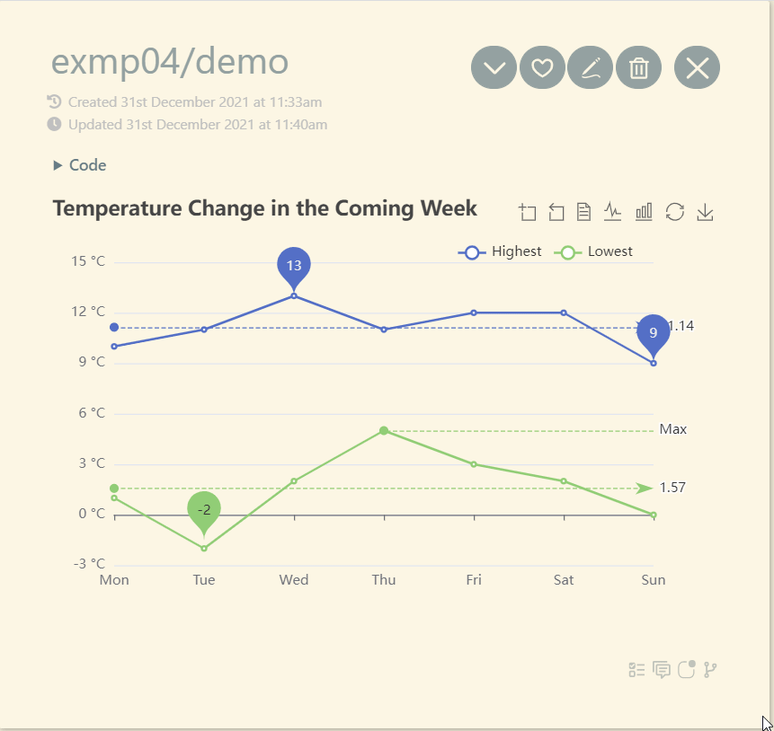
Ok - here’s some more information. See screenshot below. The code is from Examples - Apache ECharts.

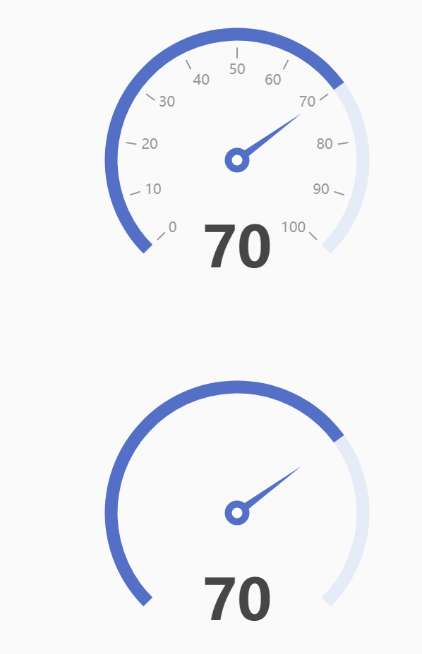
The top gauge is using the new $text input method. The bottom gauge is using the $tiddler input method (code below). Note that this input method requires tick marks (backwards single quote) around the whole thing which are not included here.

Definitely a difference in behavior. As far as I can tell, the $tiddler input method is required to use filters (correct me if I’m wrong), which may make it difficult to get the chart that you’re really looking for if you’re wanting to use filters and lists. I’ve also noticed that the vars widget does not seem to work with this.

{
“series”: [
{
“type”: “gauge”,
“progress”: {
“show”: “true”,
“width”: “18”
},
“axisLine”: {
“lineStyle”: {
“width”: “18”
}
},
“axisTick”: {
“show”: “false”
},
“splitLine”: {
“length”: “15”,
“lineStyle”: {
“width”: “2”,
“color”: “#999
}
},
“axisLabel”: {
“distance”: “25”,
“color”: “#999”,
“fontSize”: “20”
},
“anchor”: {
“show”: “true”,
“showAbove”: “true”,
“size”: “25”,
“itemStyle”: {
“borderWidth”: “10”
}
},
“title”: {
“show”: “false”
},
“detail”: {
“valueAnimation”: “true”,
“fontSize”: “80”,
“offsetCenter”: [“0”, “70%”]
},
“data”: [
{
“value”: “70”
}
]
}
]
}