Details, reveal, section macro, callouts-details, etc. but one slider at a time

Details, reveal, section macro, callouts details, etc. are very nice, but I would like to open/reveal/show only one slider/content/section at a time, like an accordion.
I don’t want a transcluded content (like those of Mohammad, Tobias Beer or the Subsume plugin)
The closest to this I’ve found is Tobias Beer’ folding sections, but it has an issue: The slider/content closes when clicking on it.
How to modify one of those macros or plugins to open only one slider at a time and be able to click on the content without closing it down ?

You could turn the default html Details/Summary function into a macro*?

Then it wouldn’t close.

Only problem is that you wouldn’t be able to nest the macros, only plain html would allow you to nest them, unless you utilized the genesis widget.

Personally, I just use a EditorToolbar shortcut to place a pre-made snippet of text since I nest mine.

I’m not sure if that helps at all. Are you only looking to remove the auto-closing function of the macro you’ve linked to?

I have a new details macro based on html sections and classes and the toggle. This allows a different approach to revealing content. I am away for 6-8 hours but will have a look if it can easily satisfy your requirements on my return. I am 95% sure it could be "near “perfect”.

  • Is that down the page?, one opens the next but closes the last?
  • Should the whole of the contents be the toggle or just the title?
  • How should the open close state be indicated if at all?

Everybody always thinks about macros and plugins, but no one tends to think of the simple solution of an editor toolbar button.

I use this in all my TW files:

Title: $:/.giffmex/EditorToolbar/Elements/Details
Tags: $:/tags/EditorToolbar
condition field: [<targetTiddler>!has[type]] [<targetTiddler>type[text/vnd.tiddlywiki]]
icon field: add the title of a tiddler with ‘Details’ or wrao with your own span class rather than bold.

text:

<$action-sendmessage
    $message="tm-edit-text-operation"
    $param="wrap-selection"
    prefix="""<details><summary>X</summary><span>

Y

"""
suffix="""</span></details>"""
/>

Replace X with slider title, and Y with slider content. The details elements open one at a time, and clicking the content does not close the details element.

1 Like

Thank you @Justin_H , @DaveGifford and @TW_Tones.

I believe that I did not express myself well.

In the gif below I used Mohammad’s Kiss macro, where the content is transcluded from another tiddler. I want to achieve the same, but without transclusion. I mean, everything (labels and contents or details and summaries are written in one tiddler):
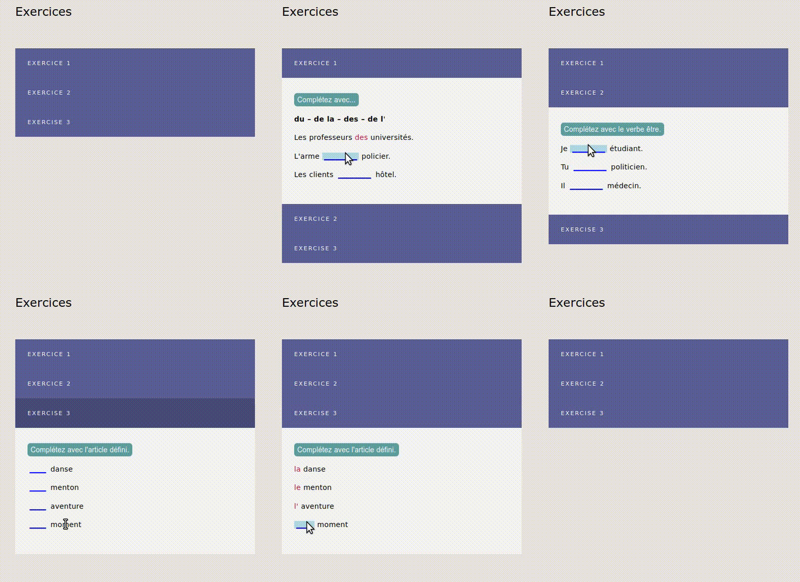
output

@pedruchini would you be able to go into a bit of details into exactly what you would like, feature-wise?

Do you still intend to input text in the Editor View ,or are you looking for a macro that has text input in the non-editor view?

And just to clarify, you want everything in a single tiddler? <Style> and text and accordian?

Edit: This is just a small stylesheet I made to look like the Kiss macro, and a keyboard shortcut.

You can go into a blank tiddler, press alt+d and it will paste the details/summary html stuff along with the class of “table-details”

Let me know if this isn’t what you’re looking for.
$__plugins_JMH_table-details.json (2.5 KB)

2 Likes

You could achieve that with $button and $reveal. I use this for a really large tiddler format (400kb-600kb) and only transclude charts at kdr.wvwlogs.com. Style the button as appropriate.

<$button set="$:/state/SampleReveal1" setTo="Q1">Question 1</$button>

<$reveal type="match" state="$:/state/SampleReveal1" text="Q1">

! Question 1 - This is the revealed content
And this is some text

</$reveal>

<$button set="$:/state/SampleReveal1" setTo="Q2">Question 2</$button>


<$reveal type="match" state="$:/state/SampleReveal1" text="Q2">

! Question 2 - This is the revealed content
And this is some text

</$reveal>
1 Like

@Justin_H Thanks for your effort.
What I need is not a Button in the toolbar but a macro.

@john.edw_gmail.com Yes. That’s more or less what I’m looking for. I few days ago I’ve been playing with the reveal widget with no success (because I don’t have the skills).
Unlike your solution, in the gif I posted, it’s possible to close all the contents.
I will play with it and I’ll try to create a macro.

For now, I don’t mark this thread as solved and wait for other solutions, but John, you helped me a lot.

Mohammad has some polished macros and plugins, like the Section Editor and the Callout-details macro. I will also play with them.

1 Like

Here’s a variation on @john.edw_gmail.com’s solution that defines a <<detail>> macro and let’s you also close an open item:

\define detail(label,content)
<$button class="tc-btn-invisible" set=<<state>>
   setTo={{{ [<state>get[text]match<__label__>then[none]else<__label__>] }}}><<__label__>>
</$button>
<$reveal type="match" state=<<state>> text=<<__label__>>>

<<__content__>>
</$reveal>
\end

<$let state="$:/state/detail">
<<detail "Question 1" "<H2>This is revealed content</H2>and this is some text">>
<<detail "Question 2" "<H2>This is another revealed content</H2>and this is other text">>

Notes:

  • I used a variable named state to make it easier to use separate state tiddlers to create different groups of <<detail>> macros (and also make the macro definition code more readable)
  • The setTo=... parameter uses the button’s label text as the value of the state tiddler, and also handles toggling to a value of “none” if you click on the currently open item button, which effectively closes the item.
  • Unlike @john.edw_gmail.com’s “inline” code, the content parameter of the <<detail>> macro call doesn’t handle embedded newlines, so you need to use HTML <Hn>...</Hn> header elements or explicit <br/> or <p/> elements in order to display multi-line content.

enjoy,
-e

3 Likes

If this video is how you want it to look that is what I am planning however on top of my macro plus html tag method a single state tiddler that only opens one in the set at a time. Ie close last.

However its part of a very flexible solution so may take a little longer.

[Edited]

  • I have started this journey and realised first I need to style the “toggle” which is currently a button. I am not sure how to style the full width button bar example in the video above. Just the width I have the problem with.
2 Likes

Hi, Tones,

I’m not an expert. I added a class to the button in @EricShulman’macro. The style is inspired by Mohammad’s KISS macro:

The macro in a tiddler tagged $:/tags/Macro:

\define detail(label,content)
<$button class="accordion__title" set=<<state>>
   setTo={{{ [<state>get[text]match<__label__>then[none]else<__label__>] }}}><<__label__>>
</$button>
<$reveal type="match" state=<<state>> text=<<__label__>>>

<<__content__>>
</$reveal>
\end

In a tiddler tagged $:/tags/Stylesheet:

.accordion__title {
text: align-left;
width: 100%;
margin-bottom: -16px;
  font-size: 0.7rem;
  text-transform: uppercase;
  letter-spacing: 2px;
  padding: 1rem 1.5rem;
  background: #5B5F97;
  color: white;
  cursor: pointer;
  transition: .3s ease;
border: 1px solid #5B5F97;
display: block;
}

.accordion__title:hover {
  background: #484b77;
}

Then, in some tiddler:

<$let state="$:/state/detail">

<<detail "Title 1" "

content ONE

">>
<<detail "Title 2" "

content TWO

">>

<<detail "Title 3" "

content THREE

">>

Thanks @pedruchini I do now, with the accordion__title thanks.

Now to facilitate the serial opening of one at a time.

[Edited]

I am still working on this. I am thinking I may add to the details macro, that is “the toggle” an additional attribute perhaps called index. The solution would look something like this.

<<details groupclass index:1 button-class:"accordion__title">>
<section class="groupclass" index="1">

Content of the first item
</section>

<<details groupclass index:2 button-class:"accordion__title">>
<section class="groupclass" index="2">

Content of the second item
</section>
  • The above only the section with both class="groupclass" index="n" where n is the index of the last clicked details, will display.
  • Button-class is as per previous reply re styling.
  • You can add additional classes to the “sections” to style the content.
  • Any html tag can be used including those inside macros and widgets all than needs to be set is the class eg “groupclass” or “uniqueclass”.
  • After the first blank line any wikitext, widget and macros including transclusions can be used.
  • The whole structure could be built inside a list widget,

To be honest I have a challenge with some inconsistent behaviour I am trying to Iron out. So please don’t expect the result soon.

I have returned here because I was reviewing “again” @Mohammad’s section editor and it seems to me to be the most direct route, because all you need for a section is to use headings. ! !! !!! etc… and saw its already being mentioned;

It has the advantages;

  • There is nothing special about the tiddler content
    • Without the plugin active is is just content with headings
    • When active it “collapses” the set.
  • You can use it to edit the content and slider titles, or Enable reader mode
  • You can restyle the sections to look like your desired sliders

I don’t think it would take much to toggle the section editor on of off a particular tiddler and perhaps some minor changes to the solution would expand its use; Primarily to allow a per tiddler solution.

  • Allow one state to change the other as per the OT
  • Ability to Enable reader mode and style selection per tiddler.
  • A button to toggle the existence of se-type on any given tiddler
  • Be able to handle unnested headings eg;
!!! one
!!! two
!!! three

I am still reviewing the features so some of these may already be handled.

1 Like