Simpler Accordion Macro

To create a slider/accordion/display on demand in Tiddlywiki you can go with one the following solutions
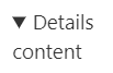
In TW 5.1.23+ using toggle operator this can be simplified!

See below example

\define acdetails(status)
<details class="ac-dtl" $status$><summary style="display:none"></summary>
<$transclude tiddler=<<__content__>> field=title mode=block/>
</details>
\end

\define accordion(label:"Details", content:"", stateTid:"$:/state/accordion")
<style>.ac-btn{font-weight:500}.ac-dtl{margin-top:0.0rem;padding:0 5px;}</style>
<$button class="tc-btn-invisible ac-btn"> $label$
<$action-listops $tiddler=<<__stateTid__>> $field="text" $subfilter="+[toggle[open]]" />
</$button>
<$macrocall $name=acdetails status={{{ [<__stateTid__>get[text]]}}}   />
\end

To give a try

  1. open https://tiddlywiki.com/
  2. create a tiddler
  3. paste above code and tag it with $:/tags/Macro

Now test it

  • create another tiddler
  • paste the below code
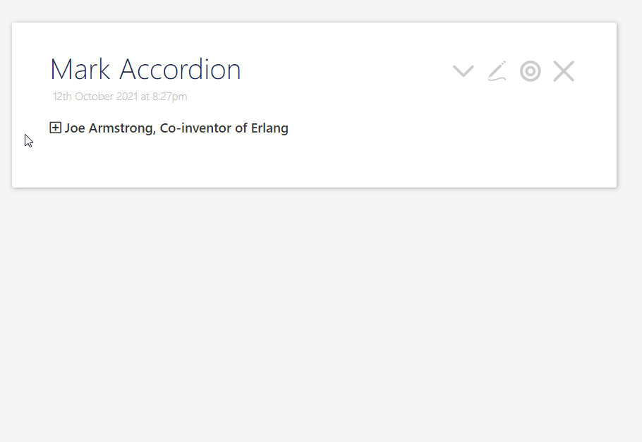
<<accordion label:"Test" content:"This is a sample text!">> 


<$macrocall $name=accordion label="My Accordion" content=<<.lorem>> stateTid="temp/02"/>

Note: This solution uses one button and html5 standard details widget

Question

I was thinking

  1. Can we have a simpler macro using details tag?
  2. Can we keep the status when Tiddlywiki refreshes the host tiddler?

Mohammad,

I have played a lot with the details tag and would be happy to take on this challenge.

  • What do you see as the value of the simpler macro using details tag?
  • The above macro does not indicate it is an accordion ie click to open may be missed
    • Are you happy for the solution to demand a manual “state reference”? eg you used stateTid="temp/02"
  • Are you keen to see the details “icon”?
    Snag_8fa112d

[Edited]
Actually I am starting to think, the simplicity is in the use of the macro. ie if it is close in behaviour to the details tag yet is customisable with good defaults. I will return with a solution.

[Edit 2]

Attached is a work in progress creates a “details” macro. Includes examples. If a state mechaisium is used its honored all I need now is to;

  • Hide the existing icon
  • Allow the whole of “summary” to respond as the button.

This certainly demonstrates alternative ways to code and simplify the Accordion macro, but in this case it is simplifying the use not the macro.

details-macro.json (3.5 KB)

Add $:/tags/Macro to make it global

Thank you Tones!
I was looking for a simpler solution! I though maybe we can find a way to keep status of details tag which can work without JS even in exported html!

To keep the state you have no way to use a permanent variable e.g. tiddler! but you can have code to generate stat tiddler! as I was looking for simple solution I ignored all those complexity!

Using inline style definition as in the example is very hacky. It makes it impossible to style the content by themes or use user settings to define font styles.

You should assign classes instead.

Right! This is just a prototype and it should use css classes!

OK. Once you are settled, please update the OP. Many users just use copy / paste without reading the whole thread. …

Mohammad,

I got derailed by the possibilities, but I believe within my code there lays some tricks, and few more are “fermenting” and I believe there is an easier way.

For example all one needs to indicate the state is to have a way to determine if the details open parameter exists or not, perhaps a “filtered transclusion”. Then all you need is a trigger to change that state, in fact there is already a trigger the details “button”. However I am looking at hijacking that button (Remove the icon with CSS) and replace it with my own, a button in the summary will work.

Little quirks appear when pushing but then other quirks can help solve is as well.

I like a challenge.

This would be great!

Since you can’t use the summary button, nor see it’s open/close arrow, I’m wondering if there is any benefit to using the detail/summary tags?

Like you could instead just manipulate the display state of a div to make it hide/show. And it would manipulate the display state of two icons ( down arrow, up arrow) at the same time to emulate the summary arrows.

Like this. Apologies for using text instead of actual arrow/chevron icons.

\define accordion(label:"Details", content:"", stateTid:"$:/state/accordion")
<style>.ac-btn{font-weight:500}.ac-dtl{margin-top:0.0rem;padding:0 5px;}open</style>
<$button class="tc-btn-invisible ac-btn"> 
<span style={{{ [<__stateTid__>get[text]toggle[display:none;]] }}}> > RIGHT-ARROW</span>
<span style={{{ [<__stateTid__>get[text]] }}}>V DOWN-ARROW</span>
$label$
<$action-listops $tiddler=<<__stateTid__>> $field="text" $subfilter="+[toggle[display:none;]]" />
</$button>
<div style={{{ [<__stateTid__>get[text]] }}} >
<$transclude tiddler=<<__content__>> field=title mode=block/>
</div>
\end

One benefit is it works in exported htmls!

1 Like

Your solution is simpler than mine!

A little modification to Mark accordion:

\define accordion(label:"Details", content:"", stateTid:"$:/state/accordion")
<style>.ac-btn{font-weight:500}.ac-dtl{margin-top:0.0rem;padding:0 5px;}open</style>
<$button class="tc-btn-invisible ac-btn"> 
<span class="far fa-plus-square" style={{{ [<__stateTid__>get[text]toggle[display:none;]] }}}/>
<span class="far fa-minus-square" style={{{ [<__stateTid__>get[text]] }}} />
$label$
<$action-listops $tiddler=<<__stateTid__>> $field="text" $subfilter="+[toggle[display:none;]]" />
</$button>
<div style={{{ [<__stateTid__>get[text]] }}} class="ac-dtl">
<$transclude tiddler=<<__content__>> field=title mode=block/>
</div>
\end

No give a try!:

img_568_%pn

1 Like

You could add a simple detail/summary to your macro and give it a class “exportable”. Add class “nonexportable” to the div based portion. When you run from tiddlywiki, have your stylesheet:

.nonexportable { }
.exportable {display: none;}

but before you export, or in your export stylesheet, have

.nonexportable {display: none; }
.exportable {}
1 Like

Hi All,

This is very interesting to me. I am learning I need to fix part of my personality, the “perfectionist” part. I keep trying to build the ultimate solution, whilst also trying to make it the simplest.

In this implementation we can only use a state “field” on the current tiddler;

\define details(state content summary:"Details")
<$button class="tc-btn-invisible">
<$action-listops $field="$state$" $subfilter="+[toggle[⇱],[⇲]]" />
{{!!$state$}} $summary$
</$button>
<$list filter="[{!!$state$}match[⇱]]" variable=nul>

$content$
</$list>
\end


<<details "details-1"  "{{ButtonWidget}}" "{{!!description}}" >

You need to click the “summary” once/twice to display the “icon” and set the initial state. Because the icon is the state.

Notes;

  • This is making use of 5.2.0 new macro parameters (I now have a compelling use)
    • Except for state/fieldname, content and summary can be any string or “transclusion”
  • Unicode has a large suite of characters we can use, I hope you can see these in tiddlywiki.com

Experiments and futures

  • Use tag=div on the button to display content inside the button
  • Use reveal to allow the “state” to be any “text reference” eg !!fieldname tiddlername tiddlername!!fieldname
  • Enable all parameters to be a literal OR text reference.
1 Like

Given the icon I use in this last example, does any one know how to use css on the open content to put a corner in the top left and bottom right? Like a boarder that only goes 5% of the way from the corners?

Here is a simple more… or …less, Like the last example but with an obvious button to set the state field for the first time.

I need to test this in different situations, viewTemplate, transclusions, nested etc… But this may be my new more solution. One could plump it up with class or styles on the buttons and content.

\define more(state content close:"...less" open:"more...")
<$button class="tc-btn-invisible">
<$action-listops $field="$state$" $subfilter="+[toggle[$close$],[$open$]]" />
{{!!$state$}}
</$button>
<$list filter="[{!!$state$}match[$close$]]" variable=nul 
       emptyMessage=<<new-fieldname """$state$""" """$open$""">>
>

$content$
</$list>
\end
\define new-fieldname(fieldname value: " ")
<$list filter="[all[current]!has[$fieldname$]]" variable=nul>
   <$button><$action-setfield $field="$fieldname$" $value="$value$"/>
Set $fieldname$: $value$</$button>
</$list>
\end

<<more "more-content" "{{!!content-field}}">>

@TW_Tones

Open https://tiddlywiki.com/ and drop your code into a new tiddler with tiny modification as below:

\define details(state content summary:"Details")
<$button class="tc-btn-invisible">
<$action-listops $field="$state$" $subfilter="+[toggle[⇱],[⇲]]" />
{{!!$state$}} $summary$
</$button>
<$list filter="[{!!$state$}match[⇱]]" variable=nul>$content$</$list>
\end


This is a test by Tones see <<details "details-1"  summary:"Example"  content:"This is a long description" >>

And see the result

img_571_%pn
: