Demo: Periodic Table

Yes, I seem to be in a fairly unusual position of writing wikis not for myself, but mostly for other users. I’ve written a large documentation wiki at work that has edit mode entirely hidden. And this one, while intended to be quite editable, is for entire classes of users I don’t know that much about. So, while I could try to be very opinionated about how all the pieces, it seems likely to fail for many users. I will likely try for something generic.

Of course. I don’t have the TW skills yet to play around much with layout. At some point that will rise to the top of the learning queue, but right now I couldn’t do this if I wanted to.

At the moment, I will probably skip it and eventually install Move to top. But it’s very interesting to see all the variation possible.

1 Like

Once in a blue moon if the breeze is just right and I’m in that kind of mood for a really particular task for all of a New York minute, the “zoomin” story view with “Animation Duration” = 0 (control panel, Info tab, Basics subtab) is okay.

It has been a while since all of them circumstances lined up.

Regarding @Scott_Sauyet’s OP, I think your comments are v. relevant.

What interests me a lot in it is that the OP provides an intuitive, visually elegant navigation base.
It is both great for it’s explicit purpose (the PT already) and intuitively illustrative of a honed mode of operation that is very nicely visual. It is very TiddlyWiki and a super useful approach, IMHO.

This, along with @BurningTreeC’s Multi-Column Layout (MCL), which has a very effective auto-filtering “reductive search mechanism” —that is cross column of all OPEN Tiddlers— looks quite optimal to combo with The @Scott_Sauyet PT (c).

But, @CodaCoder, would you ever care to give us a briefing on your use of FOUR screens?
It might help contextualise what all of what we labouring upon is for? :slight_smile:

In the Dharma
TT, x

You know, for something that was originally meant just to teach me some more TW techniques, it seems quite popular! :slightly_smiling_face:

Oh wow, I hadn’t seen that. I can definitely see myself using it for all sorts of projects. I’m curious how you might see that working with the Periodic Table, though. Would you see something like the PT in a left-most column followed by one two columns to the right? Something else? While the table is quite scalable (and I should have a new version that improves it this weekend), to be useful, the table needs a fair bit of space. I was assuming that it would take up most of the screen width and scroll out of view vertically when other tiddlers are opened.

But this is still very much a playground, and I’d love to hear other ideas.

Version 0.6.0 is now available.

There are a number of changes under the hood. (And @TW_Tones , if you’re interested, feel free to grab the plugin from there.)

There are several fairly uninteresting structural changes. The big thing, I’m hoping, is an improvement in the layout. It’s still not complete, but I’m hoping that @TiddlyTweeter can find some time to test whether this fixes the layout problems noted in v0.3.0. I will raise another forum topic to ask for advice on why the properties are too close to the symbol for tiles in the table when they seem fine in the stand-alone tiles. But if I can figure that out, I will call the layout temporarily complete.

I got stuck when trying to add formatting to the fields. I should go back to that, but I think I will instead try to add a simple teaching game.

1 Like

@EricShulman already found a solution to this problem for me. His suggested fix is in https://crosseye.github.io/TW5-Chemistry/latest/ and will make it into the next release.

Scott, the table is indeed beautifully developed now.

Two thoughts: (1) it seems the scrollable dynamic table view is entirely gone? Or at least, I can’t find it easily… Even though the recognizable and colorful PT view is clearly the best “landing page,” the dynamic sortable table had its own beauty, such as being able to poke around with sorting by this and that field (year of discovery, etc. It’s even possible to make a dynamic table include only a subset of fields and only a subset of rows… dynamically!

(2) Back to the recognizable PT view: One other thing to consider including would be adding the preview (hover on preview) plugin by tobibeer. That way, viewers could get an especially responsive “peek” into an element, not losing focus away from the table to get a sense of what the details are like.

-Springer

1 Like

Yes, and at some point I do want to add it. This was inspired by the work you and @TW_Tones did, but at first it was simply meant as a demo using the same data. Now it’s trying to grow into something more useful, and some version of the table view will be essential.

That’s a very good idea, and I’ll put it on the list.

Thank you very much for the suggestions.

1 Like

Ciao Scott,

I’m not sure this is good news or bad news. But I wanted you to see the following …

#1 – On (my!) Chromebook I still get wrapping when the PT is expanded … :-1:
photo_2023-03-03_08-30-11


#2 – On (my!) Chromebook if I adjust it’s settings all is right in the garden:slight_smile:

Adjustment

Result
photo_2023-03-03_08-37-14


I dunno why this happens (you’d need a PhD in Not Getting Frustrated By Computers to figure it out, I guess).
When does your CSS rule, OK? :blush: .

Merely me, I wanted to mention how, in the end, I got it to present nicely.


Outcome: I’m not so sure now you should burden yourself too much solving this particular issue (for Chromebooks only??).

Though I love your dedication to get it as right-as-possible.

An appreciative comment, TT.

Right. But I don’t want to get too far off your topic.

But maybe I should mention that MCL has the ability (via tag) to make a Tiddler a “topper” that spans columns below it. That could be one approach?

AND, on wide-scenarios one could easily have the PT in Column One and the clicked element appear in Column Two etc. (All column widths are dynamically adjustable.)

(MCL is not as well documented yet as it needs be for optimal use, but it is coming. It is very layout flexy when you get-it. For interested readers: to look at and → GET MCL ← go there. Kudos @BurningTreeC)

Just a side-note
TT, x

Oh, that’s bad news, for sure. I didn’t even consider browser minimum- font-sizes; that may leave an insoluble problem.

This was on latest, yes? That used a fix from Eric that hasn’t been pushed out to a numbered version yet.

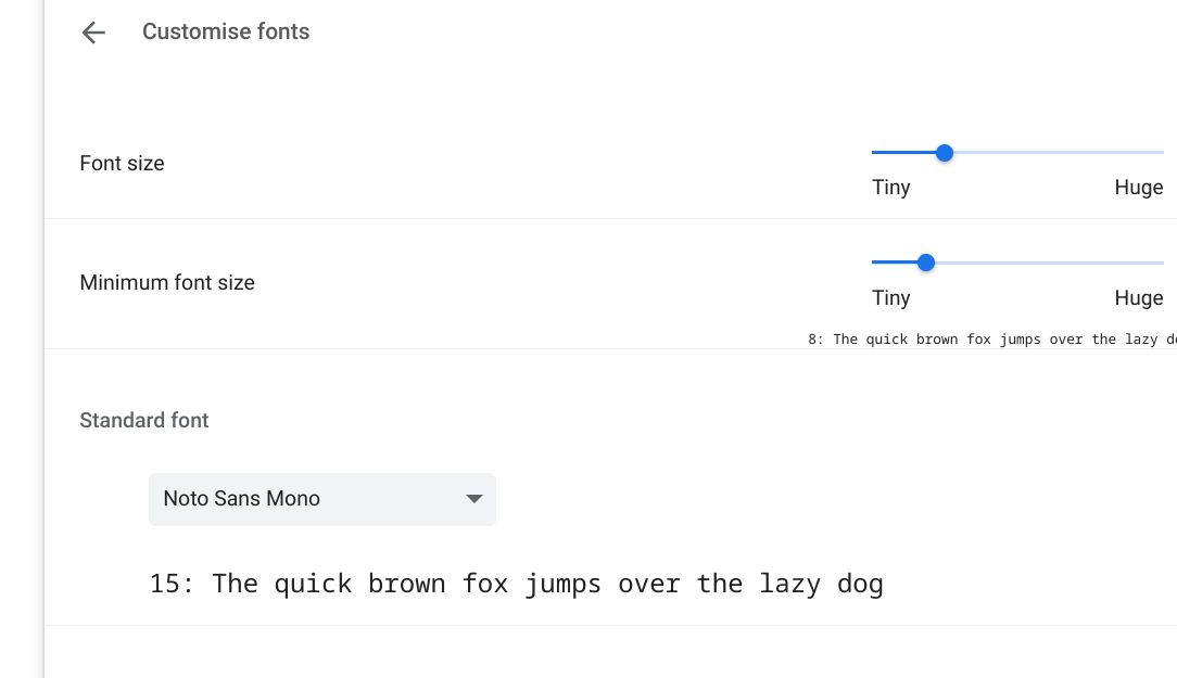
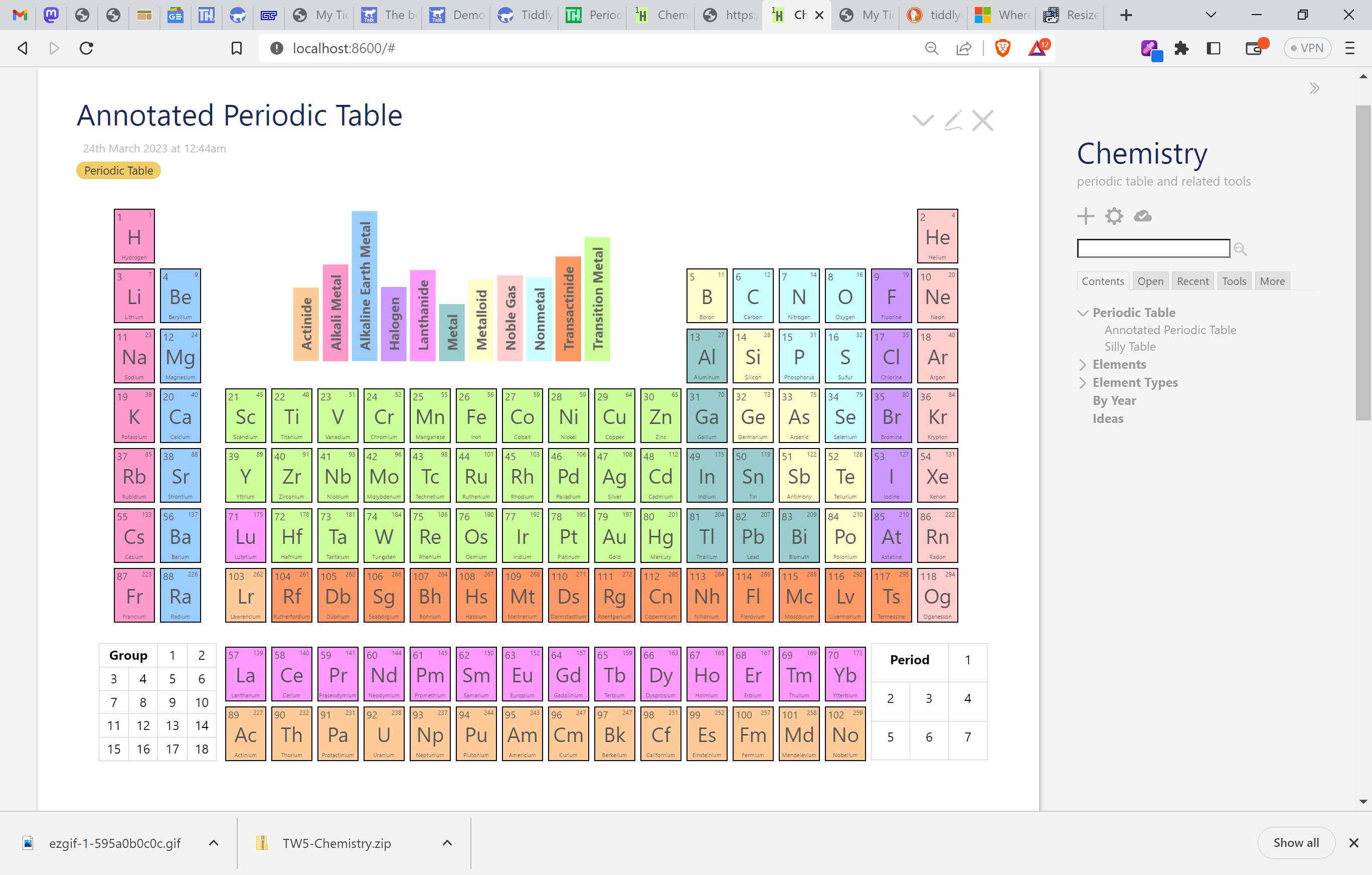
If you’re willing to do a small bit more testing, I would like to know if this can be fixed by shrinking the size a bit more. In $:/_/my/sytles/tile, around line 8 is this CSS rule:

div.element div.name {position: absolute; /* ... */ font-size: 14cqw;}

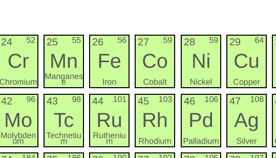
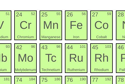
Could you try with font-size: 13cqw or font-size: 12cqw? I’m guessing that this won’t work, but it would be nice to know. To my eyes, the longest-looking names are for elements 59 and 104 with 110 and 111 running close behind. (Also, if you’d be willing to share the details of your Chromebook, I can see if there’s an online emulator I can use to try these things myself.)

I don’t expect this to fix the problem. If the browser is requiring a minimum font-size where these won’t fit, there’s not much I can think of to do, except to change the breakpoints where the name is visible. But I will play with it next time I’m working on layout. (I haven’t specified font-name anywhere, and it’s remotely possible that would help.)

:laughing:

I failed that course.

Failed miserably!

(And I’m a developer by profession!)

No worries. While I am working on this in various bits of spare time, I have only the vaguest of roadmaps so far, and am much more interested in hearing about potential paths than in following one particular one at the moment.

That makes sense, but I’m still not sure what I would use two columns for except for two things: This:

and the ability to do side-by-side comparisons… but even that would probably be better inside a single tiddler.

But this does lead me to think about a possible useful UI: a floating button (not that I don’t know how to do that, but I imagine it’s possible since the expand-sidebar button is similar) that when clicked brings up a popup with the clickable periodic table.

Hmm. all sorts of possibilities here…

Thank you very much for testing the Chromebook issue.

And thank you for the ideas. Food for thought is the most nourishing kind!

Small footnote.

One thought I had was that on-click an element opens in a near full-screen MODAL (with option to edit the Tiddler in that modal).

Just a footnote caro.
TT

I’ve just published a new version, 0.7.4. It adds an alternative view of the table with the ability to highlight any element type, group, or period.

The important thing to see is the new Annotated version of the table.

ezgif-1-595a0b0c0c

Unfortunately, Firefox will not show this behavior. I don’t know when they’re going to support the CSS :has pseudo-selector; they claim to be working on it at the moment. I don’t know if I’ll look for another implementation of this behavior or simply hope they catch up soon.

There was a lot of supporting work that went into this… with help from several threads here – thanks everyone! The biggest change is that the macro that generates the table now takes a number of additional macros as parameters, describing what goes into five separate empty blocks surrounding the table. Here we use the (10 x 3) north block for the colorful element types, the (2 x 2) southwest block for the groups, and the (2 x 2) southeast block for the periods. But there are are also a (1 x 1) northwest block and a (5 x 1) northeast block that can be used. I have several other views I want to make, using these. But you can see my throwaway Silly Table that I used to prove out the technique.

Question

I originally had the type-key at top having a ragged top. But I had some problems making the exact behavior I wanted with that version, and the current rectangular version is what it looked like when I finally got that behavior. I prefer the ragged version. Do you as well? And if so, is it enough better that I really should put in the work to get the right behavior with that look? It looked like this:


Next up: a drag-and-drop Reactor showing some compounds you can make with a given group of elements.

3 Likes

This is gorgeous work, Scott - an excellent example of the kind of bespoke app that can be made with TiddlyWiki. And yes, Firefox support for :has really can’t come too soon.

For what it’s worth, I also like the look of the ragged-edge key, and I do think it minimizes the visual distraction of what is otherwise a big solid block of color. But I’m not sure it’s worth agonizing over if you have other features you’d rather be working on.

2 Likes

Thanks. I’m finding myself happy with the results. And I’m learning a lot doing it.

The power of this tool never stops amazing me. The funny thing is that so far I haven’t touched on the most central idea in TW, the easy ability to add your own content. That’s coming, either second or third in my current to-do list. It’s something I absolutely want, but I think I already know how to do most of it, so I don’t expect to learn very much in doing so: more of a chore right now than an interesting task. But I’ll get there.

Yes, I asked about this the other day on their 15-year-old (!!) bug report, and was told that

There’s work going in progress on this.

Not very encouraging!

I do think it looked nicer. Unless I get an overwhelming response of “No, the box is better”, I’m planning on revisiting it at some point. It’s probably low effort, but also low priority, the kind of thing to work on in a spare half hour (or during a boring meeting, but don’t tell my boss I said that! :wink: )

Utterly brilliant!

As an aside before I comment on the new filtered layout…

It is very interesting how the PT, obsequiously, records time developments of socio-political relevance … like Americium in 1944, proximate to when the USA became the World Leader. See your: Elements by year (1944).

Just a side comment
TT

1 Like

I think it’s less a matter of obsequiousness and more one of where the hotbeds of discovery were in the days when the elements weren’t named by committee but by their discoverers. Note also Berkelium and Californium, all found by the same group at Berkely National Laboratory (in California) around the same time.

Lots of place names are included, obviously or more obscurely: Hafnia (the Latin name of Copenhagen) gives us hafnium, Holmium is for Stockholm, Lutetia (City of Light) means that lutetium is named for Paris, Strontian in Scotland gives us strontium, europium is obvious, and the mineral rich Swedish town of Ytterby gives us ytterbium. The funniest bit though is that gallium is probably not really named for France (Latin, Gallia), but was the self-titled debut element of Paul-Émile Lecoq de Boisbaudran (“gallus” is the Latin translation of “le coq”.) He denied this, but the story is far too good to die.

Much more appropriate to my mind are names like Curium, Einsteinium, Fermiun, Mendelevium, Nobelium, Rutherfordium, Bohrium, Copernicum, and the like,


The wonderful book, The Periodic Kingdom (recommended by @TW_Tones) has an entire chapter on the naming of the elements, and is my source for the above.

1 Like

A tangent, but there are actually four elements named after Ytterby: yttrium (Y), terbium (Tb), erbium (Er), and ytterbium (Yb) !

3 Likes

That’s right. I’d forgotten that. The residents must be so proud!

2 Likes

One thing the author does in that book is viewing the periodic table as a landscape, @Scott_Sauyet’s interface to the data is making substantial inroads to the visualisation and understanding of the table.

Because of this book, I also dream of “surfing this dataset in a 3D landscape, with contours and colours and textures representing qualities”. The use of innate human faculties, to travel through the elemental landscape is a way to “develop an intimate understanding of the complexity of nature”.

Side fact
I wonder how many people know where “browser” comes from? “Browsers” are animals such as goats that eat things at eye level, up at head level, Grazers eat at ground level like cows and sheep. Perhaps a table top screen (a grazer) would allow us one day to Graze the periodical table as well?

  • Perhaps this would be the “Gleaning” of information.
1 Like