(css) How to vertically align ViewToolbar to title?


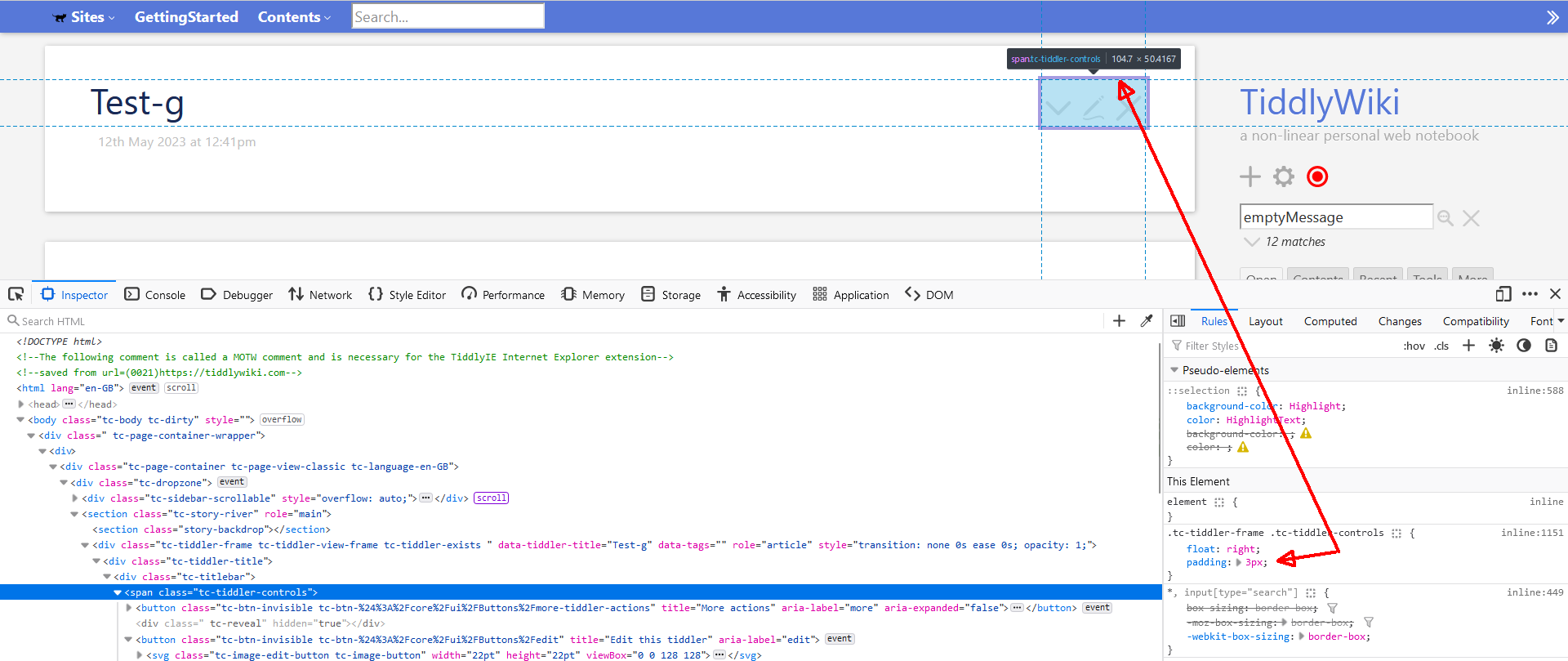
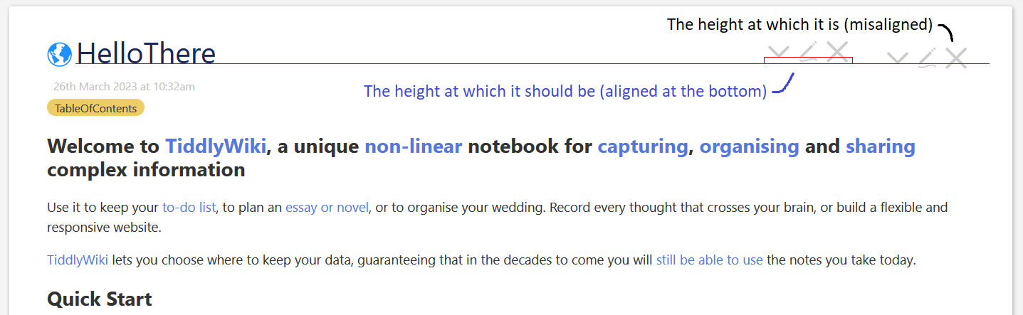
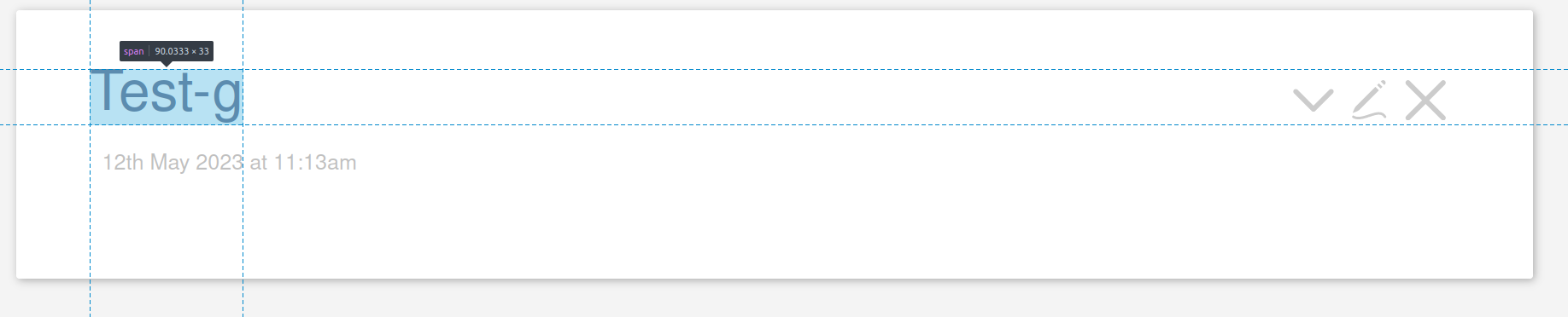
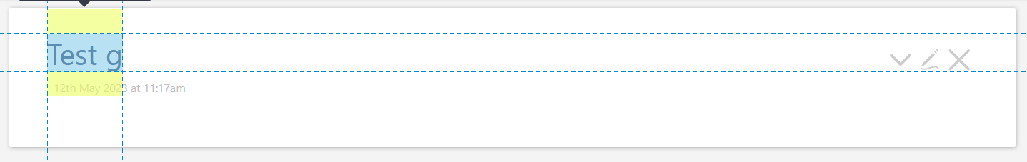
Visually I’ve always found something strange about the ViewToolbar, and I’ve noticed that it’s not aligned with the title of the tiddler. I’ve put a screenshot here to show what I mean, but you can also see it visually or with browser tools.
I tried to see if anyone had already tried to align them and I searched for things like “how to vertically align css” but I didn’t find any solutions (or maybe I wasn’t able to apply them right).

  • Does anyone know how to do?

Are you sure? Try again with a tiddler named Test-g

(This is on https://tiddlywiki.com/, but the same thing happens to me even in an empty.html)
I’m glad it’s not a global issue, but I’m confused…

In your first screenshot you wanted the icons to be aligned on the baseline, not the bottom of the title, didn’t you ?

Actually it was a rough thing, I don’t know what exactly to align it to (I just want it to visually look right/better)

That’s not possible, because it does look right already :wink: … What I want to say is: No matter what we do, it will always be wrong for someone.

I think moving it 1 or 2 pixel up or down is absolutely useless, since there are probably 500++ different screen sizes where it will look different on every one of them.

IMO if you must … moving it up some pixels you could create your own stylesheet tiddler and change eg:
tc-tiddler-controls padding: 0 3px 3px 3px;

1 Like

Thanks, not much improved, but reducing the padding to 1px in .tc-tiddler-frame .tc-tiddler-controls made things a little better.
It wasn’t a big deal though, I thought the situation was common to all users. Since that’s not the case, I can accept it as it is (and now it’s even a little better than before). Thanks again :+1:t2:

I liked that you also brought evidence :joy:

I’ve found a nice talk some time ago, which I think is brilliant: Hey! Presents · Be the browser’s mentor, not its micromanager

The system that is shown in the video is tailored to a “standard read only” experience, for a “simple” demo. … BUT

At the end he shows some examples of real world websites. Google hired them to create a “design system” which IMO is very close to what we would need for TiddlyWiki. …

So I think the concept scales.

1 Like

Thanks I’ll sure give it a watch!

Sorry to jump in late but I do think @Sobriety has a good point: the icons should align with the baseline of the text, and not be aligned with the bottom of the descenders of the text. I’d welcome a PR for this.

I think it’s best to separate the two so that on mobile, there is no spacing when the title is too long.

Here is the style code, create a new entry and copy the code below into the body with the $:/tags/Stylesheet tag.

.tc-titlebar h2 {
    font-size: 1em;
    display: table-row-group;
}
.tc-tiddler-frame .tc-tiddler-controls {
	display: table-header-group;
    float: right;
    padding: 0px;
}

The effect is shown in the image.