Thank you for fix, I’ll add that in. 
I made a button to hide the main and utility panes simultaneously. Can it be extended to simultaneously open both or one of the main and utility panes on the next click.
<$button>
 <$action-setfield $tiddler="$:/state/Rad/Panes/Main" text="" />
 <$action-setfield $tiddler="$:/state/Rad/Panes/Utility" text="" />
{{$:/images/svg-icon/eye-hide}}
</$button>
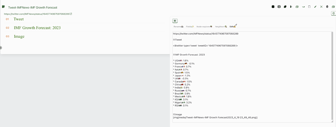
I transcluded this button within the Tiddlertabs and it looks like this
I’m not sure there’s a one-size-fits-all solution here: you’ll have to decide which tab you want each pane to default to upon opening. But as a rough example, try something like this:
<$button>
<$list filter="$:/state/Rad/Panes/Main $:/state/Rad/Panes/Utility +[!has[text]]">
 <$action-setfield $tiddler="$:/state/Rad/Panes/Main" text="$:/themes/be-rad/SidePanes/Tabs/BrowseContent" />
 <$action-setfield $tiddler="$:/state/Rad/Panes/Utility" text="$:/themes/be-rad/Config/StoryList2" />
</$list>
<$list filter="$:/state/Rad/Panes/Main $:/state/Rad/Panes/Utility +[has[text]]">
 <$action-setfield $tiddler="$:/state/Rad/Panes/Main" text="" />
 <$action-setfield $tiddler="$:/state/Rad/Panes/Utility" text="" />
</$list>
{{$:/images/svg-icon/eye-hide}}
</$button>
@etardiff Thats enough for me. I can modify it to suit my needs. thanks for the quick response and help.
Anyone was able to solve the issue with overflowing of storyriver which occurs when there are many main pane tabs present ?
@Brian_Radspinner
Is there a new version available for testing. I was planning to update my wikis to tw5.2.6. Would love to update be-rad components also if available.
Did anyone tried upgrading to tw 5.2.7
My tiddlertabs are not visible after the upgrade
This is the code i am using which was working with 5.2.4
{{Hide panes button}}
<$list variable="showRiverTabs" filter="[<MainRiverTabs>get[text]match[show]]">
{{$:/themes/be-rad/AboveRiver/TabsBar/OpenTidsMenu}}<div class="tc-tab-set"><div class=tc-tab-buttons>
<$list filter="[<tv-story-list>get[list]enlist-input[]]">
<$button
class={{{ [<tv-history-list>get[current-tiddler]match<currentTiddler>then[tc-tab-selected]else[]] }}}
tooltip={{{ [<currentTiddler>addprefix[navigate to ]] }}}
aria-label={{!!caption}}
to=<<currentTiddler>>
>
<$list filter="[<tv-history-list>get[current-tiddler]match<currentTiddler>]">
{{||$:/core/ui/Buttons/close-others}}
</$list>
<$transclude field={{{ [{!!title}has[caption]then[caption]else[title]] }}}/>{{||$:/core/ui/Buttons/close}}
</$button>
</$list>
{{$:/core/ui/Buttons/new-tiddler}}
</div></div>
</$list>
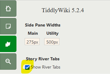
I had this issue when upgrading to 5.2.6 and 5.2.7 too. Luckily it’s an easy fix! You just need to recheck the Story River Tabs option:

I believe the issue is that $:/state/ tiddlers aren’t copied (edit: by default—thanks, @EricShulman!) when using the upgrade site. If you look at $:/themes/be-rad/AboveRiver/TabsBar/TiddlerTabs, you’ll see that the tabs are all wrapped in a list widget which controls their visibility based on the text field of a tiddler:
<$list variable="showRiverTabs" filter="[<MainRiverTabs>get[text]match[show]]">
And that variable is defined in $:/themes/be-rad/PageTemplate:
MainRiverTabs="$:/state/Rad/Rivers/MainTabs"
So when the state tiddler is missing, the tabs don’t show up. But it’s not immediately apparent what’s going on because that checkbox has been prechecked in the edition that Brian shared, so when you download a copy you’re getting the state tiddler too.
Looking at that configuration panel ($:/themes/be-rad/SidePanes/Tabs/CustomizeWiki), the checkbox is defined as follows:
<$checkbox tiddler=<<MainRiverTabs>> field=text checked="show" unchecked="hide" default="hide"> Show River Tabs</$checkbox>
So one quick fix that will save you worrying about the $:/state tiddler in the future might be to change that list widget in $:/themes/be-rad/AboveRiver/TabsBar/TiddlerTabs to the following:
<$list variable="showRiverTabs" filter="[<MainRiverTabs>!text[hide]]">
Note that, when upgrading, $:/state tiddlers aren’t selected by default, but they CAN be selected manually before pressing the “upgrade” button.
I’ve moved over to 5.2.7 and am working to get some layout problems fixed to allow for some more options. I haven’t been able to do much lately.
I’ll add to the list: have decent default values when state tiddlers are missing.
Here is a my wiki based on be-rad edition. In this tiddler, you can see sidetabs I float to the right side of the tiddler body. This is the code responsible for the sidetabs.
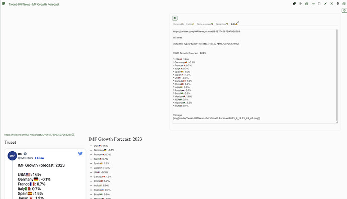
In this image you can see the mismatch in the height of the sidetabs and tiddler body.
How to make the height of the sidetabs and tiddler body matching ? This mismatch is not seen in my other wikis which doesn’t use the be-rad edition.
I don’t think this is an issue with the edition: it’s just your CSS working as expected. Your current styling uses position: absolute;, which takes the element out of the normal content flow. Try replacing that line (and right: 0) with float: right.
W3schools is a good resource if you’d like to read up on CSS positioning.
That solved the issue. Thank you @etardiff
I will have to review this thread to find why I was using that code.
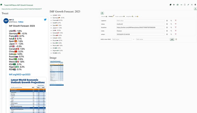
@etardiff after making this change, if I use the multicolumn layout of shiraz plug in, the tiddler body is seen below the level of the sidetabs as shown here
With the old code which I was using, the alignment was correct.
Can something be done to correct it?
It looks like you’re running out of space to display both elements side by side. This wouldn’t have been apparent before because absolute positioning applies regardless of the size or position of sibling elements: the sidebar could overflow the adjacent column in the same way it was overflowing the bottom of the tiddler.
I didn’t do much testing, but at a glance, adjusting the CSS of your braintemplate tiddler seems to fix it:
[data-tiddler-title='{{!!title}}'] .rightside {
  border:1px solid transparent;
  width:48%;                                      /* changed 50% to 48% */
  margin-top: 20px!important;
  float:right;
	}
I’d recommend learning to use your browser’s inspector tool, which will make it much easier to find and diagnose any CSS or DOM issues you may be having. (Here’s a guide for Firefox, for example). It’s helpful to get comfortable reading and modifying other people’s code when you’re using so many plugins by different authors; it’s unlikely that they’ll all work together “out of the box.”
@etardiff Thank you, Its working in my testing.
I do use inspect elements option of browser. I have even created a theme for remnote app using inspect elements alone sometime back, but some things are beyond my capabilities.
This is my test wiki which has all the plug ins which I like to use so that I can detect any incompatilities easily. I haven’t found any significant incompatilities in this wiki till now. I will remove some rarely used plug ins later. I take notes in this same wiki in such a way that it can be easily transferred into different wikis in future (notes of different subjects can be filtered using fields).
I do want to learn more about TW, and related stuffs like css, html, javascript. But I hardly get time to do those. Daytime I will be at workplace (I am a doctor) and after reaching home, I won’t get time to do any TW related stuffs till my child sleep. So all these stuffs I do is in the late hours. Thats why you see so many questions from me in this forum. I don’t have to time to deeply study everything when I encounter some roadblocks. It’s not that I don’t try to solve them on my own. Only after trying many times I ask questions here. And 90% of my questions have been solved by people like you in this forum. All those solutions can be seen in my demo wikis which I post in this forum. And the one thing I do regularly is read the posts in TW forum, github, discord. I must be among the most frequent visitor of this forum  .
.
Is there a way to always keep the story river tabs as disabled in mobile mode?
I took a copy today of the current edition, and upgraded it to 5.2.7 and it seems to be working well,
- The only “bug” I can see, even before update, is using Side Bar > More > any tab the side bar is truncated or invisible down the centre, we can’t see the right hand side.
- I would fix it myself, but I don’t know where to start.
Otherwise this is a snazzy edition @Brian_Radspinner
@Brian_Radspinner Were you able to work on this Be Rad layout ? How does the UI looks now ? Any teasers or screenshots to share ?


