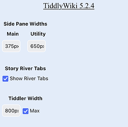
Be Rad Edition - alternative layout with custom UI elements

While still very much a work-in-progress, my on-going customization feels complete enough to post about again. Since all the major UI elements are very dependant on an alternative layout, I can’t currently release anything as plugins, so I’ll just call this an edition.

As always, I’m hoping that my contribution may be of some inspiration for others, and not necessarily to be regularly used; but I do think this edition is handy for holding reference tiddlers in the right-side Utility River when writing in the Main Story River.

Be Rad Edition

BeRadLayoutPreview

6 Likes

Thanks for sharing your continued progress! Of all the editions I’ve seen, I think yours might be the closest to my ideal starting point, and I look forward to seeing where you take it next.

1 Like

I agree with @etardiff. This is shaping up to be something I’d be most interested in trying to implement myself. I’ve only toyed around with it a few minutes, but I definitely like it. I will be watching this very closely.

The more I play around with your layout, the more I like it. I especially like the utility pane and alternate story rivers. Great work! I am very much considering migrating my Kansas Railroad wiki to your new layout once you’re done tweaking. In the mean time, I will be looking at what you did very closely to see how you did it.

1 Like

Thanks for sharing this alternate layout @Brian_Radspinner
I have started testing out my hacks in the be-rad edition to check for any incompatilities so that I can shift to this alternate layout.

I have a few suggestions for your consideration

  1. Can the storytabs be made scrollable like in opened tiddlers bar (TW Calendar — Tiddlywiki Calendar Widget and Page Layout displaying tiddlers on calendar and agenda, based on created, modified, startDate and endDate fields on tiddlers. ) and draggable like the windows bar of mentat (search for $:/plugins/admls/mentat/ui/tabs/window-tabs in the advanced search of this wiki - Mentat — a customizable workspace )

  2. There is some issue with the plug in section of the control panel in the utility pane and when opened in the storyriver. The plug in list has an odd formatting.

  3. How to add new tabs in the utility pane

  4. Can the layout and the theme be seperated into two different plug ins whenever you plan to make this edition into a plug in.

Will give more feedback after further testing. Once again thank you creating such an awesome layout.

@etardiff and @HistoryBuff thank you both very much. :grinning: I’m happy to hear that there is interest beyond just myself.

Now that the overall layout is really useful for me, I want to make it more modular and less dependant on this specific Layout—if possible. I want to make it easier for myself and others to add parts to other wikis without working to make them fit.

@arunnbabu81 Thanks for pushing me to post updates. To me, it never seems ready for others to bother with.

  1. I will study @linonetwo code for tips on scrolling tabs. If anyone knows a way to add left/right buttons for scrolling, like Excel worksheet tabs, please post a link.

  2. Yikes. :grimacing: At one point it looked more like the Main Side Pane > Custom tab > Plugins tab. I’ll get to fixing that. Thanks for the catch.

  3. Add the tag $:/tags/rad/UtilityTabs to a tiddler, along with caption & icon fields for the Utility Toolbar and a summary field for a title at the top.

  4. Depends on how much I can figure out. I’m still confused on making a proper theme if I built this on top of Vanilla. I want to split as much as I can into plugins, but the whole ensemble may just stay an Edition that can be imported into rather than a theme.

5 Likes

What is this?

And about the layout, if it won’t affect other parts of wiki. You can make it a plugin and share a so it can be installed from CPL.

@Brian_Radspinner I tried to include some of my hacks into the be-rad edition and it looks like this - https://be-rad-scribe.tiddlyhost.com/

I have some more suggestions and questions based on my experiments.

  1. How to remove box shadow around tiddlers especially when dark palettes are used.
  2. Make Be-Rad compatible with Captivate theme (not Captivate layout) - check the buttons in the topbar and input boxes in the custom tab of the main pane after applying vanilla and captivate themes one after other . There are some visual changes to those buttons and input text areas when captivate theme is applied . I like captivate theme because of the different colored light palettes available with it.

  1. Different default tiddlers for different stories by using filters. Also can different palettes be set for different stories.
  2. How to make TiddlerInfo section sticky

A quick note based on my own tinkering: if you replace

<$view field=caption><$text text={{!!title}} /></$view>
with
<$transclude field=caption><$text text={{!!title}} /></$transclude>

in $:/themes/be-rad/AboveRiver/TabsBar/TiddlerTabs, any caption formatting (transcluded icons, etc) will be nicely rendered in the story tabs.

Would it be difficult to modify the utility pane so that it works with the resizable sidebar plugin? I think ideally, I’d like a fluid-fixed/fixed-fluid toggle like the one the standard TW sidebar uses, so that the utility pane is maximized when the main story river tiddlers are set to fixed width, and the utility panel can be dragged to a desired width when the main story river tiddlers are maximized.

I think I can figure the toggle out by comparison to the standard TW layout, but I’m not sure how to incorporate the responsive panel. Not a request, just musing in case anyone feels so moved!

There is small gap when we set Sticky Titles to Yes

Appearance → Theme Tweak → Sticky Titles : Yes

Let’s suppose that I have a table of contents in the utility river. Would it be possible to open the links from that table of contents in the default story instead of the utility river? I know I can do this from the sidebar, but I’m thinking I might want the ability to do this from the utility river as well.

@Dinesh_Datir I don’t use sticky titles in my wikis. Also I haven’t found a way to fix the issue you have mentioned here. Will share it here in case I can fix it .

Try putting this in the tiddler with the TOC:

<$navigator
     story={{{ [<MainRiver>is[missing]then[$:/StoryList]] ~[<MainRiver>get[text]] }}}
     history={{{ [<MainRiver>is[missing]then[$:/HistoryList]] ~[<MainRiver>get[text]match[$:/StoryList]then[$:/HistoryList]] ~[<MainRiver>get[text]get[text]] }}}
     openLinkFromInsideRiver={{$:/config/Navigation/openLinkFromInsideRiver}}
     openLinkFromOutsideRiver={{$:/config/Navigation/openLinkFromOutsideRiver}}
     relinkOnRename={{$:/config/RelinkOnRename}}>

<<toc TAG-FOR TOC>>

</$navigator>

@etardiff
Good call about the caption rendering, I’ll have to other places to see if I should similarly replace view with transclude.

I would like to have re-sizeable sidebar. A quick check on the plugin seems like I have a few options:

  • Allow tiddlers tagged $:/tags/SidebarSegments show up in the pane and hide what I don’t need

  • Add something to the current layout & CSS that would except the plugin’s UI element if it is present

  • Use a tag that allows additional elements to the Side Pane without being just another tab

  • Figure out a to combine the Utility Pane with the original TW Sidebar layout, so the plugins Segments tag would work by default.

I’ll add that to my list of things to play around with.

The responsive Panel would probably take some editing of the $:/themes/be-rad/Styles/WikiLayout tiddler to add different layout options based on the same state tids the TW Sidebar uses.

@arunnbabu81

How to remove box shadow around tiddlers especially when dark palettes are used.

Hmm…I would probably add something to the $:/themes/be-rad/Styles/TW-Tiddlers tiddler to only have a box-shadow if the color palette has color-scheme field set to ‘‘light’’. I’ll have to see about adding this.

Make Be-Rad compatible with Captivate theme…

Yeah, I mainly used a lot of repeating palette colors that were convenient. I’ll have to study other palettes more to figure out the most compatible colors to use for the custom UI elements.

Different default tiddlers for different stories…

Not sure about these off the top of my head, I’ll have to look into what TW does normally to load default tiddlers. I assume a start-up action(?) which I don’t have yet have any experience.

Also can different palettes be set for different stories

That’s an interesting idea, that I currently have no idea how to implement. :upside_down_face: It would be pretty neat to have palette options in the Story River Options modal dialog…

How to make TiddlerInfo section sticky

Yeah, I’ll have to see how TW does that by default, should be do-able.

@Dinesh_Datir I will definitely look into making Sticky Titles work again.

I also noticed quite a few quirks when viewing the layout in Firefox on my laptop, which I normally don’t do (TiddlyDesktop on my laptop and Chrome on mobile devices). I’ll have to work on making things better compatible on other browsers in general.

@arunnbabu81 oh yeah, I really like your demo wiki layout! It’s pretty cool to see some of my work in someone else’s wiki
@etardiff I like this suggestion. Can something be done for tiddlers with caption field left as blank. Can the title of those tiddlers with blank caption field be used in the story tabs.

That’s a good idea, and I’ve implemented it myself. Here’s the edited tiddler: TiddlerTabs.json (877 Bytes)

1 Like

The following will transclude the caption only if it is non-blank. Otherwise, if the caption field exists but is blank or if the caption field does not exist, it transcludes the title.

<$transclude field={{{ [{!!title}has[caption]then[caption]else[title]] }}}/>
1 Like

@Brian_Radspinner, that worked perfectly! Thanks!

@Brian_Radspinner
I have some more suggestions.

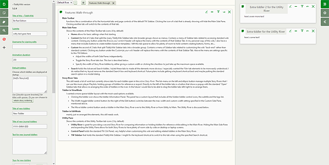
  1. Regarding compatibility with captivate theme, I was more concerned about the size of the buttons near the tiddlertabs and input boxes in the custom tab in the main pane (see the images in the previous post), rather the colours of the theme.
  2. Shift-clicking a link in the storyriver, search results, main pane should open the tiddler in utility pane.
  3. On clicking viewtoolbar button to divert tiddlers to Utility Pane, the Utility Pane should open automatically.
  4. Storyriver is overflowing in mobile mode in my wiki. I think it’s occurs when we add more number of tab buttons in the Main Pane - more than the screen size of a phone can accommodate. If the tab buttons in the Main Pane is made scrollable, may be this can be fixed. Also try making the tab buttons in the Utility Pane also scrollable.
  5. Make the utility pane buttons fixed at the bottom of the screen in mobile mode with no space below it unless a tab is selected. When a tab is selected in the utility pane in mobile mode, the utility pane should fill the entire screen space with utility pane tab bar at the top of the screen.
  6. I use modals a lot in my wiki-Check this tiddler. But I am noticing some issues with Modal width in be-rad. I tried to fix it, but failed. I will try again.

I’d already made this modification for myself. Here’s the relevant tiddler: $ _themes_be-rad_Tiddler_Buttons_SwitchRiver.json (1.8 KB)

I like this idea too.

@Brian_Radspinner If this isn’t already on your list of Firefox styling quirks, I noticed a slight layering issue with the utility river/utility tabs:

tab layer issue

This doesn’t happen with any of the other utility panel options, and it doesn’t happen in Chrome.

At the risk of getting repetitive, I’ve been really enjoying exploring this edition! It really shines on larger screens, but even on my laptop, I feel like I’m finally making full use of the space I have.