Banner Image Competition for v5.3.7

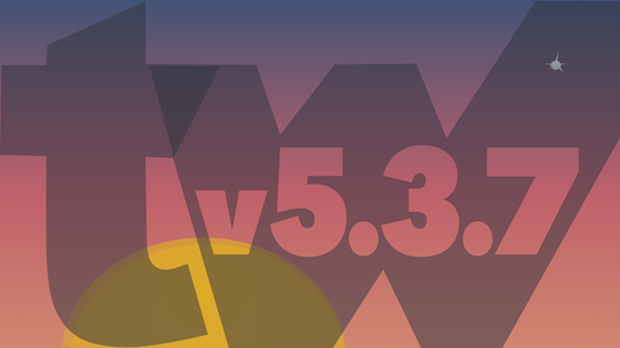
Is this strictly true? Our current v5.3.6 winning entry has text on the map, including a prominent “M” icon, and lots of prior winners include “TiddlyWiki” even though the rules are explicit that this is only optional… There were entries at v5.2.4 with additional text that didn’t get any push-back, as far as I know.

But yes — we have generally resisted having a banner that incorporates slogans or text that looks like it needs to be read (in order to take in the meaning of the version banner). And whatever’s in a version banner needs to look good and retain its value even at pretty small sizes.

I was simply quoting @pmario, who tends to know a lot around here. But I don’t know if he was quoting competition rules or just noting his own opinion.

You have a Tardis version 5.3.7. That is it.

That is the main mane. Extra words are possible IF necessary. The ‘‘if’’ definition you need chat with @pmario upon.

Without investing a great deal more energy (and since I have lots of other stuff on my plate at the moment, despite my late-night blathering on in a parallel thread about modest vs maximalist tech!), here’s a very quick tweak of the prior “Nord-palette sunset” design, so that it looks a bit less like “just typography”:

TiddlyWiki 5.3.7 with sun

I may be able to work up another idea by end of week…

4 Likes

Sorry for my ignorance. I did not understand the slogan and the connection to Dr.Who. I know that this TV show exists, but that’s basically it.

IMO The main problem is still valid. The banner is only shown for a view seconds, if there is a slower internet connection and it is shown in a very reduced size.

So I think the text may need to be bigger, and it should be less words.

There is actually a solid connection between TiddlyWiki and Doctor Who: when I was 17 I was commissioned to write the first official Doctor Who computer game. It was not a success. You can see me talking about it on an old TV show and at a conference last year.

5 Likes

But the slogan sure does work for TiddlyWiki: “Bigger on the inside”

4 Likes

Thank you all for the feedback so far.

  • I got rid of the “Slogan” (Those who are WHO affine probably get it anyhow and for the few who don’t (just kidding @pmario) it’s just a black cat with a blue box)
  • made TiddlyWiki bigger and
  • hid the “big 4” on the “planet” farthest away

TiddlyWiki Banner v5.3.7-TARDISv2

Still open for suggestions. :upside_down_face:

9 Likes

I like the simplified version! I think Motovun Jack might benefit from some rim lighting so his ear doesn’t get lost in the background… or failing that, perhaps a slightly lighter background than the Tardis blue?

2 Likes

Right. Very true.  

Whoa! Nice fit.

Tardis fits and that you were active around it is fantastic too.

WOW. Great talk and a time travel in itself. Thanks for sharing.

2 Likes

I moved Motovun Jack (I personally don’t like an outline here) and I tried the TiddliWiki blue for the background:

TiddlyWiki Banner v5.3.7-TARDISv4

Thank you @pmario. Below is the version that I submit to the vote.

And I do apologize for having so many versions out here, maybe there is a better way to ask for and incorporate feedback. Thank you all for patience.

TiddlyWiki Banner v5.3.7-TARDISv3

6 Likes

I think I personally prefer the second (in TiddlyWiki blue); it strikes me as more dynamic, with Jack unconstrained by the border of the moon. But I find both options more “legible” than the previous iteration, and would be happy with either. Nice job!

2 Likes

Then Tiddlywiki blue it is.

I had great fun during this process, which was more than worth it. Thank you all for the input.

2 Likes

@Xrizzy … You need to make it clear, which version should go to the voting process. Otherwise all of them may be listed, and they will “cannibalise” each other.

This is why ranked choice voting is important! (yeah, prob a bit overhead for this though :smiley: )

Since polls are managed by the Discourse system, we need to use, what we have.

The Discourse version we use does not support a ranking system. Later versions do.

tbh, that’s more than I expected. I continue to be impressed by Discourse!

1 Like

Thank you pmario. I marked it. It’s the TiddlyWiki blue version with big 4.

1 Like