
2 posts were merged into an existing topic: Discussion about AI created banner
Probably, one could find some inspirational images in the poem of the same name: The End of a Beautiful Era by Joseph Brodsky. An ax and a laurel? Or a tabby cat with a glass of wine?
I’d like to add: Springer’s entry and Xrizzy’s entries are very genuine and in keeping with the TW release tradition. Great work.
2 Likes
I like the general contrast of the tech. That kind of image does invoke tech change/evolution well.
FWIW, visually it caused me to think about the plot of Ayn Rand’s Atlas Shrugged.
I did want to leave it open if it is the start or an end of a journey.
Since the jib and the main sail are not secured, it can mean, that the boat is about to start or it just arrived. The crew is not finished to secure or to set sails.
In the prompt I defined “sun set” so it’s evening. There is almost no wind anymore, so it’s safe for the crew to be a bit “sloppy” 
Jeremy indicated a desire for imagery beyond typography (and presumably the sunset gradient sky-imagery is not enough of that). If I have time, I’ll aim to add something. I’m determined, if I do more, to track at least one feature beyond the end-of-era theme.
1 Like
Right.
1 Like
I think it is worth adding some people fixing the old train on the left, meaning that v5.3.7 has some bug fix.
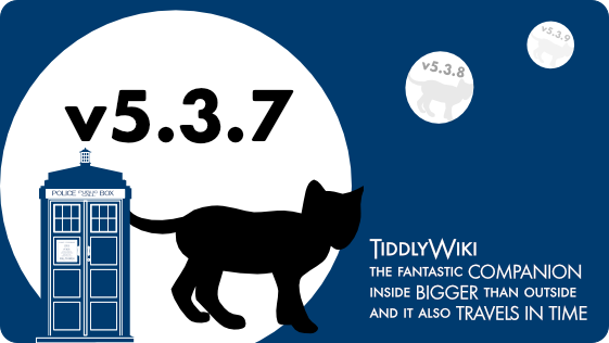
The Keywords journey and leading to the future inspired another banner. Maybe because for some reason unknown to me I always associated TiddlyWiki with the TARDIS:
I love all the other fresh banner ideas and the discussion is truely inspiring.
3 Likes
On the first glance the banner looks great and not like AI, but on the second glance it does, because it raises questions:
Shouldn’t there be a fairy? 
Shouldn’t the boat point in the opposite direction?
Very inspiring though. 
1 Like
@Xrizzy – Please read the OT again.
Banner images should have no other text than the version number.
Your slogan is nice, but none of it is official TW text and it will be too small to be read.
I would love to see this idea reworked… I love the idea of the Tardis (and I’m one of the few geeks who is not a Dr. Who aficionados, it seems.). But as well as @pmario’s note about additional text, I think we’re all hoping there will be no need for 5.3.8 or 5.3.9.
Still, I think there is the germ of a very good idea here.
1 Like
I am open for suggestions. 
Of course @pmario is right the Text is probably not readable in the small version, but as it is not “necessary” I thought it could pass. But I can just remove it.
As an architect by training, a designer by nature and just an ambitious user of TW I have no clue which version will be necessary. You guys doing the hard work know better. Should I change it to v5.4.0 in the future?
PS: I have never been a WHO fan until I first saw the “new” inside of the TARDIS in 2006. Ever since then I kinda liked the whole concept of that blue box.
Right now 5.3.7 is being finalized, discussions are ongoing on 5.4.0, and we’re at the dreaming stage of TWX, ideally 6.0.0 – not expected out until around 2036! 5.3.8 would be merely a bug-fix release for 5.3.7. And 5.3.9 would likely be a second one. We can always hope that these are not ever necessary.
You could change it, but I don’t know if even that would be subject to the restriction @pmario states as
Banner images should have no other text than the version number.
In any case, it would likely be unreadable at small sizes.
1 Like
Thank you for the explanation. So we are hopefully heading for v.5.4.0.
I checked the text at the beginning of this thread. It doesn’t state that restriction. Do I have to look elsewhere or maybe I just don’t see it, which knowing me that’s a possibility too.
For some reason well known to me (after one year of continuous learning, the sight of wikitext, and particularly long, complex filter syntax, still pushes me into a state of total panic), I think I’m rather associating TiddlyWiki with the Gom Jabbar test box, except I have to insert my head rather than my hand into it, which makes it even more terrifying 