Banner Image Competition for v5.3.7

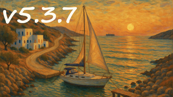
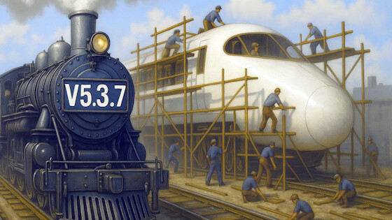
We’re planning to release TiddlyWiki v5.3.7 on Monday 7th July 2025. As usual, we’re holding a competition to design the banner image that is shown on the splash screen and within the opening “Find Out More” tiddler.

We usually suggest that the artwork reflect some of the changes in the new version. That may not be practical for this release, given that it is mostly bug fixes and minor tweaks. Instead, you may want to explore more conceptual ideas. For example, it might be interesting to try to convey the sense of end-of-an-era as we prepare for the major changes in v5.4.0.

https://tiddlywiki.com/prerelease/

Entries will be accepted until Friday 4th July 2025 at 8am UK time. We will then hold a vote here to determine the winner.

The other rules/guidelines for the competition are:

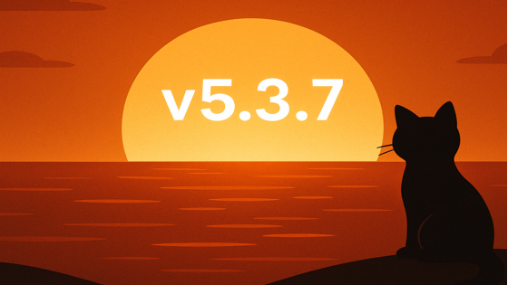
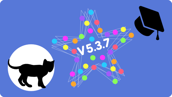
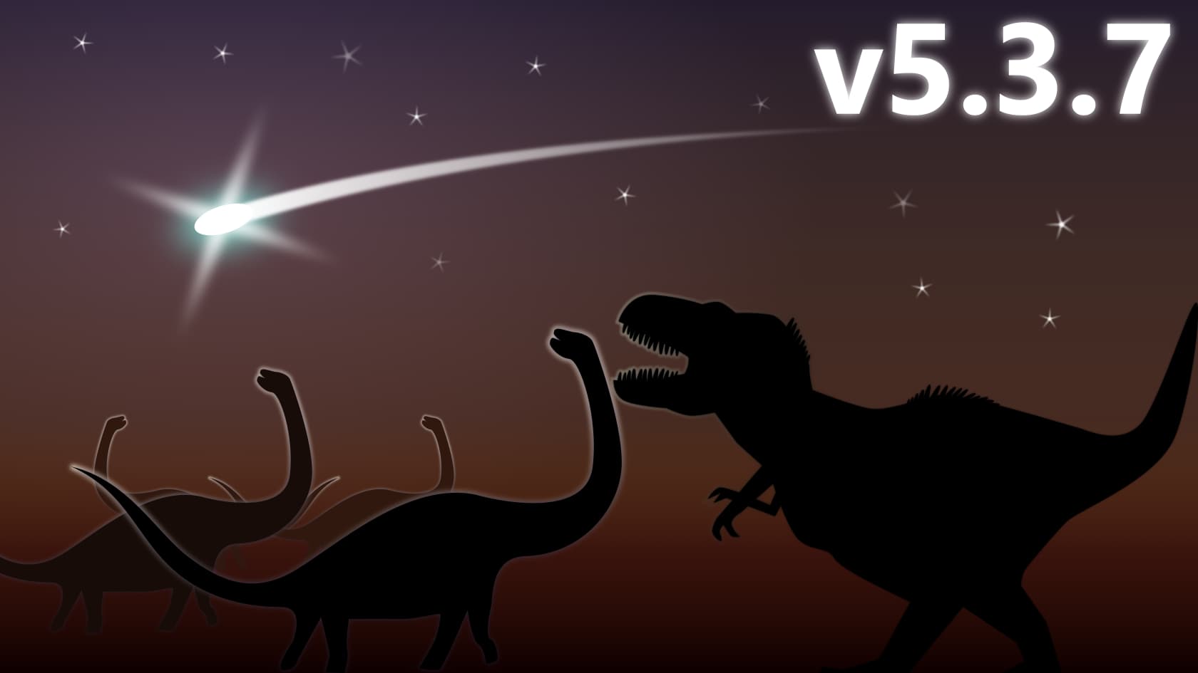
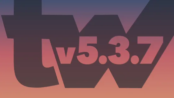
  • The version number must be clear and readable even when the banner is shown at a reduced size
  • The version number must use the correct punctuation including the “v” prefix and clear full stops between the numbers
  • The image must be a PNG or JPEG of exactly 560x315 pixels
  • Note that the image is displayed at a smaller size on tiddlywiki.com , so check that your artwork is legible at the display size (the scaling is done in order to yield good quality on hi-dpi displays)
  • The image need not include the word “TiddlyWiki”. The banner image is only used in contexts where it is clear that it is about TiddlyWiki
  • Feel free to enter an updated version of artwork that was a runner-up in a previous competition
  • Reply to this message with your entry, or any questions
  • Please give lots of feedback here to encourage the artists

Good luck! I’ll be looking forward to seeing the entries.

Best wishes

Jeremy.

2 Likes

I’m no artist… so I asked Sora for help… this is what we came up with:

TW3.5.7 Banner Entry

Cheers Ceebee :smiley:

11 Likes

As usual, I invite folks to peruse my gallery of past version-banner entries, and winners, for inspiration and perspective:

https://tw-logo-contest.tiddlyhost.com/#v5.3.7

I’ll also try to keep up with this thread as current entries come in.

5 Likes

2 posts were split to a new topic: Discussion about AI created banner

Nothing to contribute but some thoughts…

As this is likely the last release in the 5.3 series, it might be good to return to referencing of the main features of this series: functions and procedures, which you can see throughout Springer’s gallery.

The sunset/horizon image by Christian is good too as a metaphor, showing distance (from the first release in the series) and hinting at ‘reflecting back’.

For what it’s worth, it didn’t strike me as AI-like at all and I would have assumed it was homemade vector art. Funnily enough, it reminds me of an intro to a short 2000s Flash film. I tried to find it again on Newgrounds without success. It was pirate-themed and had the Monkey Island theme song playing.

3 Likes

Well, Christian, I like it. Thanks for sharing it with us. The cat’s really cute in this one.

TiddlyWiki Banner v5.3.7

I love the “confetti explosions” you get during the instruction tour. I just wonder why it is rectangles. :thinking:

PS: It’s all homemade and available as SVG. No AI.

6 Likes

I like it and I have to say it goes to show, that the output of AI depends on the input. :grinning:

Maybe a little too literal, but it was a significant end of an era.

560 x 315
TiddlyWiki_Banner_v5.3.7

Please excuse any anachronisms, all depicted species are purely fictional. Any similarities with real specimens, living or dead, are purely coincidental.

9 Likes

I withdraw my entry. I support the dinosaur, the sunset and the “sail boat bridge” entries.

4 Likes

Like @Christian_Byron — who got us quickly launched here — I like the “sunset” theme.

But I wanted to do something with an actual feature… and palettes do figure heavily in the improvements list.

So, here’s a design reworking a “tw” mask from a prior version banner idea, but now built entirely on colors from the (updated) Nord palette. Sunset into (nordic) dusk.

Cheers!

nord sunset v537

Fine print: No automated image-generation engines contributed to the creation of this banner. :wink:

11 Likes

It is not a “WAS A” yet. You are supposed to promote it before it’s birth, not mourn it’s death (dino extinction) prematurely? :slightly_smiling_face:

That said, the meteor in the sky is a good symbol of future promise (Jesus Sign et al).

But what about some detail of the release?

OR do you think it just a step to a halcyon next version?

Just asking, TT

I like it!. v5.4.0 is something to look forward to, and the shooting star is certainly something to look forward to for us dinosaurs. Duarte is really able to bring our eyes to it with that effect. And the dinosaurs are all witnessing it. WE are witnessing the evolution of TW and it is great to be a part of it.

The “twinkle” in that image was something that inspired my own contribution. But it’s obvious I was not able to give it multi-spectrum flash it gives… this one almost hurts the eyes! Great work.

2 Likes

We don’t have impact yet, those dinos still “are”, most probably survived some time after, so it is still a somewhat accurate depiction of the situation. :wink:

I confess I didn’t look much into the new features, I just took Jeremy’s word for it being an interim release and his intention to mark the end of an era.

Hopefully I’ll be able to revisit the theme for the last of the 5.4 series before 6.0

1 Like

A vero.          

I think we may add elements of the text “v5.4.0” instead of the element of end of the era. An example for it may be a hand tearing “v5.3.7” at half, showing “v5.4.0” under it.

The only problem there (setting aside the challenge of being extra-careful to ensure that it doesn’t look like this is already the banner for the incoming 5.4) is that on at least two occasions (in recent years I can recall) we needed a speedy follow-up minor release (so fast that there wasn’t a full banner preparation interval).

Of course a quick-fix release is never something we positively expect. But surely we shouldn’t completely tie our hands so that v5.3.8 is ruled out. (But maybe a v5.4 subtly on the horizon wouldn’t have the same effect as a tear-off page …?)

Great to see all the entries, and the discussion is helpful.

We are indeed fairly likely to need to make further v5.3.8+ releases, but they would strictly be bug fix release, with no new features. In that situation, I would prefer the banner image to stay the same, just with the version number changing.

I will ask the winner of the banner competition to also prepare artwork for v5.3.8 and perhaps v5.3.9. If we need a bug fix release beyond that I think I would want to change the banner image to reflect the unexpectedness of the situation.

Minor points:

  • I agree that there is a risk of confusion if we include v5.4.0 in the banner
  • I prefer the banners that have resonant imagery, rather than just typography
  • I like the dinosaur idea as an exploration of depicting the end of an era. Perhaps there are other metaphors that might be fruitful: the end of one journey and the beginning of another, or a caterpillar turning into a chrysalis, or a bridge leading to the future. As others have noted, the difficulty is depicting the end of the era, and not the start of the next

Title: It’s a Journey

image

PS: Completely AI generated using the Edge Copilot. With a prompt that took me 2 hours to refine :wink:

8 Likes

Maybe overstating the gap here - but illustrates the coming transition!

image

8 Likes