Warn a guy, will you? I was eating pistachios when I opened this, and almost choked! 
That’s fantastic!
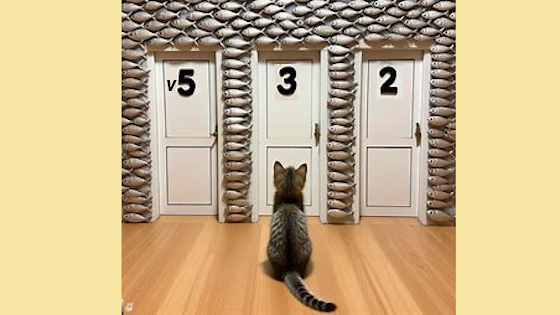
Not really a serious contender. Done with AI and post-production by a Gimp-challenged individual. I was impressed by how close it came to my original concept. Maybe if I was a professional user they would allow me to create high-resolution images so I wouldn’t have to expand the edges to make it 560x315.
I messed up and asked for 5 3 3. The AI used 5 2 3! So it was more right than I was. I Gimp-shopped the numbers around.
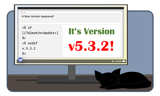
A kitten (the TW default avatar) is making a choice (condition) from 3 doors in a wall of tiddlers. So that’s the connection to v5.3.2.
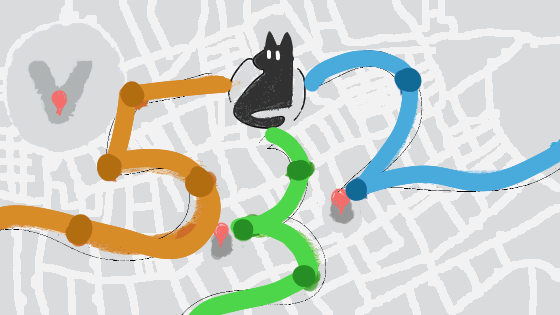
This is extremely rough, but transit maps feel (to me) like a good combination of Conditionals (need X line to get to Y place) and Image Maps (which I am very excited about). Concrit welcome, ofc, but if this is  -worthy then I can finish carving it out.
As always, the gallery of version banners is open for nostalgia and inspiration: https://tw-logo-contest.tiddlyhost.com/#v5.3.2
And here’s one quick banner-image draft from me, to add to the party:
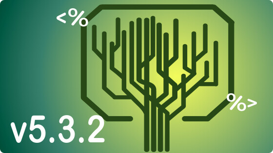
(Edited so that image here is actually a png. — or at least I tried to make it a png, though this forum is stubbornly converting to jpeg. Meanwhile, the gallery site has webp versions, just to save KB.)
@jeremyruston I always understood that it doesn’t have to contain “TiddlyWiki” as it’s redundant, but it is not forbidden to use it. But maybe it’s just me not understanding the wording correctly.
In any case, if you want that the artwork explicitly does not contain “TiddlyWiki”, maybe the rule should be formulated differently to avoid confusion?
Hi Jeremy,
Sorry for the inconvenience. I move these under the Cafe!
That is correct, and accordingly we have had banners in the past that include the word as part of a design. But that’s not quite the case here; the “banner” is almost entirely the word “TiddlyWiki”, plus a simple generic graphic that does not appear to be related to the new version of TiddlyWiki, and an artful presentation as a fake photograph.
I am happy to use generative AI tools myself for all kinds of things, but the output is almost always banal and generic. In my experience it takes a lot of human labour to make something satisfying out of their output.
Hello Mark_S,
Just in case : depending on the AI software you use, some, like stable diffusion, provide outpainting features that can handle expanding the edges.
Best regards,
Eskha
This is clever and eyecatching, @Springer! I think it’s a great idea to graphically highlight the new syntax (as @vilc also suggested). As a user, if I see an unfamiliar string of characters right on the version logo, I’m automatically inspired to find out how it’s used.
I’ll just leave this brainfart here in hopes that someone is inspired to make it pretty:
5! FREE TOO!
? Isn’t 5! == 5 • 4 • 3 • 2
Here’s a conditional tree that more clearly bears fruit:
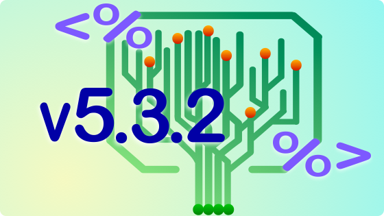
(This supersedes my earlier draft.)
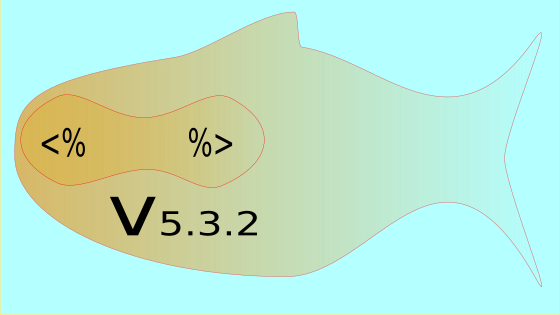
Looks a bit <% iffy %> if you ask me (see what I did there?)
These are my artworks for TW 5.3.2 release banner competition. These are created using AI.
Banner 01
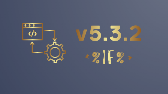
Banner 02
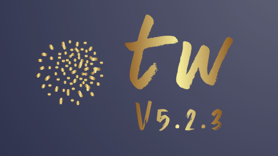
Banner 03
Remarks
- The first banner indicates the new
<%if%>feature in 5.3.2 - The symbol in banner 02 and 03 is an indication of TiddlyWiki is made of several small chunk of data (e.g. tiddlers)
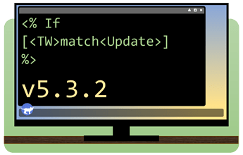
Not my greatest work but, here is my submission for the next icon.
I included the TW logo as the super icon on the taskbar (like the windows icon) but if thats no good I can replace it, I just thought it would be a nice easteregg
I also considered instead of a terminal window to show a simplified tiddlywiki page, but it would be too small to really see what what written in the tiddler 
If you placed v5.3.2 inside with <% endif %> at the bottom… perfect. I like that a lot.
@CodaCoder Yea, I agree, I took a closer look at the updates and I have a few changes I wanna make, like fixing the mistakes and I might start over tbh but the same sort of idea.
Edit: This won’t make much sense to anybody, but to future me, don’t try to freehand cats out of shapes in ms word, sincerely, past you.
Edit 2: Here’s my proper submission, in the required size.
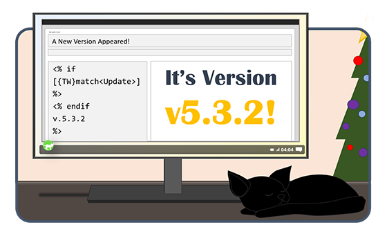
Edit 3: and a holiday themed one… ok I’ll stop now.
I can make edits to the color bg and font if something is preferred over the other.
