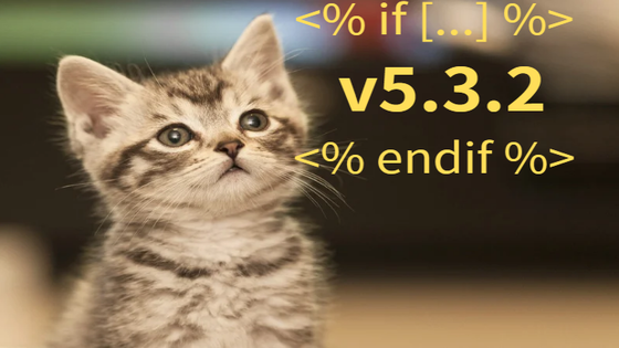
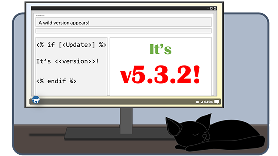
If you placed v5.3.2 inside with <% endif %> at the bottom… perfect. I like that a lot.
@CodaCoder Yea, I agree, I took a closer look at the updates and I have a few changes I wanna make, like fixing the mistakes and I might start over tbh but the same sort of idea.
Edit: This won’t make much sense to anybody, but to future me, don’t try to freehand cats out of shapes in ms word, sincerely, past you.
Edit 2: Here’s my proper submission, in the required size.
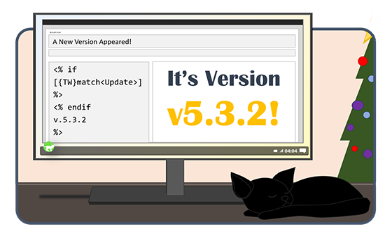
Edit 3: and a holiday themed one… ok I’ll stop now.
I can make edits to the color bg and font if something is preferred over the other.
4 Likes
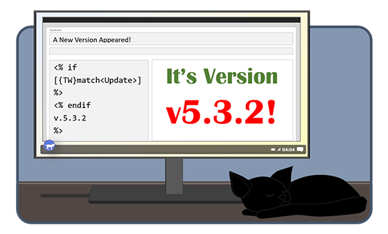
Nice crisp work! Currently the pngs are a bit over-tall, but just with extra transparency.
I’ve uploaded 560x315 versions to the gallery at tw-logo-contest — in tiddlywiki, for tiddlywiki
We have 10 entries from 6 authors, so far!
Around the holiday-theme variant, I do worry that it may be in tension with the cosmopolitan potential and actual reach of the TiddlyWiki community. (Of course, nothing anyone does or says is entirely “neutral” in terms of cultural flavoring. Still, how well would a christmas tree resonate in China, Iran, India, South Africa, Brooklyn  …? I’d lean toward the first image of these two, because of this concern.)
Oh, I totally understand, I’m actually not the festive sort, so I don’t celebrate any of the holidays, but I wanted to make a variant since the holidays are coming up soon, it wasn’t meant to be a valid contender, just the first image.
In all honesty, I considered taking the BG color from the 2nd png but I’m not sure which is more appealing.
That code should be:
<% if [...] %>
 v5.3.2
<% endif %>
1 Like
Also, to improve the left-half code part:
replace v.5.3.2 (note the extra stray period after the v) with <<version>>
Ah.. oops haha, I can adjust that then.
Got it, I think I will go with @CodaCoder’s suggestion to avoid needing too much space.
I noticed the “04:04” clock display in the lower-right corner…
“404… the missing minute… when you just can’t find the time!”
If the text is too long…
<% if [<upgrade>] %>
1 Like
The shorter the text the bigger I can make it so it’s easier to read when a smaller size, so thank you! ![]()
I’m glad someone caught that little tidbit haha
…
So, before I create another, whats the census on the beige background over the muted navy background? other adjustment suggestions are welcome as well!
Not that it matters a whole lot, but this, for me…
I mean beige??? That’s not even a color anymore, is it? ![]()
The color scheme on the plain one looks good to me. I’d even encourage you to keep the red & green as a very subtle potential nod toward the holiday timing.
1 Like
Hmmm.
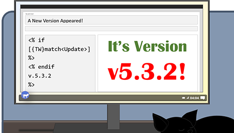
@Justin_H – v5.3.2 IMO the “v” already says “version” – So your image says: It’s Version version5.3.2
1 Like
Then blue it shall be! (I also adjusted another easter-egg, because I forgot how it went originally..)
Edit: Fixed it! (I think I’m gonna call it done here lol)
I think that takes care of that! ![]()
4 Likes
Sorry for the niggle, but I think the macro is <<version>>, not <<tw-version>>
Then you’d have room for the exclamation point on the left as well. 
Of course, perhaps it’s possible to allow any winning entry to make final technical tweaks as needed, rather than tempting you to revisit. I know I’m tempted to play with more variants of my entry, but need to move on to other things!
1 Like

7 Likes
This would have been great for whatever release introduced :map.
2 Likes
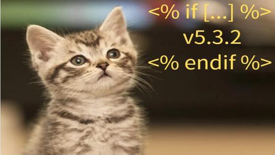
I used this kitten to express my confusion about the new feature. Because I’m as confused as a kitten about how the new feature works.
Pictures are free can work fine.
1 Like