
I’m still working on my Periodic Table demo.
I have fixed some of my layout problems, but I have an annoying glitch.
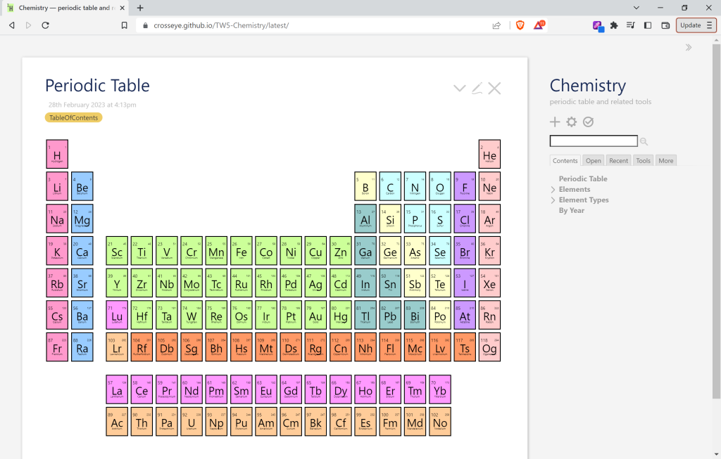
The tiles in the table are supposed to be laid out like they are in the element tiddlers:
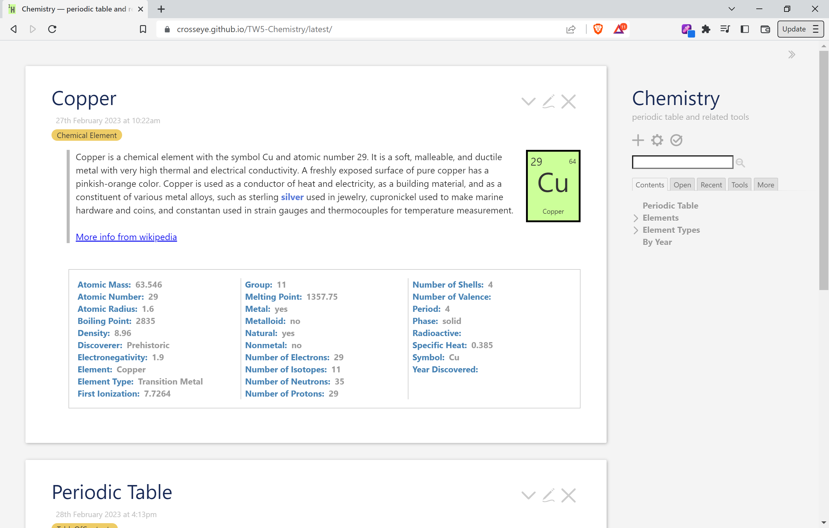
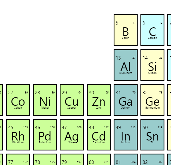
Note the space between the element symbol and the other properties which should be stuck close to an edge. However when running in the table, they seem to have grown some extra space away from their edges:
Closeup:
There are two stylesheets relevant here:
- $:/_/my/styles/tile styles a tile in either circumstance.
- $:/_/my/styles/periodic-table lays out the table and adds a few overrides for the nested tiles.
The table is a CSS container, and the tiles are each containers (the markup is in Periodic Table for the table, in $:/_/my/templates/body for the element ViewTemplate, and in $:/_/my/macros/tile for the actual tiles.
I use the container query width units, cqw, for both the table and the stand-alone tiles. There is some complexity as the table is using these units, and the the tiles inside the table are using their own.
So if you have some CSS skills and a few minutes to check into this, I would be very grateful. Do you understand why the tiles inside the table are laying out their internal properties a bit differently than the stand-alone ones?