At: Here I go again, I just want to colourise a button in the Toolbars Tony wrote.
I don’t have exact answers for your questions here but I try to give some information, how you can find the answers yourself.
Styling in TW is complex, because our UI and the related CSS / stylesheets have organically grown over time and are more complex as they should be.
We do have 3 button types in TW, which can be globally changed using the ControlPanel → Settings tab → Toolbar Button Style
- Borderless buttons that have a class:
tc-btn-invisible - Boxed buttons that have a class:
tc-btn-boxed - Rounded buttons that have a class:
tc-btn-rounded
So this can be 1 selector, that can be used to specify a CSS class definition.
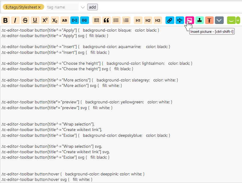
There are several definitions of all 3 of them in the Theme Vanilla Base stylesheet.
- tc-btn-invisible is used 7 times in that tiddler. You need to search for it, to see how.
- tc-btn-boxed is used 4 times … search for it
- tc-btn-rounded is used 4 times … search for it.
Those classes define the “main” button CSS elements. … Sorry that’s not easy, but it is as it is at the moment. As I wrote already CSS has grown over the years.
TiddlyWiki has 18 different palettes, that are currently part of tiddlywiki.com
Be aware, your modifications need to play nice with all of them, to be useful for everyone.
The palettes define some foreground and background colour definitions, for many different elements. … palette -> foreground is mapped to the CSS color setting and palette -> background is mapped to CSS background …
The button definitions in the palette are:
-
Default button background
button-background -
Default button border
button-border -
Default button foreground
button-foreground
Vanilla has no value assigned for them, so the browser default colours are used.
-
Sidebar button foreground
sidebar-button-foreground
inherits the foreground colour with a macro <<colour foreground>>. foreground is defined by
-
General foreground
foreground
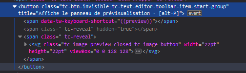
the Vanilla base tiddler uses the following definitions for the svg fill-colour of the tiddler toolbar buttons. So if you define them, you can change the default color in your palette.
eg: If you want to change the Cancel Button to green you can open the palette editor and change the first value in the list below to green.
-
Toolbar ‘cancel’ button foreground
toolbar-cancel-button ← green
This works nicely for Borderless and Boxed, but not for Rounded, which is a bug. I’ll create an issue for this one after I finished this post.
-
Toolbar ‘close’ button foreground
toolbar-close-button -
Toolbar ‘delete’ button foreground
toolbar-delete-button -
Toolbar ‘done’ button foreground
toolbar-done-button -
Toolbar ‘edit’ button foreground
toolbar-edit-button -
Toolbar ‘info’ button foreground
toolbar-info-button -
Toolbar ‘new tiddler’ button foreground
toolbar-new-button -
Toolbar ‘options’ button foreground
toolbar-options-button -
Toolbar ‘save’ button foreground
toolbar-save-button
If you want to know, which CSS rule is used to define the SVG colour for those buttons open the
Vanilla Base tiddler and search for Toolbar buttons … That’s the section where those definitions start.
So if you want to create a CSS rule in your user-stylesheet, you need to redefine that rule.
And you need to make sure, that your stylesheet is loaded after the core style sheets.
This info can be found at: ControlPanel → Info → Advanced → Stylesheet tab.
There is a list of all active stylesheets, which can be sorted using drag and drop. Make sure yours it near the end.
BUT
Be aware, that your CSS should play nice with existing palettes.
To be absolutely sure, which styles are active for a button or an SVG element, you’ll need the browser dev-tools.
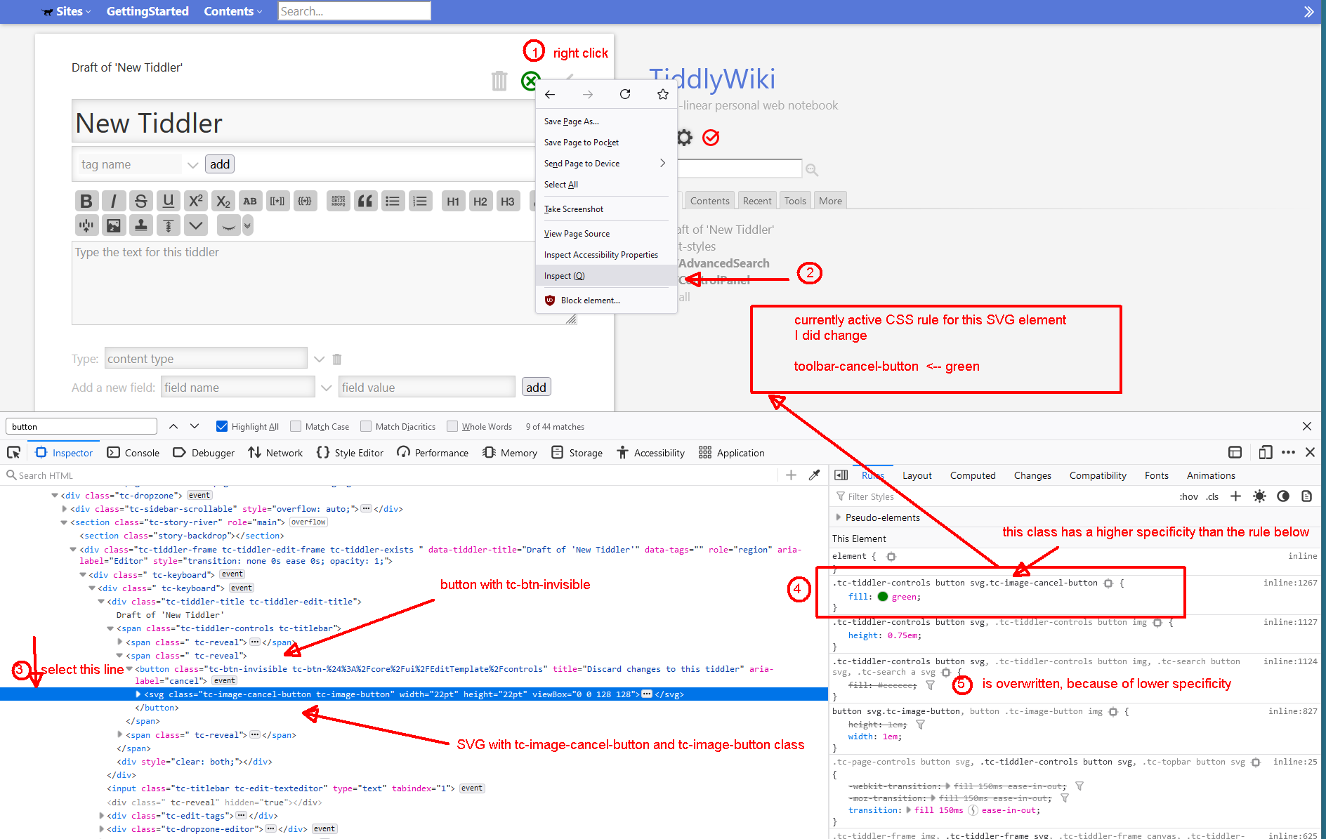
There are many videos at YouTube, that discuss CSS specificity. The link contains a good starter, but there are many more.
I know it is complex, but the configuration options we have are endless.
I’m trying to improve some elements at the moment with an upcoming PR.
The issue is at GitHub https://github.com/Jermolene/TiddlyWiki5/issues/6874#issuecomment-1212197295 and it discusses some changes where about 20 lines of Vanilla Base CSS are involved.
IMO improving the Palette UI would be a possibility to improve our 18 palettes. … Many of them are missing important definitions, because we do have way too many parameters where creators don’t know, what they are used for.
I’d like to change that with some palette UI improvements. … eg: The UI should show live elements. So if a colour is changed, the users can actually see, what they change.
I hope, that this post can help a bit, but I’m not really sure. I’ll try to improve it in the future.
May be I could create some videos. … If I get minimum – 30 Rockets  – for this post.
have fun!
mario