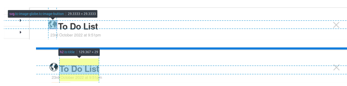
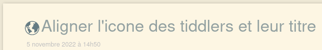
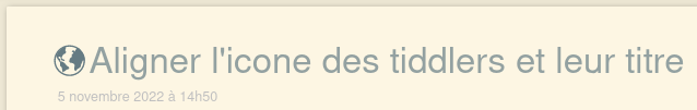
What would be the best way to tweak the alignment of tiddler icons such that they properly align with a tiddler’s title text?
At present, icons always seem to float about half a line above the title text. I’ve had a bit of a dig, and I expect the answer is buried somewhere in the CSS, but as a mere “dabbler” in all things coding, I’m struggling to identify a good way to implement such a change.
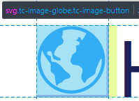
If it matters, I’m using Nicola Petton’s Notebook plugin, but I don’t expect this will affect the answer, since the same icon misalignment is visible on the main tiddlywiki.com site.
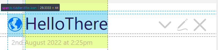
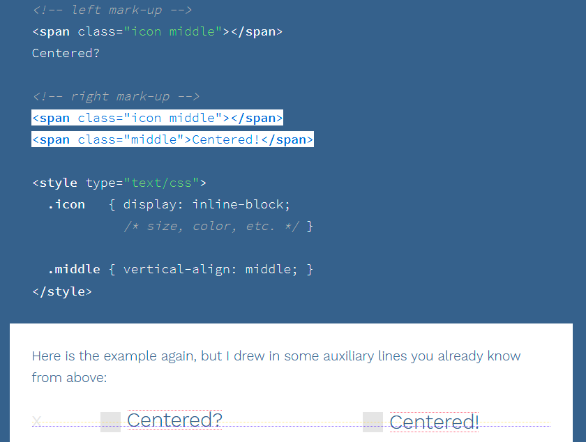
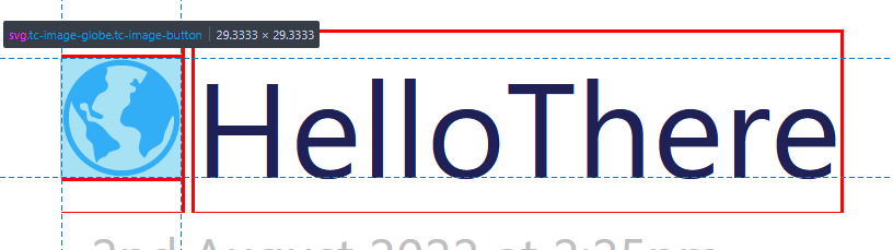
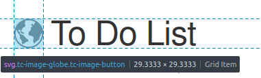
Tiddlywiki attempt to vertical align the icon with vertical-align: middle.
As we can see in this overlay of the bouding box of both title and icon, it is not the case:
Thanks a lot @telumire - that’s a really useful answer. It definitely captures the key information I needed, so I’ll mark as “solution”.
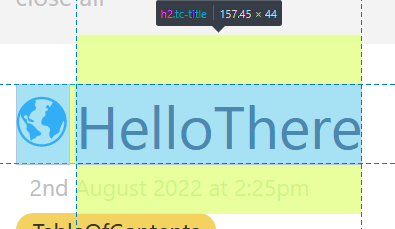
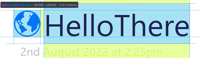
I found the same as @tw-FRed - I actually get better alignment using
.tc-titlebar h2 {
vertical-align: bottom;
}
I also hit a minor bump resulting from using the Notebook plug. It turns out that the theme changes the titlebar font properties, such that the text is no longer the same height as the icons. I therefore added a couple of extra rules to revert the relevant properties back to those used on the vanilla template. For anyone who hits the same issue, my full solution as of now is:
The !important flags were needed as these are used by the changes present in the Notebook plugin, so these (above) changes were not getting applied without the !important. I also doubled the margin-right for the tc-tiddler-title-icon based on personal preference.