A multi-column Layout / Storyview

Comment On Naming #1: We call it “MCL” – but is also “MRL” :smiley:

Ciao @BurningTreeC

As I’m working with MultiColumn Layout (MCL) and trying to document parts of it I suddenly realised that in TW terms it is a MultiRiver Layout (MRL)! :slight_smile:

I am amazed at how each Column/River can be used as-if it were an independent wiki river itself!

For instance every column can independently import Tiddlers.

In docs I will try and make this more explicit as I think it is radically useful to be clear about!

JUST a comment
TT

1 Like

It seem to be working now. Krystal is working fine in an ensemble of my MCL wiki

2 Likes

Don’t suppose you have a link for that?

Here is a demo

https://multicolumn-krystal.tiddlyhost.com/

There is a bug where the some of the tiddler contents are not seen at all (tiddler goes totally blank with even the buttons not visible). I have seen this bug in Krsytal before also. Have to report it in krystal github repo. If anyone has a solution of it, please share.

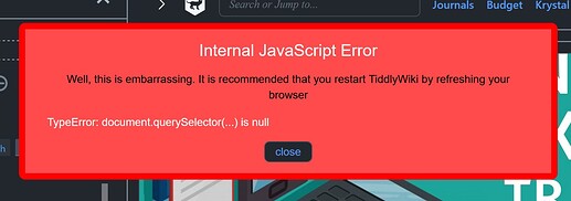
Sorry to say that on both FF & Chrome on Windows 10 I currently get RSODs …

… on FF …

… on Chrome …

TT

I guess here the error is shown because the header is not displayed…
It is requested in the .js .
I have a tiny hidden instance but it would be best to remove the line it from the js … perhaps this is even the cause of the second bug

2 Likes

I have seen this bug …But it was occuring randomly …so couldn’t find why it’s happening. Don’t know whether it’s related to some of the plug ins I was using… Will have to do some more testing.

1 Like

As I said in the post above yours:

I have craeted an github issue in the krystal repo regarding this. Let crazko also respond. I will make the change after that.

Hi @BurningTreeC

I kept testing within TiddlyDesktop and didn’t find any problems, except for one thing that is odd: in TD both the vertical and horizontal scrolling (while navigating tiddlers with keyboard shortcuts) is much slower than it is in Firefox and the setting “scroll duration in x-direction” (within the plugin’s own settings) doesn’t seem to do anything. TW’s own animation duration setting isn’t related to this I think, I tried and it made no change in this.
(Even an option where one could turn off this scrolling animation altogether would be great in case it’s difficult to solve to give control over the duration to the user in numbers - because the slightly jarring nature of jumping instantly could be preferable to the current somewhat slowness in TD. [In my case it’s all I’d need, because I prefer it to be 0ms and just jump, but in general most people like to have a little ease I guess])

One possible improvement for the plugin would be to increase the utility of the search function by incorporating keyboard navigation up and down, and upon selecting an item from the list (either by enter or mouse click) it’d close the search “layout” (where it isolated the searched for tiddler[s]) and jump to, and focus on the selected tiddler.

I apologize if any of these two were mentioned already, this thread is a quite long and I didn’t find either by searching in it.

One other little thing I noticed and it’s probably not something that could be solved within this plugin is that with the commandpalette plugin if I open a new tiddler it always opens tiddlers in the first column and doesn’t select them to be the currently active/highlighted tiddler, it only jumps to them to show them on screen but the selected tiddler remains the one that was selected before the search. The normal search box seems to be working wonderfully and the new tiddler gets the focus as it should (but I prefer to use command palette). Am I correct to assume that there should be a change in the command palette plugin to make it work with your multi-column layout? (this is something that happens both in TD and Firefox) (other commands with that plugin like “close all tiddlers” etc. also only effect the first column, regardless of what column is selected.)

Let me know if I should write these on github instead, if that is better I’ll do it over there.

Thank you again for your amazing work,
Adam

Ciao @BurningTreeC

I wanted update you that I am working on some documentation I hope will help you convey how good MCL is.

I need a few more days as it is not so easy to fully explain what MCL does.
It has been interesting to try document it as, doing that, you realise how rich it is.

Your brain is clever! :smiley:
I’ll comment more later.

TT

Comment On The MCL “Navigator” – #1 Meat & Potatoes

MCL has a very neat tool for managing columns/rivers.
It is in the right panel/sidebar …

Via Configuration Options you can add numbers if wanted …


… resulting in …

It is also available as a tool you can transclude anywhere via … $:/plugins/BTC/tiddlywiki-multi-columns/ui/Templates/columnswitcher

In use …

  • Click a column in the “navigator” to select/focus that column
  • Click and D-n-D a column in the “navigator” to another column to copy its Tiddlers to the destination column.

TT

#Issues Arising – beta v78.0 – Scaling When “Vertical”?

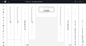
One issue that comes up is if you enter an MCL wiki with “panorama” off the user can get confused by seeing things like this …

What I’m wondering is IF in “vertical” mode we might be able to use CSS to dynamically “zoom down” presented Tiddlers to fit the column widths??? In effect seeing “thumbnails”???

I’m not expecting you to do it!

I’m just commenting that unless you understand MCL it might be confusing if “vertical” is on in wikis with many columns, rather than “horizontal / panorama”, on Ensemble startup??

Maybe later?

Just a comment
TT

1 Like

Is there a version without the new menubar (ie. just with the multiple story rivers)?

Hi @Elijah

The top menu bar is a separate plugin

Best wishes,
Simon

Can there be an option to add filters in the story field instead of the list of the tiddlers?

Also how does the title of this tiddler - $:/plugins/BTC/tiddlywiki-multi-columns/ui/SideBarTabs/Ensemble looks different in view and edit modes

2 Likes

I was referring to this:

Was able to get rid of it by setting

show the hamburger buttons in a top panel
to no, and

hide the system-sidebar / panel and its button
to yes

Now, I’m trying to get rid of these weird bars above the story rivers, as seen here:

Basically, I’m wanting it to look like this:

Rather than like this:

No.

You “get rid of it” by removing the tag “$:/tags/TopToolbar” from it.

TT

You mean this …?

That is gonna be there in VERTICAL mode Screenshot 2022-06-19 105831

We could gently ask @BurningTreeC to remove it, but I don’t see it as a problem. It is there to help identify the columns.

It is not present in HORIZONTAL mode Screenshot 2022-06-19 110030

TT

Hi all,

sorry I was away from the forum for some time
I’ll try to catch up with the questions made here and answer asap

Best wishes,
Simon

4 Likes